
 notepad
![[articles]](https://eev.ee/theme/images/category-articles.png)
I assume you’ve read the introduction, which tells you the basics of putting a world together.
This post is more narrative than mechanical; it’s a tour of my thought process as I try to turn my previous map into something a little more fun to play. I still touch on new editing things I do, but honestly, you already know the bulk of how to use an editor. Poke through SLADE’s keybindings (Edit → Preferences → Input) to see what hidden gems it has, click that “Show All” checkbox in the prop panel, and go wild. But please do comment if I blatantly forgot to explain something new.
(Fair warning: NVidia’s recent Linux drivers seem to have a bug that spontaneously crashes programs using OpenGL. SLADE is one such program. So if any of the screenshots seem to be slightly inconsistent, it’s probably because the editor crashed and I had to redo some work and it didn’t come out exactly the same.)
Design
I have to say upfront: I’m far from being an expert on design. I haven’t even released a Doom map, aside from the one attached to the previous post. I have no qualifications whatsoever. That means we can learn about it together!
I admit also that my initial design instincts are terrible. I want to make lots of flat rectangles, aligned to the grid. It turns out that’s not very interesting. I wish I still had a copy of the very first map I made, some fifteen years ago now: every room was rectangular, every hallway was 64×64, every encounter had monsters packed in so neatly that they couldn’t even move sometimes. Also the sectors were completely screwy because editors weren’t very good back then and I didn’t understand what was wrong or how to fix it.
I guess tidiness, neatness, and regularity don’t make for very interesting map. So what does? I went hunting for some answers.
Romero's rules
John Romero, who created episode 1 of the original Doom, had a literal set of rules that I’m just going to paste straight from the Doom wiki:
- always changing floor height when I wanted to change floor textures
- using special border textures between different wall segments and doorways
- being strict about texture alignment
- conscious use of contrast everywhere in a level between light and dark areas, cramped and open areas
- making sure that if a player could see outside that they should be able to somehow get there
- being strict about designing several secret areas on every level
- making my levels flow so the player will revisit areas several times so they will better understand the 3D space of the level
- creating easily recognizable landmarks in several places for easier navigation
That’s some good stuff, and you can see it in the episode 1 maps. (If you’re not familiar, here are some projections of them.) There are lots of loops, big unique central areas, windows that look into other places. Truly, this is the formula for a good map.
But, hang on. Romero only did episode 1 of the original Doom, and half a dozen maps in Doom II. Who is responsible for the others?
Sandy Petersen
Yeah, him.
Sandy Petersen is a Lovecraft-inspired madman who created the entire other two episodes of Doom in ten weeks. He also did more than half of Doom II, which is of particular interest to me, since that’s where my nostalgia lies. A quick perusal of the level credits reveals that all the ones that stick out to me are Sandy’s.
And yet, according to Masters of Doom,
His levels were not nearly as aesthetically pleasing as Romero’s; in fact, some of the id guys thought they were downright ugly, but they were undeniably fun and fiendish.
You might even argue that while Romero’s levels were elegant and flowed around each other, Sandy’s were bizarre mishmashes. Slough of Despair is just a big hand. Tricks and Traps is eight different rooms containing different weird little gimmicks. Downtown is a group of unconnected buildings with various ideas in them. So is Suburbs. And so is Industrial Zone — but that one was actually Romero! Surprise:
I loved it most when I’d try some weird experimental thing. Then John Carmack would berate me for stretching the engine too far. Then Romero, McGee, and Green would do a bunch of levels imitating it, because they liked it. Then John Carmack would change the engine. One good example was when I did a whole outdoors level, set in a city. Then everyone else had to make one.
I love this story. Sandy just went and did something bizarre, and it was unique enough that it inspired everyone else. Game culture tends to talk derisively about “gimmicks”, but I think a well-done gimmick is a fabulous thing.
Alas, I’m not sure this helps me concretely — “do something bizarre” is still very open-ended.
It's art, dummy
In an attempt to absorb some of whatever made Doom II stand out to me, I started a project of reimagining individual levels, but larger and with fancy ZDoom features. I was explaining this to my artist partner Mel, and went to show them the first level of Doom II.
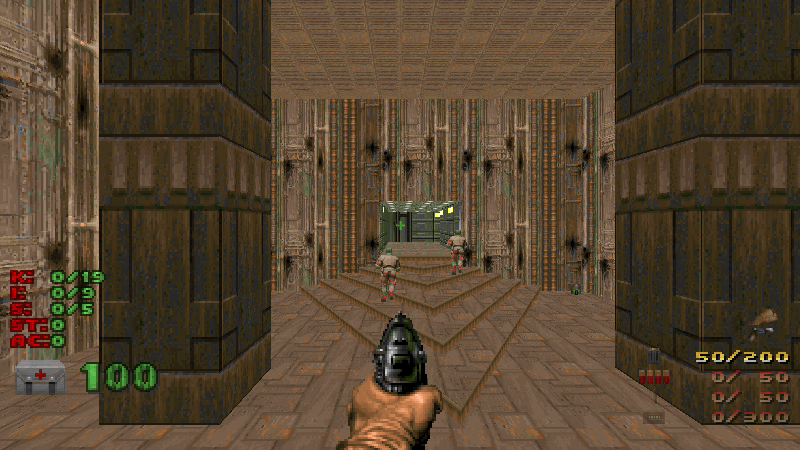
They immediately commented about how everything in this opening shot draws the player’s eye to where they’re supposed to go. The hallway is the brightest thing on the screen, and the gradient of light makes it seem to glow. The walls are a bright green in an otherwise grungy brown room. The corners of the triangular steps literally point you in that direction. The two pillars frame the whole scene.
If this were a painting rather than an 3D world, well, you could do worse.
This is an incredible revelation that I still haven’t fully wrapped my head around. Level design requires the same kind of composition that goes into any other kind of art. You want landmarks, so the viewer knows what’s important and what’s not. You want hidden details, to reward viewers who pay closer attention. You want things to connect together and be revisited, so the world seems to evolve as the viewer spends more time with it. You want variation, so the viewer can tell the “background” from the “foreground”.
These are the same principles you might apply to any visual work, just interpreted differently. You can find the same ideas in good novels, or even non-fiction, or even this very blog post — landmarks, details, connections. so for the most part, it’s really all about…
Contrast, contrast, contrast
Contrast is how we make any sense of the world. We look for differences and carve stuff up into groups based on those differences. Order is boring — and sometimes boring is what you want — but contrast is interesting.
Almost all of Romero’s rules are about managing contrast. Contrast between floor height. Contrast between textures. Contrast between light and dark. Contrast between cramped and open. Contrast between required, optional, and secret. Contrast between your initial perception of an area and the way you understand it when you revisit. Contrast between landmarks and filler.
You don’t want too much contrast, of course, or the result will be chaotic and confusing — so the hard part is figuring out how to make effective use of contrast. It should guide the player around your space, emphasizing things that are important and filling in spaces with more subdued details.
Paint a picture, weave a story. Which reminds me:
Other influences
I’ve had a blast listening to Liz Ryerson’s Doom Mixtape series, in which she plays through a community map and just talks about its design and game culture. I hesitate to even call this a Let’s Play, since the voiceover isn’t so much about the map as about its relation to Doom modding, the Doom community, and the larger gaming community. It’s super interesting and I like to just play old episodes in the background while I’m fiddling with a map.
She often touches on narrative elements, which are something I realized I really love a few years ago. I don’t know if she’d put it this way, but I think of it as any details that make a world feel like it exists independently of the player, as opposed to being an obstacle course specifically carved out just for you. The feeling that there’s just stuff going on, that the universe isn’t centered on you, that interesting things would still be happening even if you weren’t here. A fantastic example is when the exit of one level continues smoothly into the beginning of the next; it makes the world feel so much more connected, rather than just a pile of one-off maps, but virtually no one does this.
In a way this is at odds with the Petersen approach to mapping — one of my complaints about the Doom II progression is that several of the early levels (supposedly uncorrupted regular Earth places) are so abstract as to be meaningless. What is Dead Simple, this isolated courtyard where the only goal is to kill all the monsters? What would it have been if Doomguy had never passed through? That kind of disconnected feeling fits much better in the later Hell levels, but it’s pretty jarring to see only two slots after The Waste Tunnels, which do a good job of suggesting… waste tunnels.
Through Doom Mixtape (possibly via YouTube’s autoplay?) I also stumbled upon Antroid’s blind Let’s Play of Doom II The Way Id Did, which is exactly what it sounds like. Doom II The Way Id Did was a community project to create a whole new set of maps that drew inspiration specifically from the way the original level designers approached the levels, so it’s pretty interesting to see someone who cares about design play through them all. Someone involved with the project offers their own insights while Antroid plays. Antroid cares about narrative too, which is great for me, though he and Liz are diametrically opposed on the hot topic of texture alignment.
Antroid has also LP’d Knee-Deep in Phobos, another map set that he had some thoughtful criticism on, and DTS-T which is a bit more goofy.
You may also be interested in this IGN interview with John Romero which takes place while Romero plays through the first episode of Doom, which he designed.
Let's build something already
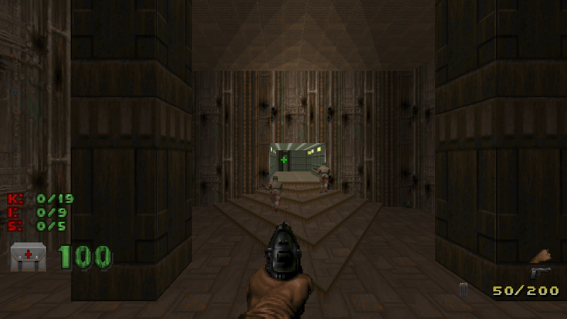
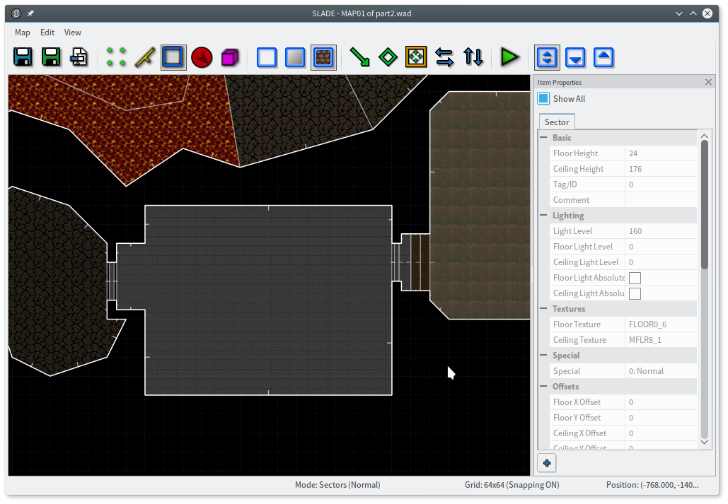
Right, yes, that would be nice. I’m going to keep building on top of the map I started last time, with the aim of turning it into a more respectable level. You may recall it looks like this:
I have a tiny outdoor area with lava, a hallway with the ambiguous “star” texture, and a gray brick room I didn’t even bother retexturing. All of this is entirely arbitrary and a matter of taste, of course, but several things strike me.
- I already have three contrasting themes here, which could play against one another.
- I have a place you revisit, but it’s just meaningless backtracking at the moment.
- There aren’t any real landmarks to speak of, though of course the map is small enough not to need them.
I want to take the advantage I’ve already got and run with it, so I’ll just say I have a base built into a volcano, on top of an old tomb.
Does that make sense? Maybe not. But who cares? Doom is abstract — don’t worry too much about looking “real”. (I’m just gonna bold the more concrete tips I have.) If you wanted hyper-realistic detail, you’re probably using the wrong engine. Your goal here is to hint enough at a place that the player can fill in the gaps with their imagination, without ever consciously thinking about it. Trying too hard to create a “real” place may even backfire, if you develop a complex design in your head and then find out that Doom simply can’t express most of it.
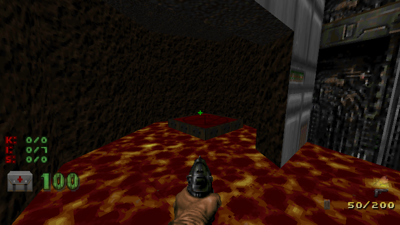
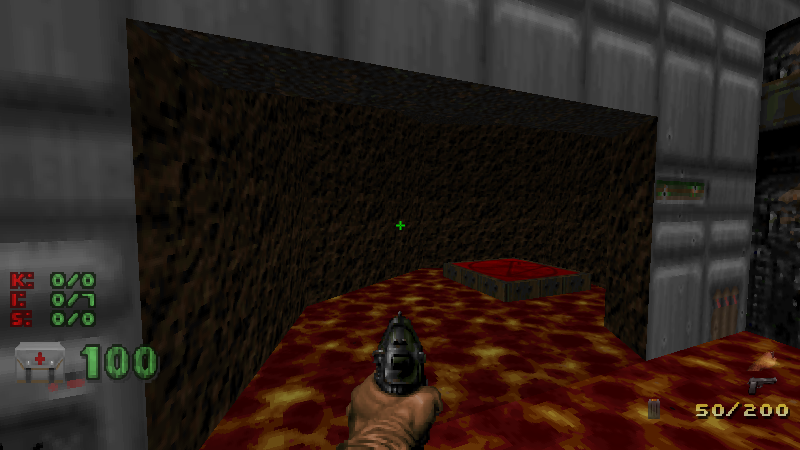
So my first thought is to expand the outside area into a sort of volcanic crater. A really big chamber filled with lava should definitely work as a landmark. The red key can stay where it is, on a platform in the middle of the lava, except I want the platform to be a tall spire. I can figure out how to get there later.
Make the space bigger than you need! I always make everything too small (remember my ancient impulse to box everything in neatly), and I always regret it. It’s much easier to deal with extra space at the end than to keep having to create new space in the middle of a map.
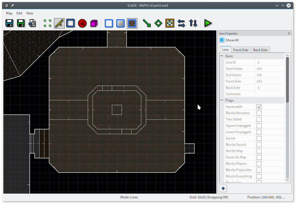
All I did was draw a squiggly area here. When I’m reshaping an existing area, I like to go into vertex mode, make one of the existing lines horizontal or vertical, add a bunch of vertices all along that line, and then drag them around to shape the room. You can also just draw a new outline around it, of course, but that’s not as fun. (You can join sectors together by selecting them and pressing J. The final sector will have the properties of the first sector you selected.)
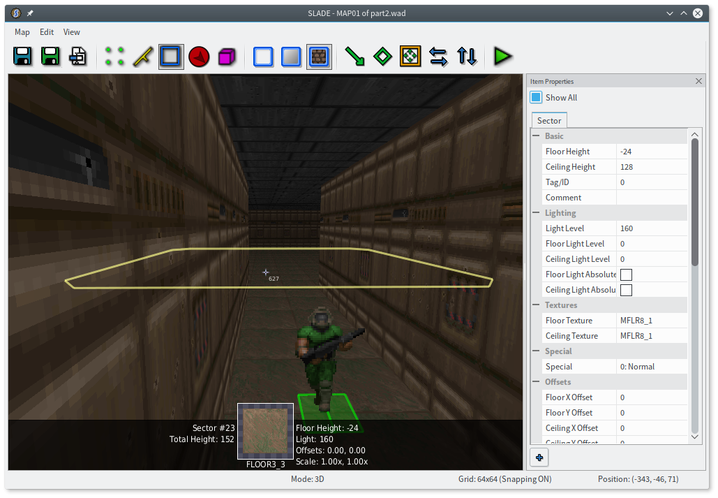
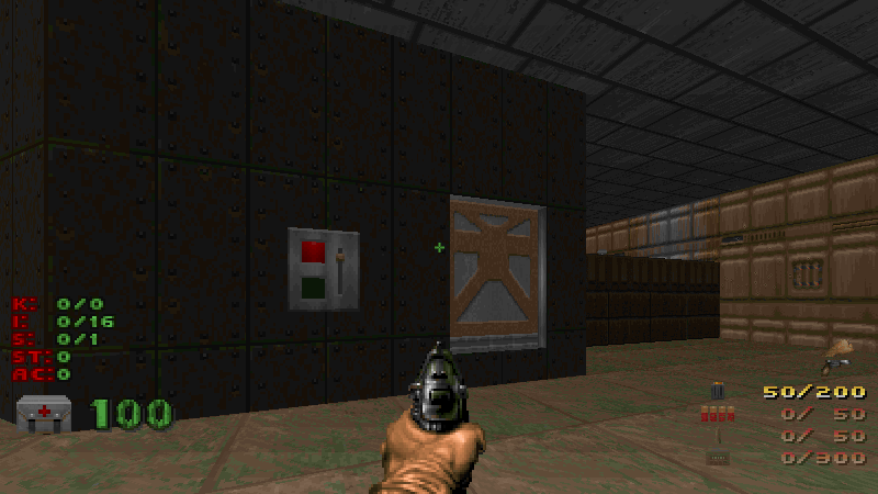
I put the red key spire at about the right height to catch the player’s eye when they walk outside. It would be more obvious if I changed it to the blue key, but I like that red fits the volcano theme out here. Keycards blink, so that should help.
With the raised ceilings in the middle, I made a conscious effort not to just redraw the outer edge, but smaller. That looks artificial. Instead I tried to make the inner shape a little smoother, and I aimed to put its vertices near the midpoints of some of the outer lines.
I think Romero said in that IGN interview that he details as he builds the map, but when I do that I get myself into trouble. Detailing is fun for sure, but if you change your mind about an area or need to move it around just a little bit, the details are a huge pain in the ass. At best, you have to destroy them all and recreate them. (Remember the crate!) Maybe it’d be easier if I were better at this and could be confident in my design from the get-go, but at least for now, I’m going to carve it out fairly rough and worry about making it pretty later.
This is still a dead end, alas. I do like that little nook in the southwest corner, a bit out of sight. Something else I struggle to remember is to not always make a whole room immediately visible or accessible. It feels so counter-intuitive — surely I want my design to be obvious and clear! But too obvious and too clear are also boring, as there’s nothing left for the player to explore. Also, more practically, there’s nowhere to hide monsters or secrets.
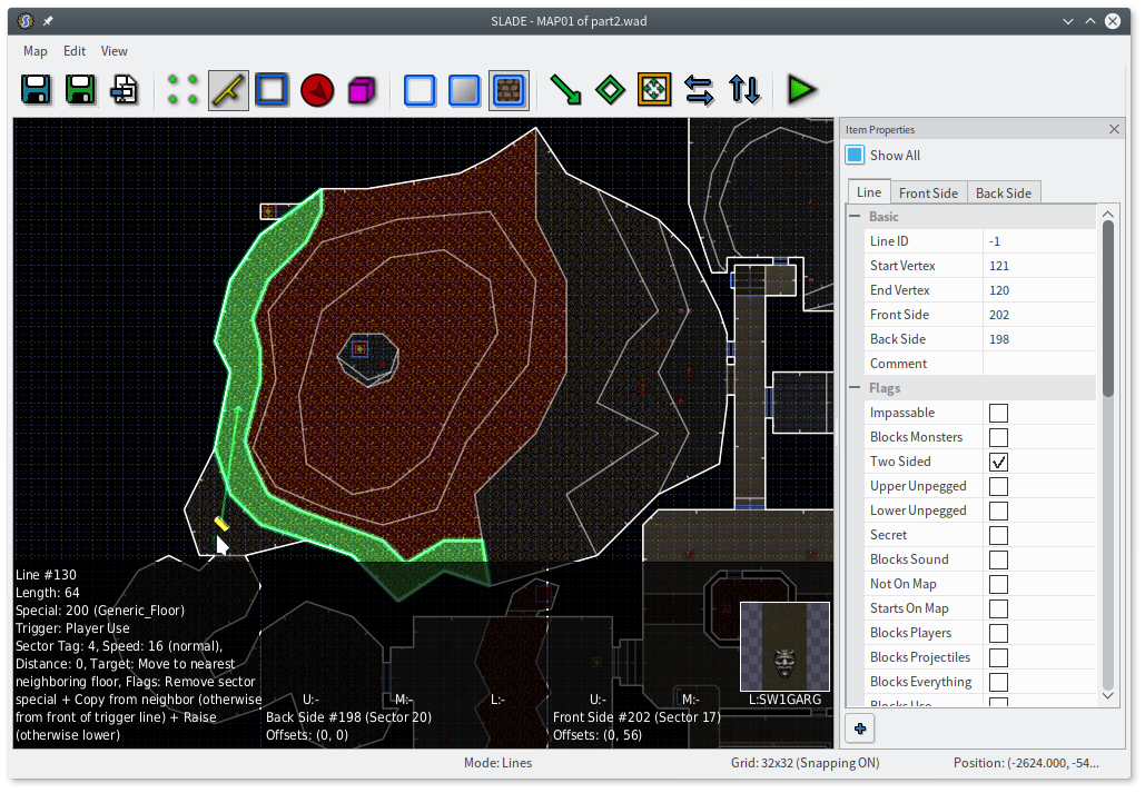
So I think I’m going to put an alcove in that nook. I want to have a switch, too, for affecting this volcano in some way. Otherwise there’s no point to going there!
Switches are a great thing. They give the player something to do, and they give the feeling that the world reacts to the player’s actions. Switches that are visible but not yet accessible act as a goal, a reason for moving forwards. This switch will probably be for progression, but sometimes it’s nice to have switches that aren’t particularly important, just for a bit of contrast. Doom II is full of doors and lifts that use switch textures right on the side, or rooms that open up once you press a readily-accessible switch.
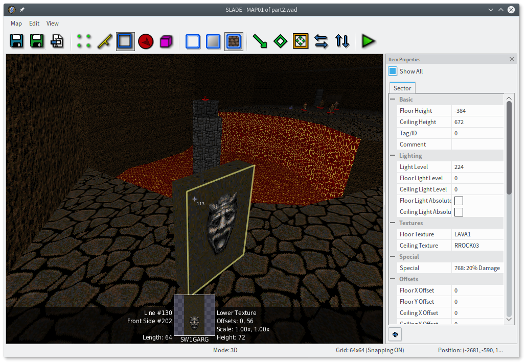
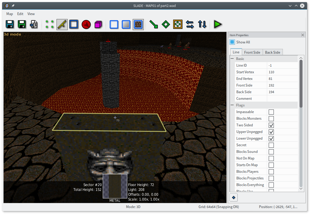
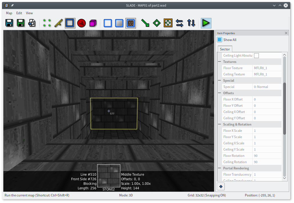
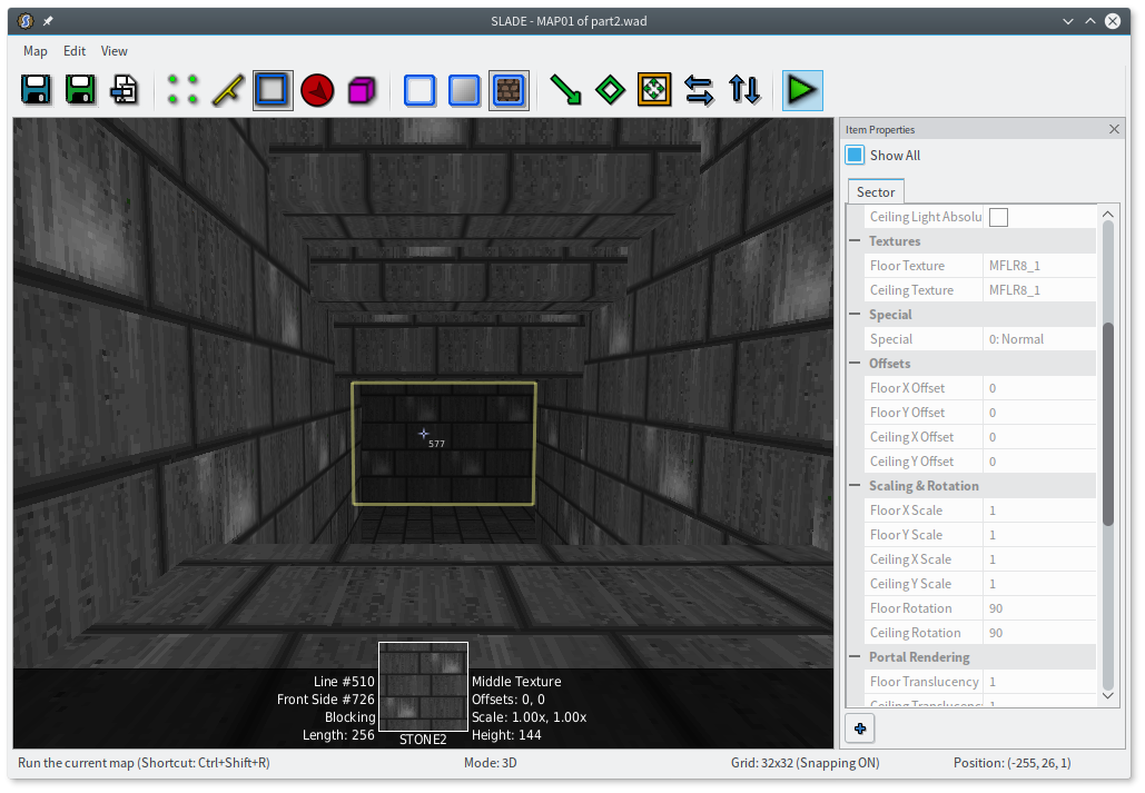
That’s SW1GARG, if you’re wondering. I’m mostly using it for its rough metal background, which seems to fit this room. I didn’t want the switch to be a full 128 units high, so I made it about 72 high instead, and played with the switch texture’s vertical offset to get it to a nice height. I used METAL, a texture with two columns of rivets, for the sides and top.
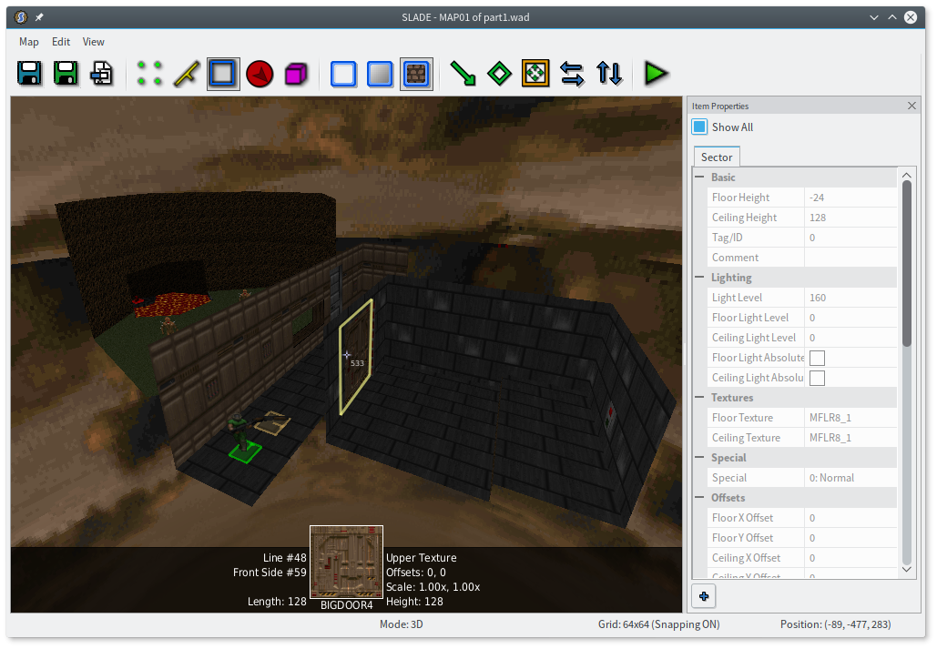
That switch is a little too orthogonal, I think, so I’m going to switch to sector mode, select it, and use Edit Objects (E) to rotate it 45°. That’ll give me a diagonal line 64 units long (the width of the switch texture), which would’ve been a huge pain to draw by hand.
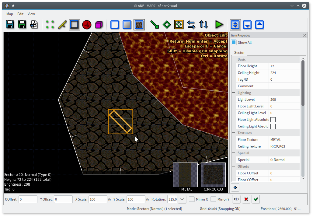
Oops, that looks a little funny, since floor and ceiling textures follow the map grid. The player isn’t likely to see it in play, but I’m going to fix it anyway, by setting the floor rotation to 45. Rotating the floor actually rotates the entire map grid around (0, 0), so the texture was still a bit misaligned for me, and I had to play with the offsets a bit to make it look right. By default, the offsets are changed with the numpad — in increments of 8 with numlock on, and increments of 1 with it off. I have this rebound to the arrow keys for 8, or with Shift held down for 1. Also I’d like SLADE to be able to do this particular operation automatically, which maybe it will sometime.
Anyway! I haven’t made this switch do anything yet, but first, let’s figure out how the player gets over here. It seems reasonable that they might come through some tech stuff, but that’s a long way to walk, so I’ll put a little more cave too. I don’t know what’s going here yet; I’m just drawing some shapes. You can see my instinct for rectangles again, but at least I sanded off the corners of that lower-right room.
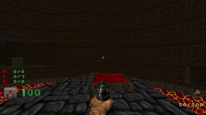
I’m pretty tired of that gray brick floor texture. I want to replace the hallway with tiles (FLOOR3_3) that match the walls, and I’ll continue them on into that first big room.
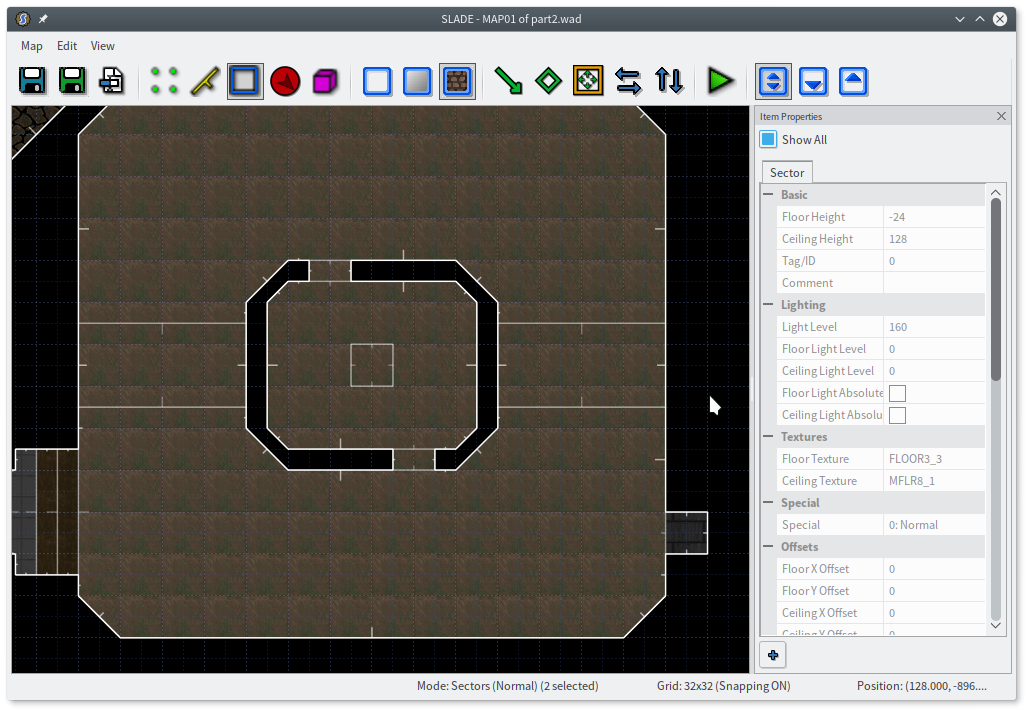
I don’t want both rooms to have that floor, though. I’m also a little tired of this tan wall. How about I make the other room STARGR2, the gray equivalent? Then I can use FLOOR0_6 for the floor. (Around this point you might benefit from changing the sort order in the texture dialog to “Usage Count”, which puts the textures you’ve used most frequently at the top of the list.)
Ah, but wait. One of Romero’s rules is that a change in floor texture means a change in floor height. I can get behind that. I need a change in floor height anyway, because I made my alcove a little higher than the starting floor. I’ll add a few steps between the two rooms, and throw in a big door as well. I’ll even make the door bronze on one side and gray on the other, to match the room you enter into and keep the door from blending in too much with the walls.
(You may notice I don’t ever say anything about ceilings. I’m half-convinced that the ceiling texture just doesn’t really matter. What ceiling does any area anywhere in Doom or Doom II have? Yeah, that’s what I thought. I believe in the Valve Rule: players don’t look up.)
I’ll also add the door on the other side, leading into the cave. The floor texture changes here, which means I need a change in floor height! I made the cave floor a little lower, so you step down out of the “building”. (Hint: you can draw lines to carve up an area however you want, then hop into sector mode and delete some of the pieces. You’ll be left with a void surrounded by one-sided walls. If you carve too much, you can always rejoin sectors with J.)
That’s all well and good, but what do I put in these empty boxes? Ah, that’s the hard part.
Filling rooms
This is the part where I start to feel really conspicuous, because it’s the part where I always get stuck. I can think up individual gimmicks, and I can roughly carve out some types of areas, sure. But the meat of a map is the series of spaces you move through, and I haven’t really wrapped my head around how to even approach designing such a space.
It’s a little awkward, then, that I find myself sitting here trying to give you advice on doing just that.
Well, let’s see. I want contrast. That’s pretty open-ended — anything might be contrast. What I really want are some building blocks that help to provide contrast. How do my favorite maps carve up spaces? Smaller structures in a larger space come to mind, with the extreme example being city maps. Also, raised walkways that you can’t reach initially.
Okay, that at least puts a basic idea in my head. I’m going to put a magma chamber in the middle of my room, and I’m going to put a walkway on either side of it to cut the room in half. The chamber will have doors on either side, but I’ll stick a monster in there so you can’t just barrel straight through. The walkway also gives me a place to stick some baddies.
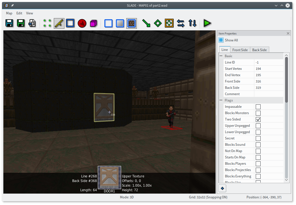
I’ll draw some of these areas, then delete the extra space in the middle, leaving solid walls behind. Then I just need some doors and texture work. Remember to unpeg walls with holes cut into them, like the walls above and below the doors, and lower unpeg the door tracks. I’m using DOOR1 here, which is a little squat door 72 units tall, but you can of course do whatever.
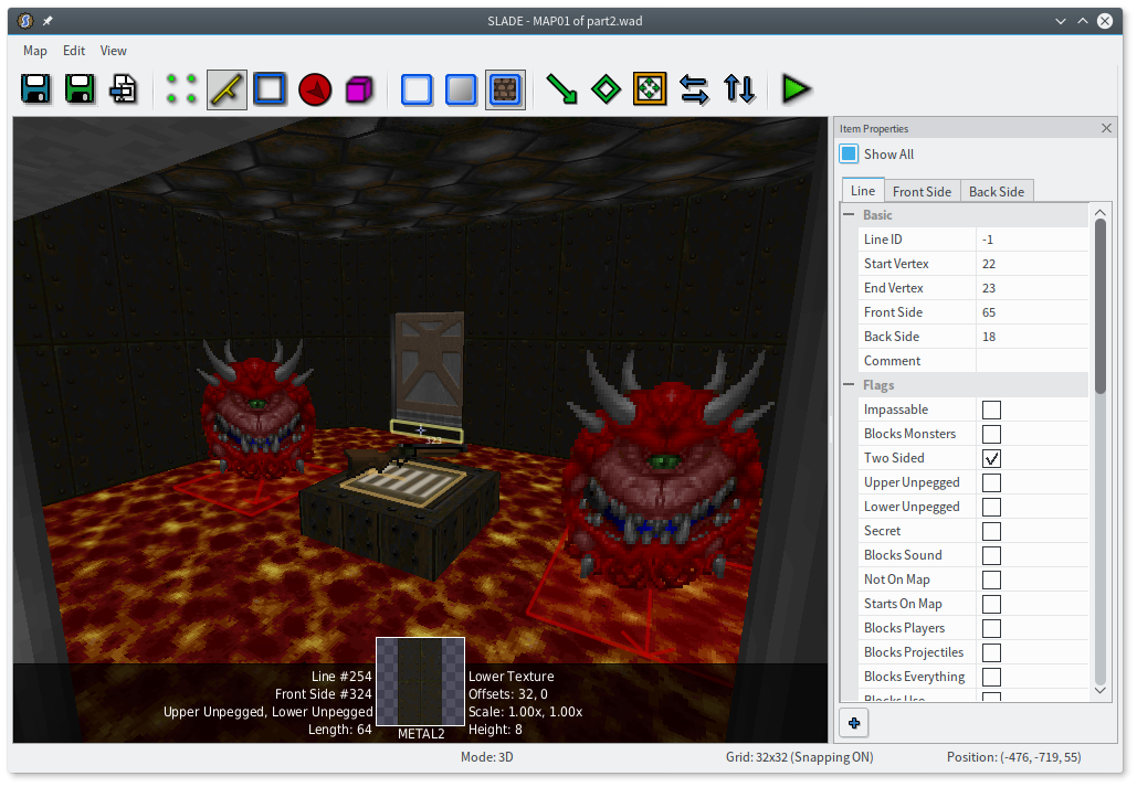
I’m also sticking a small platform with a super shotgun in the middle of the room. I’m using CEIL1_2, which despite the name, is pretty commonly used as a floor texture for a raised square platform with an item on it. The walls are SUPPORT3, another very common go-to for raised metal platforms (like most teleporter pads).
When all is said and done…
You may notice that I’m using that same trick from last time to make the lava brighter than the room itself. I did it with the raised platform, too, though not as intensely.
Lighting is really important for adding atmosphere to Doom. Compare that opening shot of Doom II with the same thing in fullbright:
Wow! That looks like some hot garbage.
You can’t just rely on the engine to do it for you, either, because the engine… doesn’t. There is no casting of shadows in Doom, whatsoever. No dynamic lighting, no light sources at all. (This isn’t true in GZDoom, which actually makes several stock Doom objects cast their own light, but the effect is fairly minor so as to not ruin the deliberate lighting of Doom maps.) The only lighting you get is the light level of sectors. Even the light level of a wall is just the light level of the sector it faces.
If you want to have a large outdoor area with some buildings casting shadows, you have to actually draw the shadows as separate sectors on the ground and make them darker. Even ZDoom’s fanciest lighting tricks can only give you slightly better tools for doing manual lighting, like separate floor and ceiling lighting. (In vanilla Doom, you might fake the lava trick by drawing a very thin outer lava sector that’s dark, so the walls are also dark, and then just making the inner area bright. The ceiling would also be bright, but oh well!) If you want a smooth lighting transition, well, you just have to draw a lot of thin sectors and give them all slightly different light levels.
I don’t have a lot else to say about lighting. Like everything else design-related, it’s just something you have to learn, and I’m still doing that. Look at maps you like, play around, see what works and what doesn’t. When in doubt, add contrast.
Sky hack
Abrupt transition! The entrance of this map doesn’t make a lot of sense as I have it right now. The player starts in the middle of a hallway with monsters facing their back and most stuff in front of them. Doom’s spawn points often don’t make any sense, but this is particularly silly.
Well, that’s easy enough. I can just stick the player at the north end of the hallway, facing downwards.
Or… I could do something a little more interesting. I do like starting areas that give the impression I actually got here somehow. All that narrative stuff, remember. A dead-end hallway is not too great at establishing that feeling. Lots of Doom II levels just stick an unopenable DOOR2 behind you (which is weird since you don’t go out through that door at the end of any levels), but I can do better. Plus I need an excuse to show you the sky hack.
This is a volcano, so I assume it has a side somewhere out there. I’ll say you climbed up the side and are facing the entrance of this weird volcano base. I guess I’ll start by drawing a squiggly area and sticking some textures on it. Then I’ll put a little building in one corner.
Hmm. This looks clumsy. Having all the walls of a room be the same height is certainly reasonable, but this is outside, and is meant to be a rocky slope besides. What can I do about this?
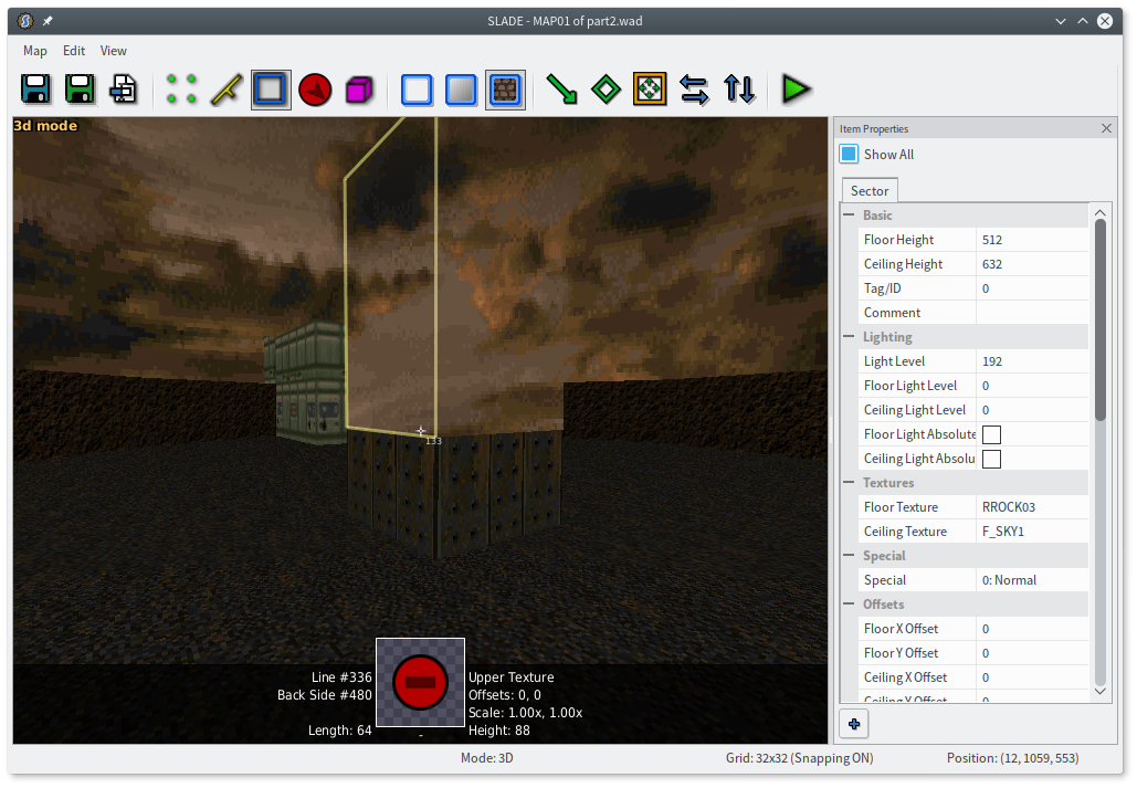
Enter the sky hack, arguably the Doom engine’s only deliberate special effect. The sky hack is that when two neighboring sectors both have F_SKY1 ceilings, the upper wall between them isn’t drawn.
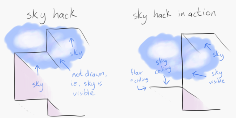
This is kind of weird, so let me just do it and show you what happens. I’m going to draw a border of two sectors around this outside area. Both rings will have a floor height 64 units higher than the area’s floor. The outer ring’s ceiling will touch the floor (like a closed door), and the inner ring will have the same ceiling height as the area itself.
The last screenshot is exactly the same geometry, but with a different ceiling so you can see what the sky hack actually does. Those “missing” textures are the upper parts of the lines between the two rings, where the ceiling height changes. When both rings use the sky texture, the sky hack kicks in, and Doom doesn’t even try to draw those upper parts. It just lets the sky show through. Using this, we can create the illusion of a tall building surrounded by lower walls.
It’s not strictly necessary to even have two rings, but there are two advantages. One, if the player happens to catch a glance over the top of the shorter wall, they’ll see the floor of the inner ring, rather than an abrupt cut to sky. Two, it lets me extend the wall of the building back behind the wall of the “courtyard”, so it looks like it has some depth.
You may notice I just made the far outer wall a square, because it doesn’t actually matter — it’ll never appear to the player. I also marked those lines “Not On Map”, so they’ll never appear on the automap either.
The sky hack has plenty of limitations, of course. If you need multiple buildings made of one-sided lines (because, say, they have doors in them), they’ll all generally have to be the same height: the true height of the outdoor area. If you want a building shorter than the outer walls, you’re gonna have a bad time. Remember, the sky hack doesn’t actually make a wall “invisible”, it just draws the sky instead. So if you put a sector with a low sky inside a sector with a higher one… well, that doesn’t work out so well.
You might also think it would be nice to show the sides of the volcano behind the building, but I can’t do that, for the same reason — you can’t make them visible “above” the building, because you’re not actually seeing above the building, you’re seeing the sky-textured ceiling in front of it.
This will do for now, though. I’ll move the player start to the outdoor area, and we are good to go. Er, almost. I made the outdoor area much higher than the indoor area, to flimsily simulate being on the outside of the volcano, so we need a way down. I’m going to make a lift.
It’s pretty typical to use STEP1 or STEP2 as the floor of a lift, so the player knows what it is. Similarly, the side of a lift (especially one you can “use” to lower) is often PLAT1, though anything obviously different from its surroundings works. I also need to make that left wall upper unpegged, since it’s the upper part of a wall with a hole (far below!) punched in it, surrounded by one-sided walls.
You can make lifts that lower when you step on them, but I find that kind of jarring. Instead, I want to have a switch that lowers this lift. I have a couple one-sided walls available, so I can carve a little hole in one and make a recessed switch.
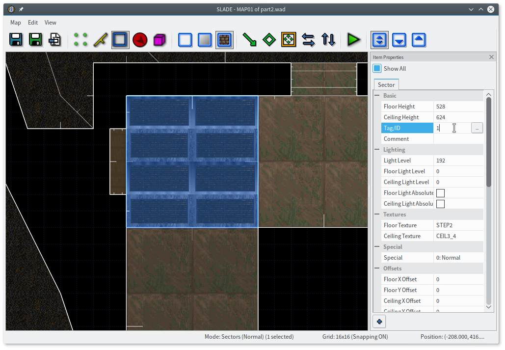
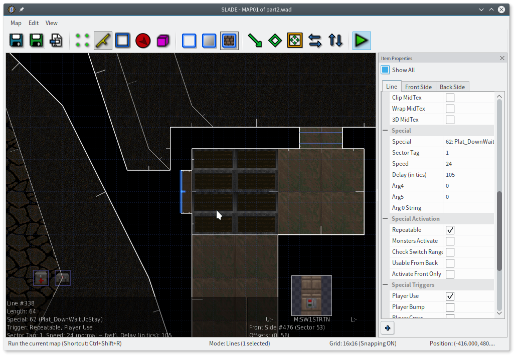
To hook this up, we finally need to use a sector tag. Just give the lift sector a tag of 1, and then be sure to use that tag when wiring the switch. (You can use the “New Tag” button in the properties dialog, or the “…” button in the prop panel, to get a new tag you haven’t used before.)
I’m using Plat_DownWaitUpStay, which is the generic Doom-style lift. (The Doom delay is 105 tics, or three seconds. I would love if SLADE told you this.) I’ll use the same special directly on the south side of the lift itself, so you can summon it down again. You can use either 0 or 1 for the sector tag here; just like doors, a sector tag of 0 means the sector on the other side of the line.
Now I can play the level and ride down my li—
Whoops! That’s the hall of mirrors effect, which you get when you forget a texture. I never gave this dividing line a lower texture, and SLADE didn’t warn me, because in the map’s initial state that part of the wall isn’t visible. (I would like SLADE to be cleverer about this, too!) I can fix this in 3D mode if I want, by temporarily moving the lift down a bit. Lower unpegging keeps the texture aligned with the other walls — the rest of the building is effectively a hole “punched” in the lift shaft. Now I have a lift!
Monsters
Let’s recap. I have several distinct areas (okay, two) with monster encounters in them, and this map doesn’t actually have any ammo. That might be nice to consider, but to know how much ammo to sprinkle around, we need to know a bit more about Doom’s monsters, and how much ammo it takes to kill them. Or you could just play the map and put more ammo in places where we run out, but this way has more numbers, and I do like numbers.
Doom II has nine weapons: fist (and berserk fist), chainsaw, pistol, shotgun, super shotgun, chaingun, rocket launcher, plasma gun, and BFG 9000. An interesting quirk of Doom’s loadout is that damage is randomized — every shot of every weapon has its damage multiplied by a random factor, which varies from 1d3 to 1d10. A more interesting quirk is that the shotguns actually fire multiple pellets, and each pellet has its damage randomized. So the super shotgun, with its impressive 20 pellets per shot, actually has the most consistent damage output (thanks to the law of large numbers).
With that as the baseline, I can very roughly describe all the weapons in terms of the super shotgun. All of the following do roughly the same amount of damage (200) on average, to within 10%, assuming you actually score a direct hit:
- 18 punches
- 2 berserk punches
- 18 chainsaw hits
- 20 pistol shots
- 3 shotgun shots
- 1 super shotgun blast
- 20 chaingun shots
- 1 rocket
- 9 plasma shots
- ½ BFG ball
- 2 BFG tracers (one shot fires 40 tracers)
You can draw a very rough comparison of ammo this way as well: 20 bullets ≈ 2 shells ≈ 1 rocket ≈ 10 cells.
Given that, here is the number of point blank super shotgun blasts it should take to kill each monster.
- 1 — zombie guy (20 HP), barrel (20 HP), shotgun guy (30 HP), ss nazi (50 HP), imp (60 HP), chaingun guy (70 HP), lost soul (100 HP), demon/spectre (150 HP)
- 2 — revenant (300 HP), cacodemon (400 HP), pain elemental (400 HP)
- 3 — hell knight (500 HP), arachnotron (500 HP), mancubus (600 HP)
- 4 — arch-vile (700 HP)
- 5 — baron of hell (1000 HP)
- 15 — spider mastermind (3000 HP)
- 20 — cyberdemon (4000 HP)
Monsters that have an exact multiple of 200 HP will need an extra shot about half the time. Since one shot does 200 damage on average. Which means it’s the middle. So half the time you’ll do less than that. Right. Plus you’re probably not going to hit with every single pellet every single time.
Using this, I can have a rough estimate of how much ammo I’ll need at bare minimum. A box of shells gives 20 shells, which should be able to take out either 10 or 20 minor enemies, depending on whether the player uses the shotgun or super shotgun. Shotgun guys drop a shotgun, which gives 8 shells, which can help kill a few more baddies. And so on. That all needs plenty of padding, of course, since running out of ammo in Doom is the worst possible thing.
Incidentally, that makes map sets kind of hard to balance! Almost any map will leave the player with plenty of ammo at the end, meaning they still have that ammo when they start the next level. But it’s considered polite to make maps playable from a “pistol start” — i.e., with only a pistol and 50 bullets, like you just started the game. How do you make both options equally viable and (more or less) equally challenging? I have no idea.
For now, I’m just going to stick a box of shells in the room with the magma chamber, and sprinkle a few shells (4 each) around the other areas. I’ll put a shotgun guy in the spawn area, too, facing away from the player, as a way to get a shotgun.
Encounters
What about health? I can’t ballpark that as easily, since the amount of damage the player takes is entirely dependent on their skill level. Or, well, not entirely. It also depends on how the encounters are designed.
Doom’s combat is very very much about movement. Taking advantage of the terrain is incredibly important, and many monsters outright force you to do it: the revenant has homing rockets, the arch-vile has a line-of-sight attack, the mancubus fires a wide spread.
A curious feature of Doom’s combat is that most monsters are just not particularly difficult to kill without taking much damage, especially for experienced players. If you want an especially challenging encounter, you have to resort to some mild trickery. Ambushing the player is a classic move, though you’ll have to be clever nowadays, since everyone has seen monsters appear when they grab a key. Opening monster closets back the way the player came is certainly surprising, and can give the feel that somehow reinforcements appeared from nowhere. You can also force the player to fight in very close quarters, have monsters appear on both sides of them, or cut off their escape route. A few imps are much more dangerous in a cramped, dark room than in an open arena.
Spawning monsters is also an option. Typically that’s done by having a big closed-off room somewhere, filling it with monsters, and putting some “monster cross” lines that teleport to various places. Add a teeny tiny channel to connect that room to the rest of the level, so the monsters can hear the player. When they do, they’ll wake up, try to move towards the player, and bumble over the teleport lines. (You can also literally spawn monsters with ZDoom’s scripting, but I don’t like to do that, since it means the “monsters remaining” count in the alt HUD is inaccurate.)
What? I never explained sound? There’s not much to it, really; if a monster hears the player use a weapon, it’ll wake up and start looking for the player. Sound travels between sectors freely, but does not pass through zero-height sectors like closed doors, which is why firing a shot on most maps doesn’t immediately wake up the whole world. That’s also why there are some teeny tunnels sprinkled throughout the stock maps — there’s one in MAP01 of Doom II, to let sound reach the secret room with the imps in it, so they’ll hear you and open the door to come out. You can fine-tune how sound spreads by marking lines as “blocks sound”, though keep in mind sound only stops after passing two such lines.
Okay, so, how much health? It’s up to you! Maybe there’s not even such a thing as too much health; the player can only take so many hits from the stronger monsters anyway, and extra medikits don’t help once you’re dead. Doom II’s MAP21: Nirvana starts you out in a room with 20 medikits, every one that exists in the level. And that’s a map that consists mainly of imps and shotgun guys.
Feel free to be liberal with health and armor bonuses, especially. Everyone loves picking up a string of 20 items.
Back to the map progression
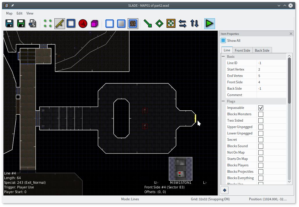
Right, okay. So you go down the lift and enter this hallway, with a red door on the left and a volcano area on the right. At the end of the hallway is another room… and I’m gonna stick a door there so it’s not just exposed for all to see. You go in that room, you go through the magma chamber, you fight some dudes.
Hold up; this is sounding a bit too linear.
There are a couple different ways to think about linearity. Running straight through this room is obviously linear — at any given time, there’s only one thing you can do. We speak of games like Metroid as being “non-linear”, but every Metroid game still intends for you to acquire each new powerup in a specific order. In that case, the progression is still linear, but there are often multiple paths you can choose from — some will help you progress, some will be blocked off until you’ve progressed further, some will be optional areas, and some will be deliberate secrets. That’s the kind of nonlinearity Doom tends to have.
You can also take it a step further and have true nonlinearity. like MAP19: The Citadel. That map has three bars guarding the exit, each bar locked with a different key. All three keys are in the map, but you only need two of them to squeeze through the bars and reach the exit. So you can take multiple different routes through the map, skipping different areas depending on what you’re going for. That kind of design is much more difficult, of course, and I don’t think there’s another similar example in any canonical Doom level.
To make my map a little less linear, I’m going to add a little side room to the magma chamber, and put a switch there that opens the next door. I’ll also add a little pointless side room that has some supplies, because Doom is full of those, and I like them. (Seriously, you won’t believe how much of Doom and Doom II are completely optional. I’ve heard that this kind of thing isn’t very common in modern fan maps, which is sad. So please, put some little neat side areas in your map! It really helps with that whole narrative thing — there’s stuff in this world that doesn’t exist just to hurry you along to the exit.)
I’m just slopping this together and don’t claim it’s great, but I’ve tried to put a few good ideas in here. The side room, small as it is, still has two ways to go — the obvious one just leads you to the side of that platform, whereas the back way leads to some stairs. You can see the switch from the main room, so you know where you’re going. The computers blocking the middle of the room are at least moderately interesting.
I got that light pattern by using TLITE6_4 and setting the floor scale to 4 in both directions. You can do some pretty cool things with just the stock textures, by using bits and pieces of them in creative ways, and being able to scale them is super useful.
Note that I used Door_Open, which opens a door permanently. Probably what you want if you’re using a remote switch to open it.
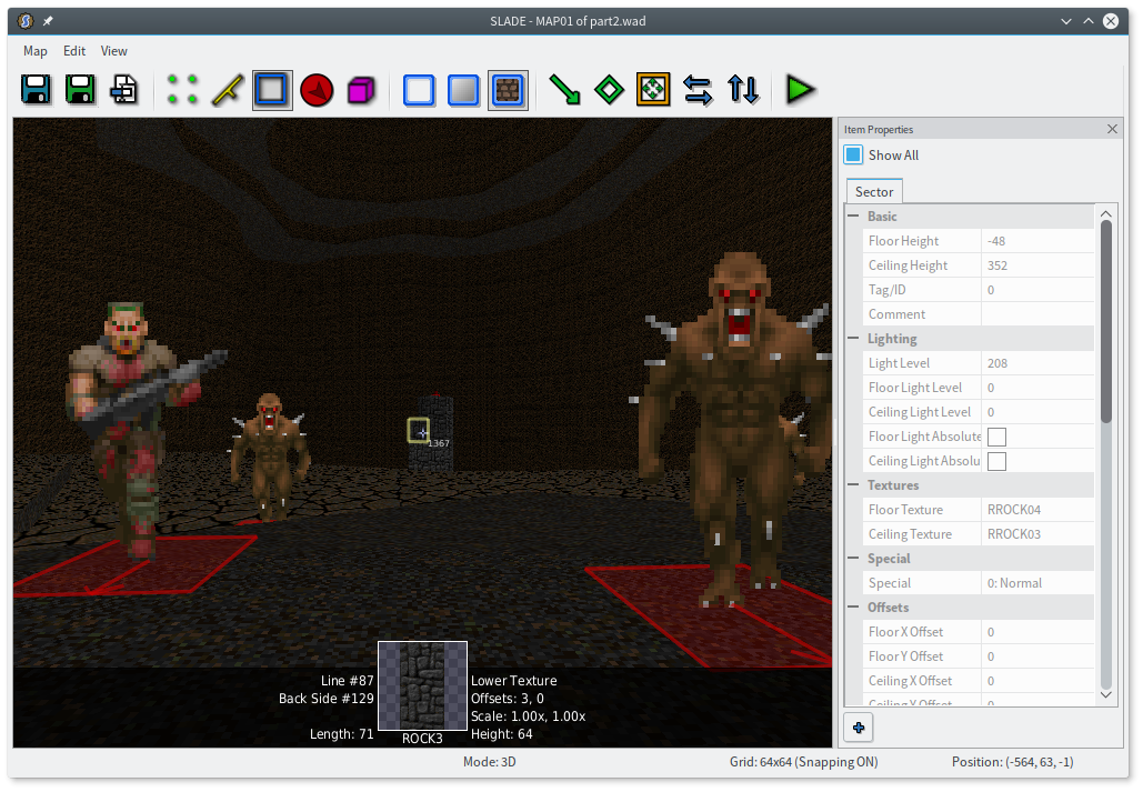
Because the side room connects back to the main room, sound can pass freely into it. If I fired a shot in the main room like this, everything inside would wake up immediately! So I flagged all of those imps as “Ambush”, which means that they won’t start chasing the player just because they hear weapons fire. They are not deaf. The difference is subtle: if an ambush monster hears you, it’ll attack as soon as it can see you, even if it’s not facing you. A monster that hasn’t heard you at all won’t know you’re there until you step in front of it.
Whew! 7000 words in and we’ve made a whole three rooms. I’d better hurry this up.
Moving right along
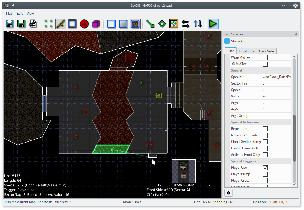
Now I have another room to make interesting. Fuck it, I’m putting a lava chasm. I’ll have a switch you need to press, and a hell knight in the way. Imps on the other side will make life a little more uncomfortable.
What can a switch do to get you over a lava pool, you ask? Well, let me tell you about this nifty special called Floor_RaiseByValueTxTy. It raises a floor, and changes that floor’s texture and type (hence, TxTy) to match the floor it becomes level with. So the lava texture will change to a regular floor texture, and the 20% damage will disappear. Magic. (You can quickly tell how far it needs to rise by looking at a wall of the pit in 3D mode.) Remember, the raising floor will need some lower textures!
I’m also going to put a little teleporter alcove in the north end of the pit. There are two schools of thought here. One is that if you fall in a pit that’s obviously full of lava, that’s your own dumb fault. The other is that inescapable pits are just plain bad design, and every pit should have a way out. I’m going to go with the latter here, just so I can show you how teleporters work.
- Make a 64×64 square, and give it one of the
GATE*floor textures. - Make sure all its lines are facing outwards.
- Put a “Teleport Destination” thing where you want the teleporter to lead. Keep in mind that the player will be facing the same way the destination thing points.
- Give it a TID, a “thing id”, which is like a sector tag but for things. Sector tags and TIDs are different, so you can have both a sector tag of 1 and a TID of 1 and they’ll never interfere with each other.
- Give all four sides of the teleporter the
Teleportspecial, and make the first arg the TID you used for your teleporter destination. Make the lines “Repeatable” and “Player Cross”, of course.
And that’s it! Easy peasy.
If you want to be super fancy, you can make the pad flicker. Set its light level to something higher than the surrounding area, and give it the sector special “Light Strobe 1 Sec”. (Documentation for the light-related sector types is kind of atrocious, alas. The Doom wiki is the best I’ve found, though keep in mind ZDoom’s sector specials are 64 plus those numbers.) Now it will normally appear as dim as the surrounding sector, but every second it’ll flicker to its assigned light level. You can even prevent this from making the ceiling flicker, by setting the ceiling light level and checking “Ceiling Light Absolute” to make it independent of the sector lighting.
Here’s what I have now. (The player start is just there so I could test in ZDoom quickly.)

Got it? Rad.
Finally, back to the volcano
I have a confession to make: I knew all along how you’d get the red key. I probably just gave it away, too: it’s a combination of raising a platform and making a teleporter.
I’m carving out room for a big ol’ ledge around the outside of my volcano, which will connect that larger outdoor area to a small teleporter alcove. Then I’ll link that teleporter to a teleporter on the red key spire, and vice versa, so you can teleport both ways. It’s no different; you just create two teleporters that happen to send you to the other. The teleport doesn’t trigger if you cross the line from the back, so the player can step off the teleporter with no problems.
Finally I’ll wire up that switch I made back in the beginning. Unfortunately, my volcano is really deep, and I need to raise it 320 units. SLADE currently won’t let you give arguments greater than 255, because it’s illegal in Hexen-format maps… even though it’s fine in UDMF maps. Oops.
Lucky for me, this is ZDoom, where there are at least two ways to do anything! So I’m going to use Generic_Floor instead, which will let me say the floor should raise to meet the next-highest neighboring floor. In my map, that’s the outdoor area you start in. So my target is 3, and my flags are 1 (copy texture, set type to 0) + 4 (copy from neighboring sector) + 8 (raise) = 15.
As you can see from the overlay there, I already made SLADE aware of the arguments and will be pushing that shortly. I am super on the ball.
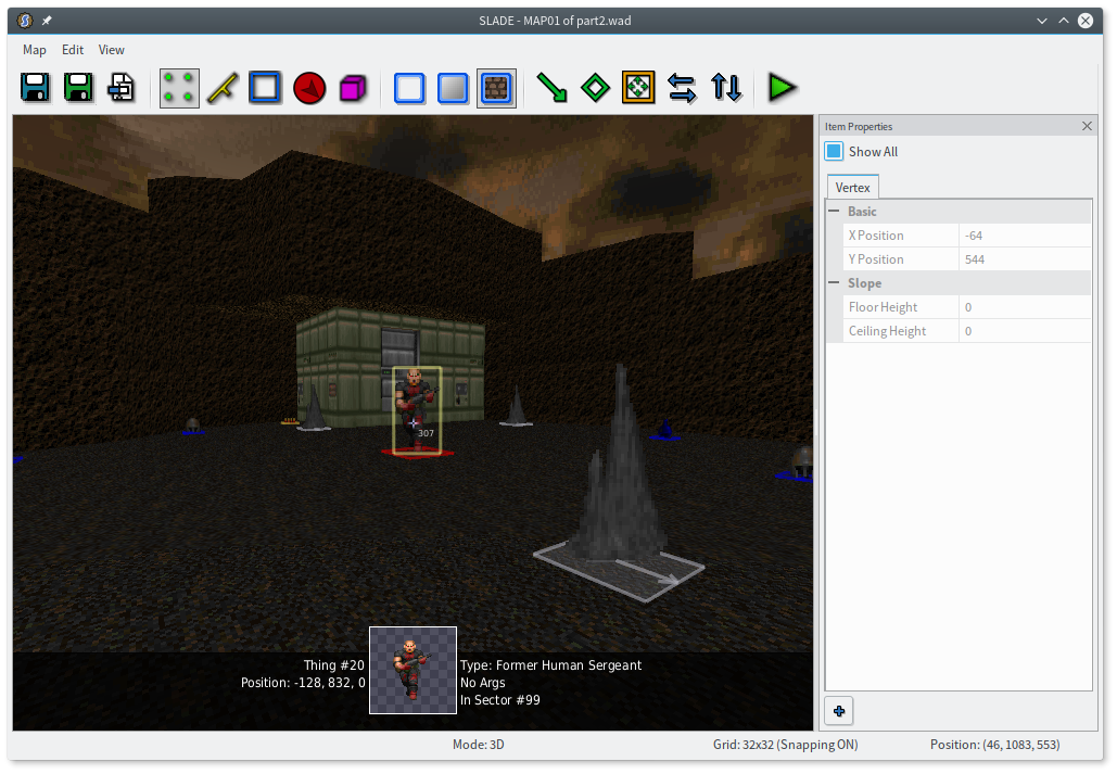
With that, the map is completable again! I feel kinda bad that the exit area didn’t get touched yet, though, so I’m going to dig it down into a weird little tomb area and stick some… I dunno… revenants. They’re skeletons. Seems fitting.
Yep. Okay. Beautiful.
Finishing touches
Lighting
Good lighting is hard, and I don’t even know where I’d start to make it better in this map. I varied it a little as I went, but it could be much better.
One thing I did do was make a slight change to the red door. Remember its fifth argument, “Light Tag”? You can give that a sector tag, and when the door opens or closes, the tagged sectors will fade between the door’s darkest neighbor (when closed) and brightest neighbor (when open). I tagged the sectors at the beginning of the tomb, so when the door opens, those sectors lighten gradually, as though the light were trickling in. It’s a pretty neat effect, even when subtle.
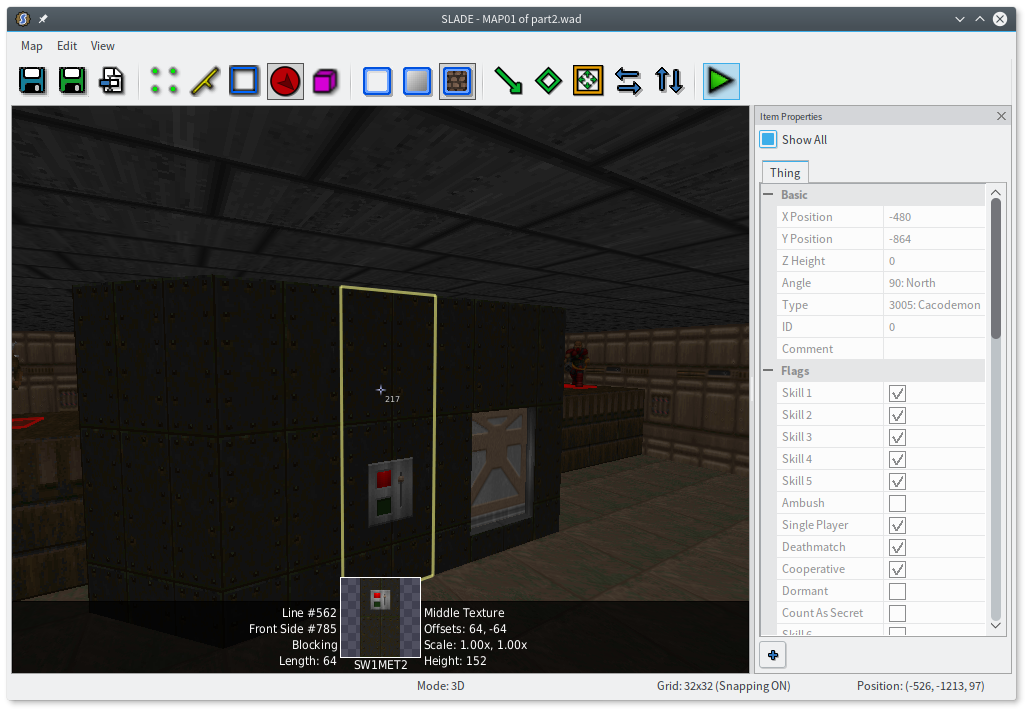
Hmm. I was saving the really good ZDoom trickery for the next part, but I’ll whet your appetite with one lighting thing that you simply cannot do in vanilla Doom. Remember this little cave with the teleporter?
The lava is very bright, but the walls are extremely dark. That goes for other places that have lava as well, but it’s particularly striking here — surely, the light from the lava should affect the walls.
It turns out there’s actually something we can do about this.
Draw a little sector out in the void, not connected to anything. It’s a good idea to keep it close to the cave, and mark its walls “Not On Map”. This is a control sector. It’s a junk throwaway sector, not really a part of the world. Certain specials can copy properties from control sectors to other sectors.
I’m going to make this sector the same height as the cave (ctrlshiftC and ctrlshiftV to copy/paste properties are very useful here), but its ceiling will be somewhat lower than the actual cave’s ceiling. You can even do this in 3D mode, since you can walk through walls and fly around all you want.
The lava’s light level is 192; the cave’s light level is 128. I’ll make my sector’s light level 160, right in the middle. I also need to give the cave itself a sector tag.
Now the magic happens! Pick one of the walls of the control sector, and give it the ExtraFloor_LightOnly special (under “Renderer”). Give it the sector tag of the cave, and don’t worry about the “type”. And that’s it. You don’t need any triggers, because this is an “init” special, meaning it takes effect when the map loads and is ignored after that.
The effect is subtle, so I hope you can see it, but the tops of the walls are darker than the bottoms! The 160 light in the control sector was transferred to the walls of the cave, but only between the floor and ceiling of the control sector.
You can use this multiple times to give more than one “layer” of lighting to the walls of a sector, so if you were really determined, you could make a rough gradient here. All the properties of the control sector’s lighting are transferred, so you can use a sector special like “Light Flicker”, and have flickering light on only part of a wall. You can transfer colored or sloped lighting, too. Ooh, but I’m getting ahead of myself.
Textures
Let me show you the tomb in 3D mode, before and after I did some manual texture alignment.
Yes, manual. Auto-align is great, but it only gets you so far. In particular, it only does horizontal alignment (for now!), so you’re on your own with stairs. Aligning a wall with a floor or ceiling isn’t necessarily even possible, automated or not. But it looks so much better with the textures aligned, right?
Another texturing quandary: what do you do when you have an obviously tiling texture like METAL2 on diagonal walls, or other places that aren’t clear multiples of the texture width? You can fiddle with the geometry until it is a multiple, of course, and you can also use non-tiling textures to fill in the gaps. But there’s also a neat trick (which I picked up from Antroid’s DTS-T videos, of all places) that I already snuck into this post. Did you catch this?
Look at the side of that alcove. That’s just our old friend STARTAN2. But the round parts tile every 64 units, and this wall is only 16 units long. Why isn’t it cut off?
I cut the wall in half! You’re actually seeing the left edge and right edge of a “round part”, mashed together in the middle. A lot of Doom’s gritty textures can be spliced together like this without leaving an obvious seam. The same trick can stretch METAL2 across a diagonal wall:
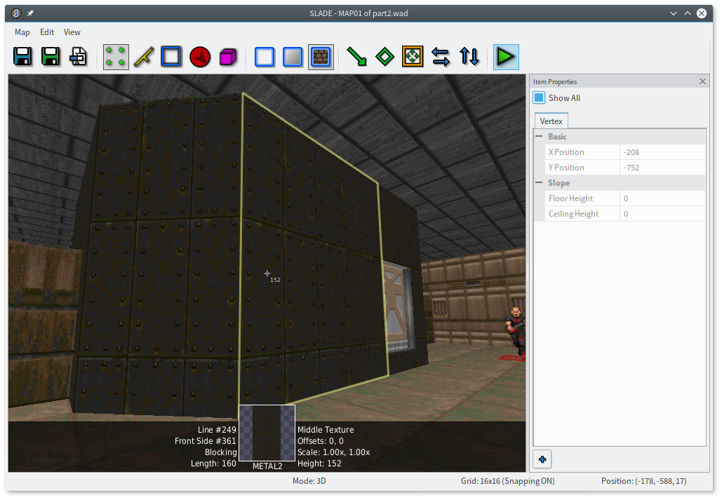
Here I cut the wall into three segments. If you look very closely, the gaps between the rivets are a little inconsistent, but the effect at a glance is still pretty nice. Of course, if you do this, you never want to use auto-align near those walls, and you’ll have to redo it if you change the geometry later. Probably best left for last.
Detailing
You can also use textures to break up the monotony of a long wall. Most of Doom’s textures have one or two variants that you can use for this. Take my lava chasm room, which has STARGR2 all the way around. I can make that more interesting just by plopping in a few vertices and changing parts of the wall to the sister texture STARGR1.

Check out the first hallway of Doom II’s MAP01, and you’ll find that every 64 units of the wall is a different texture.
You can also add “struts”, like I did around the switch alcove in the above screenshots. A long platform might want physical struts in the form of tiny square “voids” with a support texture. Just something to break up the monotony. Remember: contrast!
I’m under the impression that detailing is a teeny bit controversial in the Doom community at the moment, since a lot of mappers are kind of going overboard and making extremely detailed maps where every room needs five layers of trim and inset lights every three feet and all this weird nonsense. I, for one, don’t think you need all that much. I mentioned MAP21: Nirvana earlier; do you have any memories of it? Did it seem weird and complicated and confusing, or really give you any kind of feelings at all? Maybe you should check out its automap and see just how complex and detailed it really is. I’m pretty sure my map already has more lines than half of Doom II’s maps.
And of course, I stress yet again: any kind of detailing is a pain in the ass to change once you’ve done it.
More alcoves
Yeah, sure. That little bit of enclosed cave, for example, could stand to at least have a forking bit somewhere. And while I’m in there, I want to cut it up and vary the height and lighting a bit. Make it more, you know, cavey.
One thing I try to do is lightly nudge the player towards the optional areas first. Otherwise, they may just continue down the “progression” path and never remember to come back and check out the alternatives. There are a couple biases you can try to take advantage of here — most people will be drawn to the closest option first, or in the case of a fork, will tend towards the right. So I’ll make a bit more room and put an alcove on the right side, with some goodies in it.
I don’t know if you’ve noticed, but I try to avoid having any perfectly horizontal or vertical walls in caves. The reason is that the vanilla Doom engine has a feature called fake contrast, which makes horizontal walls appear slightly darker and vertical walls appear slightly brighter. It works pretty well to accentuate sharp right angles, but with cave architecture it can make walls appear brighter for seemingly no reason.

The left screenshot has a slanted wall; the right screenshot is the same wall shifted slightly to be vertical. ZDoom lets you control this as a user setting, a map setting, or even per-wall in UDMF, but I find it easier to just not draw orthogonal lines in caves. It forces me away from drawing boxy areas, anyway.
There’s one other place I have my eye on — those raised platforms dividing the magma chamber room. It’s a hallmark of Doom that you can reach almost any area you can see, even monster walkways. I think I’ll make them a lift that’s activated by a switch on the back of the magma chamber. Then I can put a few goodies on the platforms too, or maybe swap an imp for one of the former humans.
Secrets
I love secrets. A lot of what I love in Doom II is its really bizarre secrets. Even MAP01 has a secret involving a jump onto a seemingly irrelevant decoration.
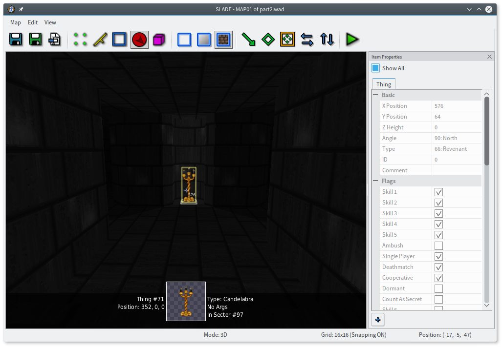
I’m not feeling quite that cruel right now, but I do want to put a secret atop one of those lifts. I’ll use a very old Doom trope and hint at it by using a different texture. Making it an actual secret is pretty easy: just pop open the sector properties and check the “Secret” box on the “Special” tab.
In that middle screenshot, you can see another possible texturing trick: a single wall can have two different textures by putting a zero-height sector on the other side of it. In this case it’s a door, of course, but it could just be a dummy sector like I used for the sky hack.
There’s one more thing I need to do here. Check out the automap. I changed my automap colors back to traditional Doom here so the problem is more obvious.
The automap shows walls in red, but shows doors (actually, any change in ceiling height) in yellow. That completely gives the secret away! Luckily there’s an easy fix for this: give the line the “Secret” flag, which will make it show on the automap as if it were a one-sided wall.
There are other places you might want to use this flag; for example, even though I have the outer edges of the starting area marked “Not On Map”, the next set of edges are drawn in yellow. Because, of course, the ceiling height changes there. I think that looks goofy, so I’m flagging them as “Secret” as well. I like to have a tidy automap, hiding evidence of rendering tricks. Just be careful not to go overboard and make the automap useless or misleading.
Note that the iddt cheat, which reveals the whole automap, also shows all the lines marked “Not On Map”, so it’s not an accurate picture of what the player will see normally. Development versions of ZDoom have a console command, am_cheat 4, that will reveal the full automap but leave hidden lines hidden.
Decorations
A super duper easy way to make spaces a little more interesting is by sprinkling around some stock Doom decorations. Add in a few lighting effects, and you’re off to the races, whatever that means.
Oho, it looks like I improved on the starting area without telling you. I wonder how I did that.
Designing for multiplayer
Doom has two multiplayer modes: co-op and deathmatch. They need to be approached somewhat differently.
Co-op
Co-op is easy to make work, at least: just make sure you drop in player starts for the other players, 2 through 4. (ZDoom supports up to 8 players, if you’d like to do so as well.) There are probably more considerations than this, but offhand I can think of four major wrinkles that co-op adds.
-
Only one player can pick up any given ammo, health, armor, or dropped weapon. Weapons and keys do remain on the map, and every player can pick them up. (A player who already has a weapon can’t keep grabbing it in co-op and get infinite ammo.) So giving the player a shotgun by way of a shotgun guy doesn’t work so well in co-op. I can fix this by putting an actual shotgun in the starting area. That will look redundant in single-player, so I can just remove the “Single Player” flag, and it’ll only appear in co-op and deathmatch.
-
Ammo is split among players. This seems fine, since there are still the same amount of monsters overall. But in co-op, a player who dies respawns from a pistol start without restarting the map, so it’s easy to completely run out of ammo halfway through the map. It’s up to you how much you want to compensate for this, since giving tons of ammo may make a team of good players ridiculously overpowered. (Maybe that’s why several Doom II levels just have a cyberdemon hanging out near the spawn point in co-op.) Health and armor have similar problems.
-
Some puzzles might be much easier in co-op. Say you have a timing puzzle, where you press a switch and have barely enough time to run over to a secret lift. In co-op, one player could just wait by the lift while another presses the switch, which makes the puzzle trivial. Doom tends not to have very deep puzzles and this is probably not a big deal, but it’s worth keeping in mind.
-
Because players might be in separate areas of the map at any given time, and in particular a player might respawn from the start point, you have to be careful not to permanently block off parts of the map or otherwise risk separating players.
If you want your map to be great for co-op, rather than just not-broken, you can go much further. You might use decorations that only appear in co-op to block off a path, creating a new puzzle that only exists in co-op and requires actual cooperation to solve. You might up the number of monsters considerably. (Of course, you can’t distinguish between 2 players and 8, so don’t go overboard.) You might even create separate start areas for each player and make them work together to meet up.
Deathmatch
Deathmatch is a little different to think about. There are deathmatch spawn points, too (and you should have at least 4), but they tend to be sprinkled all over the level. Otherwise, uh, the players would just keep shooting each other in a tight area.
That can pose something of a problem for your design, since players may start midway through a level without some switch having been pressed yet. Players do spawn holding all the keys, so locked doors aren’t a problem, but other kinds of doors might be. The switch in my magma chamber, for example, is the only way to open the door to the gray room — so if a player starts in that gray room, they won’t be able to go back. In my case, I think that’s okay, since they could just continue forwards through the level and ultimately loop around. If this were a dead end, I’d need to do something like make the door openable normally from the inside.
Many maps have every weapon sprinkled around in deathmatch, and that’s easy enough to do by just removing their “Single Player” and “Cooperative” flags.
Deathmatch is also a good reason not to have too many dead ends in the first place, since a player won’t have anywhere to run when cornered. On the other hand, this can be a feature — I’m going to put the BFG9000 in the exit tomb, so that going to get it is somewhat of a risk.
There’s also an -altdeath deathmatch mode, in which most pickups respawn, so you don’t have to worry too much about ammo.
Sanity checks
SLADE has a “Map Checks” panel, which can find basic errors. It may also find a couple false positives in cases like untextured walls behind a sky hack.
Run through your level and make sure it works! You can move the player start when fiddling with a particular contraption, but there’s no substitute for actually playing through your own map from start to finish. I think Romero said in the IGN interview that he only played his maps from the beginning, so he’d get to know very well how they’d feel to a player. Your mileage may vary.
If you don’t want to get bogged down in fighting, you can always play with -nomonsters, which is one of the run configurations in SLADE. This is one excellent reason not to rely too strongly on effects that trigger when monsters die. (I haven’t shown you how to do this. It’s deliberate.) Another excellent reason is that it’s very common to play deathmatch with -nomonsters.
Triple-check that your doors actually work. I have a bad habit of creating and texturing a bunch of doors in a row, then forgetting to actually make them usable. Also, make sure they’re repeatable!
To be continued
That’s all for now, but I am hard at work on part 3, in which we shall break all the rules. Or, a lot of the rules.
Here’s my version of this map. I even included a surprise, to encourage you to actually look at it in an editor. Send me yours, so I can add it to the list at the bottom of part 1!
