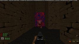
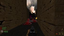
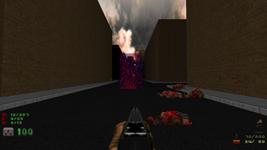
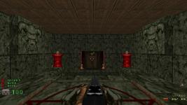
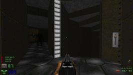
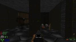
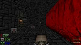
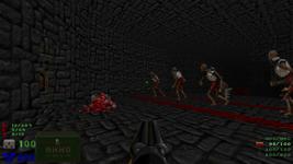
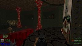
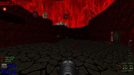
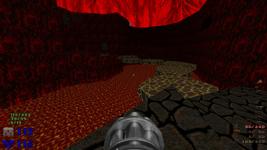
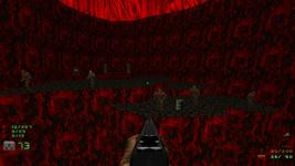
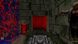
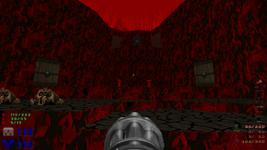
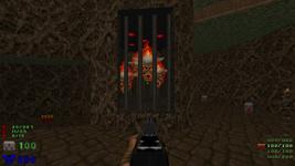
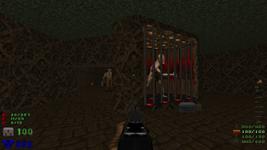
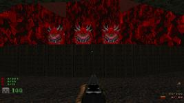
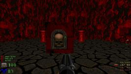
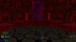
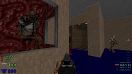
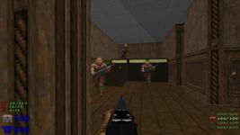
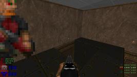
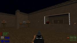
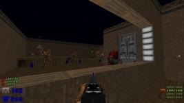
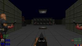
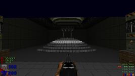
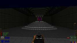
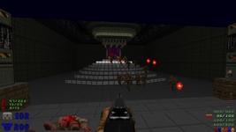
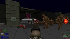
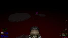
Yes, dear readers, I have a confession to make. Despite spending 29,000 words explaining why and how you should make a Doom level, I’ve yet to actually publish one myself.
I’ve been… orbiting? the ZDoom community for over a decade, but only really contributed in the form of minor wiki edits and occasional advice. I started a good few maps when I was a teenager, but I tended to get bogged down in making some complicated contraption work, and then get bored with the whole idea and lose interest.
More recently I’ve actually made a few maps that got as far as having an exit (!), but I never really finished them, and I haven’t published them anywhere.
So when the Doom Upstart Mapping Project 2 was announced, with the goal of just getting something done with the short time limit of a week, I figured I should give it a shot. And I did. I spent six straight days doing virtually nothing but working on this Doom map.
Results: pretty good! I’m pretty happy with it, and a few people have played it and enjoyed it. I put a lot of thought into it — or tried, anyway — and have a lot to say about it, so this is my developer commentary.
I’ve described the course through the map as I go, and I’ve tried to include some context for people whose knowledge of Doom is only “you shoot monsters”, so I hope it’s at least a little accessible. It’s really long, though. Again. Sorry. Not actually sorry.
Play it first
If you have any intention of ever playing my map, you should do that before reading further. I’m going to spoil the progression as well as most of the secrets, and some of this may not make any sense if you haven’t seen it. It does support difficulty levels, and in the style of Doom II, the map is practically barren on easy. Or if you don’t care about combat and just want to tour the map, you can play with no monsters, or do kill monsters in the console, or use freeze to freeze them all, or notarget to make them ignore you (unless you shoot them). Or whatever.
If you’re not sold, here are some rave reviews:
not today, satan
uhh…it works?
how the fuck did u make this map in a week […] DID U JUST LIKE NOT SLEEP ALL WEEK
Anyway, you will need ZDoom and Doom II. I covered getting those in the first Doom mapping post, and it still applies. Recent ZDooms will even automatically find Doom II, on any platform, if it was installed by Steam or GOG. Slick.
Per the project requirements, anything based on ZDoom 2.5+ should work, including Zandronum 2.1.2, if that’s of interest to you. If you don’t know what that is, don’t worry, just grab the latest ZDoom.
Also you will need my map, of course. You can just drag it onto ZDoom to play it. Feel free to poke at it in SLADE, too.
You can also play the full mapping project, which was finally released on April 22, 2016. My map is MAP32, Throughfare, which you are welcome to try finding in the overworld hub map. (It’s in an alcove all by itself.)
The city
I’m structuring this as though it were real developer commentary: I ran through the map in normal progression and took screenshots of interesting things as I went. Most of these were taken with notarget (which makes monsters ignore you) or freeze (which pauses all object AI). I tried playing normally, but I kept getting wrapped up in shooting things and forgetting to actually take screenshots. Oops.
I also know that I said rather a lot of this before, in the design part of the Doom series, but oh well I’m saying it again.
One thing John Romero said in his IGN interview/playthrough really stuck out to me: he always tries to design the opening shot so that the player has something interesting to look at.
I realized, over the course of building this map, that that’s not enough. The “opening shot” of every part of the map should give the player something interesting to look at. I’ve compared level design to composition in visual arts before, and that’s a large part of (my limited understanding of) composition: arranging your work to guide the viewer’s eye through the important parts.
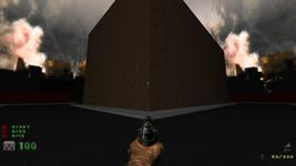
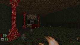
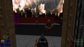
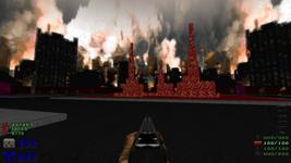
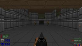
You could argue that I failed spectacularly with this opening shot, and you might be right. I took inspiration from Sandy Petersen here, rather than Romero. Sandy designed more than half of Doom II, and his maps are generally chaotic and sloppy and gimmicky. They’re also my favorites.
This, then, is something of a tribute to the Doom II map that’s most memorable to me: MAP13, Downtown. It’s still nowhere near as good an opening shot as Downtown had; instead it serves as a reminder of that map.
The very first thing I did was look for background music, in the hopes that it would conjure some inspiration. Alas, that didn’t work. I did eventually find music I liked, though: “Back in 1982” by warlord, if you want to give it an independent listen.
It’s not really a city map, though. I get the impression that a lot of the Doom community doesn’t much like city (or “sandbox”) maps, and whether that’s correct or not, this is my response to them.
Doom is fundamentally a creepy game. It’s still creepy to me now. It’s not merely that there are monsters; it’s that those monsters might be around the corner at any time, waiting for you. Doom’s atmosphere is unnerving more than anything else. That’s the point of all the key traps and monster closets, I think; not to surprise the player by popping monsters out, but to train the player to never think anywhere is safe.
I distinctly remember having that feeling as a kid trying to play Doom II. The further you go into these dozens of levels, the fewer safe places there are. You can clear out a level, sure, but then there’s nothing to do except go press the exit switch. There will be no reprieve, only another wave of things coming to get you.
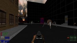
I’d love to pass that unnerving feeling on, so here I tried to do it in a different way. The city is completely empty. None of the buildings even have doors. If you have the monster count on, you can see that there are plenty, so where are they? When will they come after you?
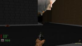
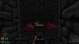
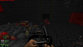
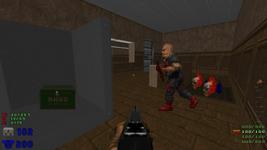
Something definitely went down here.
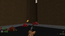
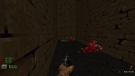
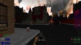
I had to improve this alley twice. The first time, it was using the same texture as the outside of the building, but the way the engine handled the light made it almost invisible. After I fixed that, someone still missed it, so I threw the burning barrel in there just in case the trail of corpses wasn’t obvious enough. I like it there thematically, anyway.
I love dead players with items scattered around them. It’s common to give the player a shotgun very early on, since the pistol is worthless, so here it is.
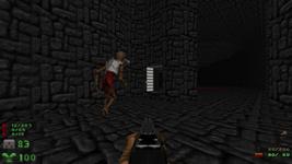
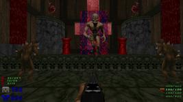
As you turn to leave, surprise! A strange swirling portal opens up, and a single demon emerges just before it closes. You have plenty of space to take it out before it reaches the end of the alley, and then it’s over, and you’re still left alone in an empty city.
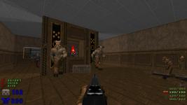
Oops, no you’re not. You can even hear all these guys pop out of their portal — I made the portal sound carry for quite a ways.
Yes, the portal makes a sound as you walk through it. It’s actually part of the Arch-Vile’s attack sound, though on its own it doesn’t sound familiar to me at all. It’s a quick, short noise that sounds, well, like something emerging from a portal.
ZDoom is pretty heavily scriptable, and it’s possible to spawn any object anywhere in the level at any time. I feel pretty strongly that spawning monsters this way is bad form, because it makes that initial monster count inaccurate. Instead, I have a small army actually standing on the other side of this portal, and they walk through it. It makes for a better effect overall, I think, because they behave randomly in a way that would be very fiddly to duplicate on my own. You might kill them all and walk up to the portal just in time for one last imp to come waltzing through, or one of them might get confused and not come through at all, so they’ll be waiting for you on the other side.
There’s even a “bug” here that worked out in my favor. ZDoom has invisible “patrol point” objects, which you can use to make monsters follow a path. All I did was stick one behind the portal, and tell the entire army to walk towards it. The bug is that they keep trying to walk directly towards it even after they’re through the portal, because their very simple AI doesn’t know they can’t possibly reach it that way. By sheer coincidence, the direction they walk is towards the alley, so it seems as though they’re creeping towards the player.
The portal is now the only interesting thing in the city.
This is the heart of my response to those hypothetical people who don’t like city maps. Fine, have it your way; this isn’t one.
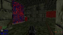
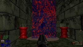
I love everything about the portals. The texture is FIREBLU1, one of a pair of notoriously gaudy stock textures. I think it works fantastically well here, and the swirling pattern (done with ZDoom’s Quake-like texture warping, usually used for liquids) helps distract from the fact that it’s just a rectangle.
I put a lot of effort into the portals upfront, figuring that they’d play a major role in the map. They open from the middle, which took a little finagling to make look right, since textures generally paint relative to the top. Walking through one makes a quick “fwuh” sound, and your screen abruptly gains a blue tint that fades away fairly quickly. You also lurch out of the portal slightly faster than you stepped into it.
Each portal requires a front line with FIREBLU as its lower textures, a thin triangle drawn behind that line, a control sector whose floor and ceiling are the same height as the middle of the portal, and a teleport destination object positioned in the exact center of the portal both horizontally and vertically. All of these things need to be tagged in very particular ways, so the portal script can orchestrate everything correctly. And you need all of that again for the portal on the other side, if you expect it to work. Like I said, a lot of effort.
I had a lot of bugs, too, including several different ones that trapped me in a teleport loop if I moved just the right way. I think my favorite involved a portal that was oriented diagonally on the map; I tried to walk through it, and the sound and blue flash played, but I came right out the back side of it. The ultimate cause? I’d drawn the line slightly misaligned with the grid, so its center didn’t quite pass through the teleporter object. If I walked through the portal very slowly, I would teleport once, arrive just in front of the other portal, and instantly teleport again to the back of the first one. That was maddening to figure out.
Hell
So this is actually a Hell map, I guess. My initial idea was to have Hell be underneath the city — not physically, but with some silent teleportation to create the illusion. I realized right away that the player would just be falling down holes and riding back up very long elevators, which is not very dramatic or exciting. Hence, portals. Maybe I took inspiration from the work being done on genuine portals in the ZDoom engine lately, or from the FIREBLU teleportation “bars” in TNT: Evilution’s MAP04, Wormhole. But mostly I just love portals.
Oh, there was one other allure of portals. Something that frustrates me occasionally about Doom’s 2D design is that you always know the area behind you is safe. Doom addresses this in various ways: monster closets, teleporters, teleporting monsters in, locking doors behind you, etc. (Sandy once replied to me on Twitter to explain that Doom II’s MAP04, The Focus, is so named because you’re constantly surrounded by critters.) Portals seemed like an interesting way to approach this problem, since you could be surrounded but still have a (very small) escape route. That said, I completely neglected to do it here, because I wanted to make you arrive on this cool altar.
The map is actually named “Throughfare”, out of the vague idea that you’re just passing through this city, but also passing through to somewhere else entirely. Then I looked it up and learned that it’s actually spelled “thoroughfare”, which clearly makes no sense at all. I was reminded of Doom II’s MAP03, The Gantlet, so I kept the misspelling as a nod to Sandy, who named all the levels. Granted, “gantlet” is an actual archaic spelling, but “throughfare” is apparently common enough to deserve a Wiktionary page.
The portal instantly closes behind you, which gives you a clear and immediate goal: get the Hell out of Hell. This is one of several reasons the map doesn’t support co-op, though I can imagine a couple ways it could be made to work.
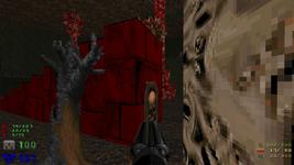
I love this skull platform. I think it turned out to be surprisingly similar to the end of E1M8, which is nice even if unintentional.
I also love that door. I don’t know if I’ve seen it done elsewhere, but I just felt like making a door that doesn’t touch its own walls. Once I started adding monsters, I discovered that a couple of the imps outside would see you arrive and open the door to come bother you, which is great.
Outside is a whole lot of stuff going on. On the left is a switch behind some very small alternating flesh bars. The bars are pretty small to prevent the player from “gliding” — wedging the 32-unit-square player into a 32-unit-wide gap. Large chunks of several Doom II maps can be skipped because the mapper made some locked bars exactly 32 units apart.
To the right are two other outcroppings. The middle one has some door and switch stuff going on, and the far one mostly has some imps tossing fireballs at you.
Please take a moment to appreciate that the sky here is different from the sky in the city. It’s not particularly difficult to do, but I think it’s an important touch.
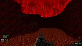
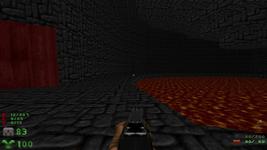
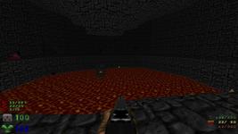
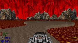
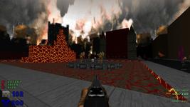
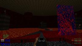
The lava, oh ho ho. The lava gave me a bit of a headache. If you’ll recall part 3 of the Doom series, I turned a flat lava-textured surface into deep lava. I don’t know how obvious it was in the article, but I very abruptly realized I didn’t know how to make the top surface of the lava brighter than the rest of the room. I think I ended up cheating and darkening the ceiling and walls, instead.
Here, I did it right. The lava is a deep swimmable liquid using Sector_Set3dFloor (the ZDoom feature that lets you stack multiple horizontal surfaces on top of each other), and it’s lit by two layers of ExtraFloor_LightOnly that extends slightly above it. You can see the banding of light on the walls; those are the EF_LOs. They’re like 3D floors, but instead of drawing an actual floor, they just change the light level for a particular horizontal slice of an area. (In vanilla Doom, an area can only have one light level, which applies to the floor, ceiling, walls, and objects.)
The headache was that the lava is set to inflict 20% damage, but I found that if you held the jump key so you sort of skidded along its surface, you’d never take any damage! For the longest time I thought this was a bug with the way damage inside a 3D floor works. Only in the second-to-last day of mapping did I realize: EF_LO really does act like a 3D floor. And while the dummy sector that controls the lava’s height is set to inflict 20% damage, the sector that controls the light‘s height is not. I changed the light to also inflict damage, and lo and behold! Fixed. I think the engine was looking through 3D floors from the top down, discovered that I was “inside” the light, saw it had no damage, and stopped looking there. Whoops.
It all works now, though. The lava is very pretty, it glows beautifully, it’s a rosy orange if you fall into it, and it will absolutely kill you very fast. There is no way out if you fall in, because it’s a gigantic chasm full of lava, and I can’t think of a better way to say “don’t fall in this pit” than to fill it with lava.
You can’t do anything outside except be shot at, so your only choice is to come back in. You have two options from here: up to the left, or down to the right. I always go down to the right first, largely because that’s the side I designed first.
That dead player and associated loot used to be on the steps, until someone told me they’d walked right over it several times without seeing it. Doom isn’t really designed for looking at stuff right below you, and the steps are fairly steep. Oops.
Lava cave
This is where I first really got stuck. It was awful.
I’d mostly finished the altar room. I’d drawn some stairs down here, and made a big box, and put a lava pit in it. The idea was that you’d drain the lava to be able to reach a switch in it. And then… nothing. That was all I had.
I only had a week, and this was day one or two, so I was pretty anxious about possibly being out of ideas already. A few people told me I should try looking at real places to get some inspiration. I don’t think that’s quite right; nothing in Doom is really a real place. Besides, real places are designed to be easily accessible, whereas Doom is about impeding your progress.
That’s something I’ve struggled to keep in mind. My instinct is to build things that are simple, straightforward, clean. And that makes really boring maps! The entire point of Doom — of games at all — is the experience of getting from start to finish, not just hitting the finish line. Games are the scenic route. That’s what I fundamentally love about Doom: exploring a slightly twisted environment, mashing buttons and having things happen.
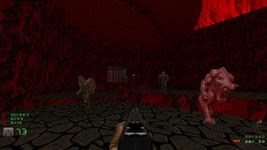
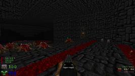
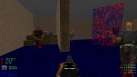
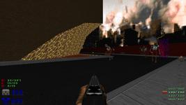
It took me a while, but I finally made this a somewhat interesting area. It even follows Romero’s rule of being interesting to look at. There’s all kinds of stuff happening here: a huge pool of lava to your left, cliff with a glowing wall to the right, a very fancy switch in the distance. And a dude on a glowing platform shooting your face.
I really want to capture how I got from an empty room to this, but it’s hard to put into words. I just tried to remember all the design advice I’d heard and apply it a bit at a time. The lava pool was originally front and center, for example, which meant your whole initial view was just a big pit of lava that you then had to circle around. Not very exciting, so I moved it to one side. Now there was a lot of empty space left on the right. The room was pretty flat, so I made a cliff. The cliff was pretty long and monotonous, so I cut a large chunk out of it to hide the back part.
I went on about contrast in the design post, but having built this map, and in particular this area, I think “add contrast” is backwards. What I did here was remove monotony.
If some sizable chunk of the space all had the same property, I tried to break it up. Is the floor totally flat? Break it up. Is the light level the same? Break it up. Are there no switches? Hell, break that up too.
“Add contrast” and “remove monotony” sound equivalent; the difference is in the point of view. If you’re having trouble coming up with new ideas, it’s much easier to think about removing something than adding something. I had a big empty cave, and I spent hours drawing a total blank on what to add to it. Then I tried breaking up the very flat and boring floor, and suddenly I had a cliff, and I started to think about what I could do with a cliff. Just having a starting point was extremely helpful.
This is all relative — the size and importance of the area make a lot of difference! This area is huge and important, so the lava pool and cliff are similarly huge. But that glowing platform right in front of you is fairly small, so it only needs very small chunks varied. And in some cases, monotony is itself a form of contrast! If your whole map has decent contrast going on, then a sprawling monotonous area like that lava pool will stand out.
The rim of the lava pool doesn’t seem very interesting at first glance. If you look very closely, just above my crosshair, you can see the texture on the wall is a little off. That’s because there’s a little side cave there, and inside, the map’s chainsaw! A fine reward for anyone with an eye for detail, anyone who explores the rim, or even just anyone who bothers to look at the automap.
I’ve realized lately how much I love narrative touches in games. I guess it’s what you call “environmental storytelling”, but I think that sounds too much like there’s a single coherent story. There doesn’t have to be. I just want details that leave me feeling like the world exists independently of me, that someone else has been through here, that it’s not just a simulated world designed solely for my amusement. Which is hard, because that’s literally what it is.
Here, then, are some dead demons, like this is a shrine to a holy relic. I particularly love this because it seems to tell a story, but the story it tells doesn’t make any sense! Who would come to Hell, kill these demons, and then carefully leave their weapon on a glowing platform like this? It’s ridiculous, but it feels great anyway.
Teeny tiny easter egg: on easier difficulties, there are fewer demon corpses here.
Rooms that you can’t see all at once give the player something to explore.
That’s really hard to internalize. It feels so inefficient. Yet I’m hard-pressed to name many memorable rooms in Doom that are entirely visible from a single vantage point.
It’s so important, too. Players need direction, something to do, so they don’t feel like they’re just meandering from room to room. Games are interactive; leave space for the player to offer their own input.
After I drew the cliff and cut this hole in it, I needed a way for the player to get up to the cliff. Hiding a simple lift behind this rocky wall seemed too simple, so I tucked a spiral staircase in the void, and it kinda grew into its own little area. The metal texturing acts as a reprieve from the rock texture outside.
That rock texture, by the way, was fairly deliberate. A playtester even commented on it and suggested I use a different floor/ceiling, but I decided to keep it this way. It should be samey, because that’s what this place is: a jagged hole cut out of solid rock.
I realized, from this room, what didn’t feel right about taking inspiration from real places. In a medium where gameplay concerns heavily affect the design of the world, and especially in a game as abstract as Doom, it’s more important to evoke the feeling of a place. Not necessarily a “real” place, either. Lay enough groundwork that the place seems cohesive, and the rest will happen inside the player’s head. If you try too hard to model a real place, you might hit the uncanny valley and just look like a crappy replica of reality.
I didn’t really understand how to do that until I did it. I thought I needed to have the fully-realized place in mind, and pare down the details until I was just hinting at it. Nope. The details we fill in ourselves are hazy and different for everyone, so it doesn’t matter what they are. Just stick to a general theme until you start to get a sense of place in your own head, and then lean into it.
You know that early underground level in Super Mario Bros? Really? Why did you know exactly what I meant? Have you ever seen an underground place like that, with easily-smashed bricks floating in the void and pipes three times the size of a person jutting out of the ground? Me neither. It doesn’t matter, because it’s close enough to obviously be underground. It’s what underground looks like within the vocabulary of the game. The music is lower, the level is a shadowed blue color, and of course you get there by taking a pipe down through the ground.
This, then, is the lava cave. It’s rocky enough to pass for a cave, and it has lava. There’s a maintenance shaft in the middle, which doesn’t seem out of place at all, because why would it?
This tiny side room is a great example of all of this stuff. It doesn’t need to exist; I could just have well not drawn this wall, and had a single larger room with these items in it. I added the room because the style of this maintenance area has been small and cramped, and even that little combined room felt too big. Splitting out a side room preserves the theme, gives the outer room an interesting shape, and gives the player one more place to go. Plus it hides the secret on the back wall.
This whole area, by the way, reflects something else I really enjoy in Doom maps: folding a deceptively large amount of stuff into a very small space. From the outside, this is just a moderately-sized rocky wall; inside, somehow, there’s a tunnel and a spiral staircase and two rooms and a small cave outside with imps on it! You go through several areas and come out mere feet from where you started. It’s a really neat effect.
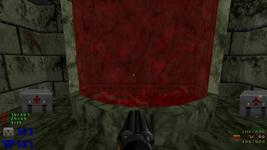
All of that led to this switch, which lowers the red wall.
The original plan was that you’d think the inner red wall was just the back side of the outer red wall, and when you pressed the switch to lower them, surprise! There’s a bunch of revenants in the middle. There are seven of them, and there’s not much space between them and the cave wall, so I was worried that they’d instantly swarm you and block your escape.
Luckily, I’m a doofus and forgot to flag them as ‘ambush’ — which would’ve made them wait silently until they actually saw me before yelling and giving chase. Instead, they hear your first shot in the cave and bunch up on one end of their little channel, so they’re easy to run away from. Even better, they’re yelling at you the entire time you’re making your way up to the cliffside. I thought that effect was much better than my first idea, so I left it how it was.
The switch that lowers them has a little stockpile in front, as a quiet hint that something’s about to go down. Also, if you’re clever, you can preserve the two barrels on the cliff and use them to inflict some splash damage, since you don’t have the rocket launcher yet.
And the point of lowering the red wall was to hit this switch that’s been tantalizing you since the beginning, which drains the lava pool.
I’d intended to have a physical pump mechanism that this switch activated; it’d explain why this switch drains the lava, and flavor the whole cave as a geothermal generator or something. I just never got around to it.
Lowering the lava also wakes up these three cacodemons, who rise out of some remaining pools in the floor. They’ve been there the whole time, but dormant.
The switch there raises a lift and grants access to the cool skull switch that’s been teasing you since you first arrived in this room.
There’s a blue armor behind it, which counts as a secret. If you hadn’t caught on yet, I love secrets. I love finding them, so I love providing them for other people to find. They’re little rewards for poking around, going off the beaten path. This one isn’t particularly hard to find, but then, neither is the chainsaw.
The switch still works even if the lava hasn’t been drained. If you know it’s there and are feeling incredibly gutsy, you could dive in, mash the switch, leap out, and skip the entire right half of the room. I haven’t actually tried this, but I think it’s just barely possible. What a shame that the only armor you can reach yet is also in the lava, on the other side of the switch.
I really, really like switches that visually indicate what they’re doing. You can get on with the game without running around for 20 minutes trying to guess what just changed, and the switch itself feels more interactive besides. It worked out particularly well here: this is the most grandiose switch in the room, by far.
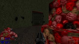
You can’t tell from a screenshot, but the pink fleshy texture rotates while the pillars open, so it looks like tendrils are twisting into the rock.
That concludes the lava cave! Next is the, uh, other one.
Green cave
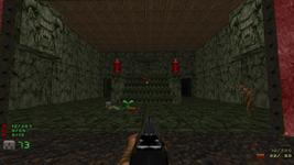
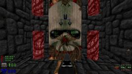
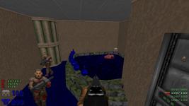
This area is a bit more abstract, but still holds together. The stairs up to it and this platform here have a mossy growth on them; the walls are unusually green for a cave; the ceiling reminds me of knotted roots. There are a couple dead trees here, in contrast to the fairly barren lava cave. And then there are the weird glowing flesh tendrils, framing the very Doom II scrolling face texture, which I adore. I don’t know what this is, but it feels alive, and seeing it in Hell with these grotesque parts stabbed through its core is a little unsettling.
Another one of Romero’s comments that stuck with me is that he hates symmetry. A symmetrical map is only half a map. The player has to do the same thing twice, and all the designer did is copy and paste the rest.
I kept that in mind and ended up with a very different second cave. The lava cave was big but fairly easy; the only ambush was the revenant army, which you could hear coming the entire time. This room is more straightforward, but also more compact and a little more tricky.
I love that sole arachnotron up there. I love how big and obnoxious arachnotrons are in general — all of their sound effects are just as annoying as the player’s own plasma gun, and their loud as hell death cry is suitably satisfying. I think they stand out to me because of the way Sandy sprinkled them all over the outside of MAP12, The Factory. Here’s a whole bunch of wide open space, so let’s dump these huge clunky monstrosities everywhere. Perfect.
Pressing that red brick switch converts that wall into a set of stairs, so you can walk up to the face platform. I tend to replay Doom design commentary that I like while mapping, and I listened to an entire Let’s Play of Doom II The Way id Did; somewhere in there was the offhand remark that stair-building effects aren’t used much in modern maps. That stuck with me, so I made some stairs out of this huge prominent wall. Creating the stairs somewhat reduces the amount of cover available, which is interesting now that I think about it.
I always do the other room first, just because I made it first. It’s also nice to get the blue armor as soon as possible, and you get the plasma gun (but not much ammo). This room deserved a reason to be done first, too, and so I put the super shotgun here. I feel like I watch a lot of expert Doom players get through maps almost exclusively using the super shotgun, so here, you have to earn it.
One of the videos I replayed mentioned that an ambush when picking up a key is boring and expected. I can understand that. It doesn’t make a lot of sense, anyway; why not attack before you get the key, to stop you from getting it? Most of the traps in this map, then, force the player to actively spring them.
In this case, the super shotgun is on a raised platform. Pressing the platform will lower it, but also lower the adjacent wall, behind which are two hell knights. If you fire or try to run, you’ll also wake up two revenants further along.
And the door… oh, the door. I love this door so much. It’s a “blazing” door, opening almost instantly and with a special sound effect. Coming in, that is. When you open it to leave, it opens veeeery slowly. I think the technical term for this is a “fuck-you”, and I think Doom is deserving of having a couple of them.
The rest of the room is fairly simple. Kill the things, take some stairs up to the smaller caves, press a switch. That raises the gate around the cool skull switch. (Raising a solid gate texture is a ZDoom thing that I dig.)
I know I just said that I like to make the player spring traps on themselves, but I broke that rule here. As you approach the switch, a wall opens behind you, and an arch-vile comes out. Arch-viles are monsters that “cast” a fire on you from a distance; you have about two seconds to break line of sight with him, or you will be in a world of hurt. This room has plenty of places to hide, making him more of a surprise than a serious threat.
Both of the skull switches automatically quicksave. If you rush directly for this switch and press it — and why wouldn’t you? — it’s possible that you’ll get a quicksave right as he’s starting to attack you. Oops. There isn’t a more appropriate place to save, though. Oh well.
I haven’t mentioned difficulty levels at all yet, and this room is where they’re most obviously different. Doom II has five skill levels, but the two easiest and two hardest use the same monster arrangements and just tweak some numbers. That leaves three skill levels to map for: easy, medium, hard. (You can set all five independently with ZDoom, but I don’t see why you would do that.) I designed the map for hard difficulty, balanced ammo and health, and then adjusted difficulty last.
To do that, I took a look at a few Doom II maps on doomwiki, which has a convenient table of how many of each type of object appear on each difficulty. I was somewhat surprised to find that ammo, health, armor, powerups, etc. are almost always unchanged between difficulties, meaning that you have plenty to spare if you play on easy. I was even more surprised to find that the monster count was roughly proportioned 1:2:3. The game is basically barren on easy.
As an extreme example: MAP16, Suburbs, is a very open map with a prominently-placed key. When you pick up the key, tons of enemies start teleporting in all over the map. It’s terrible. Aside from a handful of oddballs, the monster counts are as follows:
- Hard: 97 imps, 25 cacodemons, 14 revenants, 15 mancubi
- Easy: 49 imps, 0 cacodemons, 1 revenant, 0 mancubi
If you play on easy, the horde from my nightmares is reduced to a few dozen imps. Amazing.
Enlightened, I went through the map and made a third of the monsters not appear on medium, and those plus another third not appear on easy. I was a bit torn on what to do in places where I had only one tough monster, though, like this arch-vile trap. I decided to replace the arch-vile with a revenant on easy, and likewise replace the arachnotron with a less threatening hell knight. I took difficulty into account a couple other ways, too, which I’ll get to later.
If you’re curious, the final monster tally is 307 on hard, 227 on medium, 155 on easy.
Chasm
With both of those cool skull switches pressed, the eye switch in the chasm is now accessible. A whole lotta stuff has been released, though.
I’m really, really happy that this part of the map turned out to be truly non-linear. I say “truly” to distinguish from “faux” non-linear, which is usually what people mean. Maps like Downtown look linear at first blush, because there are a lot of places you can go… but most of them are optional and won’t help you progress. To complete the level, you always need to go through the same sequence of critical events in the same order: blue key, blue door, red key, red door, yellow key, yellow door, exit. Contrast with MAP19, The Citadel, where you always need the red key but can get either the blue or yellow key, and order doesn’t matter. Likewise, you do have to press both switches in my map, but the map doesn’t care which one you tackle first.
I didn’t use any scripting to do this, either. I feel very strongly that scripting should be kept as minimal as possible, to keep the game feeling as Doom-like as possible. I could’ve kept track of how many switches you’d pressed, and only released the monsters when you’d pressed both. Or I could’ve done the straightforward thing: stuff the monsters behind two doors, and have each switch open one door. Then the monsters can only come out when both doors are open. It’s the same reasoning as using native HTML instead of reinventing with JavaScript.
The eye switch makes this floating bridge rise slowly from the lava. The individual chunks bob slowly in the air. It’s not a very complicated effect, but it looks really cool.
This grants you access to the middle outcropping. If you’re playing on hard, you might be feeling pressed for ammo right about here. Good! A little ammo pressure is great. Like I said, I get the impression a lot of expert Doom players blaze through everything with just the super shotgun. I deliberately avoided leaving enough shells around to get away with that. Doom has a bunch of weapons, and you ought to use a few of them.
Placing the ammo was trickier than I thought. I realized pretty early on that it was hard to balance the pickups when they vary so wildly in value. I said in my Doom series that I measure damage roughly in terms of super shotgun (or rocket) blasts, so in terms of damage only, 20 bullets ≈ 2 shells ≈ 1 rocket ≈ 10 cells. Based on that, here are all the ammo pickups, how much of your maximum ammo they refill (assuming no backpack), and how many super-shotgun-equivalent blasts you get from them:
- clip (10 bullets): ½ blast, 5% max ammo
- bullet box (50 bullets): 2½ blasts, 25% max ammo
- 4 shells: 2 blasts, 8% max ammo
- shell box (20 shells): 10 blasts, 40% max ammo
- 1 rocket: 1 blast, 2% max ammo
- rocket box (5 rockets): 5 blasts, 10% max ammo
- small cell (20 cells): 2 blasts, 7% max ammo
- bulk cell (100 cells): 10 blasts, 33% max ammo
What a ridiculous spread. You’re full up with only three bulk cells, but you need ten boxes of rockets. A small shell pickup is worth four small bullet pickups. Full rockets do five times more damage than full bullets. How on Earth do you handle this?
I didn’t do a great job early on — I threw ammo around and immediately fed the map to my playtester before going to bed. It turned out that I’d front-loaded the ammo. Those boxes of shells add up real fast, and I had more than a few lying around. For my second try, I replaced most of the boxes of shells with a few individual shells sprinkled around, and used a couple more relatively-small rocket pickups. That seemed to work pretty well.
Someone has made a small resource mod that adds medium-sized pickups for all four types of ammo. I would’ve liked to have those available here, I think.
Two brief detours
Before making any further progress, I want to show the two most obtuse secrets in the entire map. If you don’t want them spoiled, you should skip this whole section.
…
Okay then.
Originally, the portal in the alleyway stayed open, and you walked through it. This little altar is where you came out. I hadn’t built anything else in the chasm yet.
There’s a secret in the alleyway that dates back to this original design: if you go behind where the portal opens, there’s an inset door that opens to reveal a berserk pack. (Berserk is the powerup that instantly refills you to 100% health, and also makes your punch 10× more powerful until the end of the level.) With the initial design, you could either grab it before you got the shotgun (which is a bit of a waste, since you have full health), OR you could re-enter the portal from the back and pop out behind it in the alley. Now that the portal closes right away, you can get it fairly easily whenever you want, which is probably a good thing since it’s the only berserk pack in the map.
Anyway, I realized that having only a single demon emerge from the depths of Hell was kind of weird and anticlimactic, so I started to build the altar and the little swarm of cannon fodder that comes after you. I realized that a fancy marble room with you as the focal point was a way cooler introduction than just popping out on a red cliff, and that’s when I made the alley portal close right away.
But. There’s a slight delay before the demon acts. If you know the portal will be there, you can charge straight for it and just barely get through before the demon does. You’ll end up here, and telefrag the demon.
Why would you do this? Because at the start of the level, there’s an alcove with three backpacks in it. The only backpacks in the map. And it closes as soon as you take the portal to the altar — not that it matters, since you can’t get back over there anyway.
The bridge used to extend all the way across the chasm, so you could press the switch to reopen the alley portal, and emerge back into the city, and… nothing would be different. It was confusing and pointless, so I cut off that end of the bridge.
The result is very deliberate and tricky and I love it. I had this whole chunk of unused map, and I turned it into a really cool secret. It’s right in front of you, rife with hints that you should be able to get there somehow. There’s an altar! There’s a big switch! (It just re-opens the alley portal so you can get back, of course.) And I didn’t mark the alcove as having a secret wall, so you can see something is hidden there if you look at the automap!
Someone commented that it’s kind of mean to have the only backpacks in an obtuse secret. Damn right it is. Having a backpack doubles your ammo capacity, which changes the ammo balance severely. If I give it to you late in the map, what’s the point, when you’re probably maxed out and near the end anyway? If I give it to you early in the map, what was the point of having it as a powerup at all when you’re never burdened by the default ammo capacity? The only satisfying answer I had was to make you earn it by being clever.
The other obtuse secret has a bright red hint in both caves. No, really, there’s a huge red slab of wall.
You might spot an out-of-the-way switch in one cave. The only visible effect is to make that huge red slab of wall a different texture. Until you find both switches, which fully opens the doors, in much the same way as the double-layered monster closets in the chasm.
This reveals a little marble passageway, connecting the two caves. In the middle is a lift, which takes you down to… a little tomb, maybe? It has some rockets for you, and two points of interest.
This tank is entirely flavor. I don’t know how well it conveys what I was thinking. If you look at the automap here, you’ll see that you’re right behind the altar where you first arrived. The idea was that the portal is being powered by blood, or something. (The corpses constantly spew little red particles that drift upwards and fade away.)
Fun fact: I originally had the map powerup down here. Then I came to my senses and realized that the item used for finding missed secrets really does not belong in the most obscure secret.
The other thing here is this portal, which takes you to a hellish beach floating somewhere out in the void. Guarded by two barons (minibosses who can take a beating) is the only BFG in the map.
The texture is a stock texture, but with its colors shifted from dark grays to light browns. I didn’t edit it; ZDoom has a feature for describing that kind of color shift with a single line in a text file.
Originally this was an actual beach in the ocean, but I felt obligated to give it sloping edges, which is a huge pain in the ass. None of the stock Doom II skies really belong above an endless ocean, anyway.
If you leave the island through the back of the portal, you come out behind it in the tomb, which lets you get to the only megasphere in the map! Secrets inside more secrets are the best kind of secrets.
The only hint to this is a misaligned section of brick. It used to be less misaligned, but I watched someone live on stream go behind the portal and still miss the door twice, so.
Now that we’re pretty beefed up, let’s get back to the game progression.
Middle outcropping
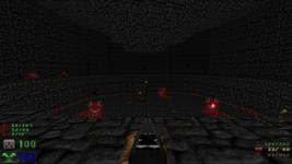
Here’s that “cool establishing shot” thing again. You’ve got some doors, a switch up on that cliff, and some little pillars awkwardly hanging out here.
This area is a calmer come-down from all the stuff you just fought in the chasm. I don’t have a lot to say about it. The left door leads to a dozen minor enemies, and the right door leads to a couple tougher ones. Both of them lead to the same revenant room behind the cliff with a lift on it. You can go whichever way you want. It’s probably worth doing both, since they have some ammo that you’re starting to hurt for.
Is it bad that I don’t feel too strongly about these areas? Or does it make sense that a somewhat quieter area would be less distinct? They’re not bland; they just don’t evoke anything in particular.
Oh, I do like this, though. A cage full of lost souls on the right side. They can only attack by charging, so they’re basically harmless in there and bumble around colliding with each other.
This is our lost soul cage, where we keep our lost souls.
Here’s another archvile, this time rendered fairly harmless. You can just peek around the corner of his cage and take potshots at him, or ignore him entirely and charge up the stairs.
I originally forgot to flag the bars as impassable, so he would see you and just charge straight through the bars to set you on fire. Two people played through this without mentioning it.
This used to be a single arch-vile, a great surprise to find on a lift. Then I added the arch-vile in the green cave, and the arch-vile in the cave, and that was too many arch-viles.
A playtester had been doing a Tyson run (punching only) for kicks, and he’d had to run past the cacodemon ambush in the chasm, since it’s hard to punch things that are floating over lava. While he’d made his way through the side rooms to get here, the cacodemons had been trying to move towards him and had clustered together at the top of this lift.
When he pulled the lift down, the floating cacodemons moved down with it. He thought that was absolutely hilarious. So now there are cacodemons here.
Pressing the switch on the cliff raises a switch below the cliff. Why? So you can watch what that switch does.
Pressing the second switch will lower it into the ground, then raise an altar right in front of you, underneath where those pillars are. Right between them, a portal opens. Finally! You’re free from Hell.
Homecoming
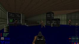
You arrive home in this weirdly nondescript room. What is this room? I don’t know. It’s textured like an apartment, but there’s not a lot of things in it.
I think that’s okay. I mean, the point of this room is for a lot of zombie men to shoot you with guns, so it’s not like it needs too many frills. If I had a potted plant object to work with, I might’ve stuck one in the corner, but I don’t, so I didn’t.
I love that revenant in the corner. Naturally, the flesh walls scroll around him. It’s great. Like Hell tried to force itself into our dimension, but it didn’t do a very good job, so now this one skeleton is just stuck in the wall.
The lift doesn’t go down, but once you leave this building, you can use it to return here (and back to Hell, if you wish). I added it in an embarrassed panic towards the end, after realizing that at one point you drop out of a shaft in the ceiling, meaning you had no way to ever go back and collect missed secrets. I’m pretty solidly in the camp that nothing in a level should become permanently inaccessible unless you have a really good reason. Like, say, if it’s an obtuse secret.
This room is so ridiculous. I love it.
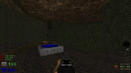
At this point you’re inside one of the city buildings, so I had a finite amount of space to work inside. I carved it into rooms and then had to put something in each room. For this one, I stuck some pipes (a bundle of pipes?) in the corner. That reminded me of those huge room-filling bathtubs, so I made one. And put a single demon in it. With some dudes hanging around.
I don’t know what’s going on here, but it’s fascinating.
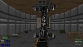
This elevator is true 3D. It’s one of the very few overt uses of room-over-room in the whole map. It seemed fitting.
I wanted to have sliding elevator doors, but for a variety of gritty technical reasons, it never worked out. Instead you get this very Doom-style open lift.
I said that I value preserving that Doom-like feel, and it’s true here too. If I’d done the Doom thing and used a traditional lift, the two floors would’ve had to be on different sides of the lift. I happen to think that draws attention to the fact that you can’t do room-over-room in Doom. What I built looks and feels like an analog for an actual elevator, but departs from vanilla Doom capabilities in fairly minor ways. The way the rooms are packed together feels like there could be two entirely separate floors here, but the only true overlap is the space immediately in front of the elevator. The switch has to use a script because it does a different thing every time you press it, but it still feels like an extension of pressing the elevator itself to summon it.
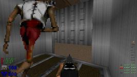
I’m hanging out with this frozen revenant. Usually you call the elevator down, he appears and yells at you, and you shoot him in the face a lot. Because sound can’t be blocked vertically, the dudes upstairs hear this and wake up. They can only hear you if you’re in the overlap area directly in front of the elevator, which makes sense if you don’t think about it too hard, so I didn’t bother fixing it.
Two options, as usual. The left is a dead end, but has a box of bullets in an open crate, which I like. There’s also a banister and some kind of pit? What’s going on there? I’m not sure.
The other room is kind of an empty square, but it has this really fancy light fixture in the center. It’s neat enough that it monopolizes the whole room and seems like a reason for the room to exist all on its own. I’m surprised how well it works.
It wouldn’t be a modern Doom map without some bricks cut out of the floor, so here’s that. It’s a silly trope, but I like it anyway.
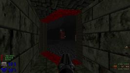
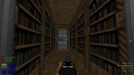
This is just a hallway, but for some reason it’s lined with books.
The books are really another fuck-you. Everyone thinks the bookcase texture is a secret switch. Everyone presses the bookcase texture. So here you go: have a bunch of imps.
The first time someone else playtested this part was right after I’d added this hallway. It had eight imps and no reward. The result was unpleasant. Now, it has the map. A micro-library seemed a fitting place for it.
In order to make both bookcase lifts count as the same secret, they’re actually part of the same discontinuous sector.
This room is great. Yeah, yeah, the switch makes stairs come up — here’s my second contribution to stair-building. But look at that lighting! It’s glorious.
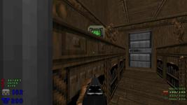
You follow the vents a bit, and you come out here. In the vents are a secret soul sphere behind that electric panel texture, which is my favorite place to have secrets, to the point that I don’t know why you would ever use that texture and not have a secret behind it. You don’t notice at the time, but the vents also cross over an alleyway, putting you in a different building here. That’s the second use of room-over-room, and you can see the third and final one in this screenshot: I made a tiny shelf for some shells.
I have slightly mixed feelings about these rooms. I do like the very open and interconnected design; you have to move around a bit to get the full picture of what’s going on. I like the wooden stage at the back. I like the stucco texture, even.
I’m just not sure I know what this is. It’s definitely something, which is good, but what that thing is eludes me. I don’t really feel like these rooms are missing anything — scattering pointless detailing around wouldn’t improve them — they’re just a bit odd.
I feel this way about both buildings, really. I did rush them a bit, but also, they’re vaguely-defined human structures; what else would go here besides what’s already here? They’re a transitional area, full of right angles to distinguish them from the (un)natural shapes of Hell, yet otherwise indistinct. You pass through them fairly quickly, with no real reason to linger. If they’re meant to evoke anything at all, it’s exactly that sense of banality, as a stark contrast to where you’ve just come from.
I’ve worried a bit that this whole building overstays its welcome, but it’s all fairly small and straightforward. The few side rooms are obvious dead ends, not major red herrings. I don’t know! I’m trying to reassure myself that I didn’t jam a boring bit in the middle here.
Hell on Earth
Finally you find some stairs that let you out to the ground floor, and you’re greeted with this. A portal with some dudes coming out of it. Well, no matter, you’ve seen this happen before.
Then you turn the corner.
I wasn’t originally sure what would happen when you got back to the city. There would have to be some monsters, of course, and… and what? Now you go in some buildings? Why couldn’t you before?
Then my playtester commented that when you come back to the city, Hell should come with you. Of course! The entire plot of Doom II.
So I set about filling these “buildings” with tiny Hellscapes that would be revealed when you returned. Yes, this is exactly the same city. All of this stuff is here when you start the map. It’s just sealed behind a few walls textured to look like buildings, all of which drop away when the altar is revealed.
I really like that Hell Cathedral; it came out surprisingly well considering I had to cram it into a fairly small space and only had a few relevant textures at my disposal. The towers are some of the only use of slopes in the map.
Those marble pillars out front could permanently trap you if you happened to fall between them and the steps. Oops! Thank goodness for playtesters.
The exposed city acts more like a traditional city map. There’s somewhere you need to go to progress, but it’s not immediately obvious, and there are a number of distractions in the meantime.
Here’s one of them. You may be running a little low on ammo by now, so if you intend to kill all the critters now filling the streets, you’ll need to find a bit more. You can run up this spire for a pretty nice reward, but you’ll have to deal with the baron and the harmful floor and the various things rushing towards you. I like this kind of risk/reward.
Another use of slopes. What exactly happened here? I’m not sure, but it looks interesting; it’s vaguely reminiscent of the Terminator time bubbles that cut spheres out of nearby objects.
There’s a little ammo cache here, too, as a reward for exploring this furthest corner and braving some revenants.
The monsters don’t actually walk through the portals this time — I wanted them fairly spread out, and choreographing them to walk to dozens of specific points would’ve been incredibly tedious and completely invisible to the player. Instead, they’re arranged in a few off-screen alcoves roughly shaped like chunks of the pavement. ZDoom has a TeleportGroup special that can teleport a group of objects relative to a particular point, and this is a very straightforward use of it. Each alcove has a teleporter thing inside it in the same relative spot as a portal, and when the altar is revealed, each group of monsters is teleported to around a portal in the same configuration.
I love this shot. It’s kind of a shame that most players will never see it; as soon as the lost souls spot you, they’ll start charging your way.
The only thing of interest in the flesh spires (which are harmless) is a switch in the back, which lowers the invulnerability sphere that’s been visible since the beginning, if you cared to look back here.
I had a couple interesting bugs with that invulnerability pillar. Originally, I had a green particle fountain on top of it to make the invulnerability sphere look all the fancier. Unfortunately, particle fountains aren’t affected by gravity, so when the pillar lowered, the particles stayed suspended in midair. Whoops.
The pillar sector was originally flagged as secret, but I found out that a player running over it at top speed might actually miss getting credit for the secret. I assume this is because the player’s center was never actually within the sector. Movement in games is usually done in discrete chunks: every given fraction of a second, the game multiplies your speed by that fraction of a second and moves you that far. It’s thus possible to be standing on one side of a small area and have such a high speed that you move onto the other side of the area without ever actually being inside it. You still get the invulnerability sphere as long as your entire radius touches the radius of the sphere, which makes for a large margin of error, but I guess secret tracking only looks at the single point marking your position.
The easiest fix was to change this so the sphere itself is the secret, which is a ZDoom-specific feature. It’s even a new enough feature that Zandronum, the ZDoom fork given as the compatibility base for DUMP 2, doesn’t support it. Zandronum will just think there’s one less total secret and not count the invulnerability sphere as being one. This is the only Zandronum compatibility issue, as far as I’m aware.
Oh, the hell knights had a curious bug. I’d been messing with another area that required a lot of careful vertical placement of objects, and then I came back to the city to add the hell knights. Due to SLADE’s somewhat obtuse handling of thing creation, the hell knights (and several other monsters) ended up inheriting a z height of 1536. I discovered this when a playtester showed me a screenshot of a hell knight standing on the wall around the city, which I can only imagine happened because a hell knight appeared in midair and then fell onto the wall… somehow.
I wanted this section to feel intense without actually being preposterously difficult.
Modders often like to make hard things. Really hard things. Mario Maker is a great testament to this. It makes sense — modders are generally people who are already very familiar with the base gameplay, so they’ll generally want more of a challenge and be capable of dealing with it. On the other hand, too much of this can alienate potential new blood, who try to get into the community and smack face-first into a difficulty wall.
But also… making hard things is easy. At the extreme end, it’s trivial to make an impossible level in any game: just surround the player with walls. Surround them with boss monsters to be only mostly impossible. Require someone to play exactly like you, or play extremely precisely, or not make any mistakes, and you have a level that’s just frustrating instead.
Creating a challenge that has consistent moderate difficulty is actually pretty difficult! You can tone down the enemies and give the player plenty of resources, but the really difficult part is finding all the accidental gotchas. Maybe it’s easy to take a rocket to the face here if you don’t know it’s coming; maybe you can fall into this inescapable pit; maybe a new player will struggle through the whole map because they didn’t know where the good weapons are. A few rounds of Mario Maker has humbled me considerably — every single level I’ve made, even the ones that were explicitly intended to be pretty easy, has had some kind of clumsy oversight. Just because other people don’t play the same way I do.
I took yet another crack at that here. Quite a few monsters spawn in the city, but there’s plenty of room for dodging, several places to hide, and a lot of infighting potential. Even these arachnotrons, a common sight in wide open spaces, spawn in this jagged street that hampers their offensive ability. There’s the invulnerability sphere, too, and it’s surrounded only by low-level zombies.
I’m not sure yet how well this worked out, but so far the handful of people who’ve played seem to have enjoyed it.
This is inside the black building seen on the right side in the previous screenshot. The entrance is blocked off until Hell emerges — another detail that makes sense as long as you don’t think about it too hard.
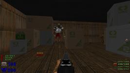
You come up a lift to see this revenant, with no obvious escape route; the lift doesn’t go back down. The crates are arranged to make navigation a little awkward.
This might be a bit mean. It used to be meaner, though completely by accident. I’m still unsure about it, but I do want it to be a little mean, just because there’s so much stuff up here: a decent chunk of health, a fresh blue armor, and quite a bit of ammo. Navigating a few surprise enemies in close and clumsy terrain is how you earn all that.
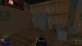
I love this little pile of crates that fell over. It also works as a staircase onto the large crate where those chaingunners are standing.
Not sure what happened to that front-most one; it seems to have lost its side textures somehow. The clip is also a little clumsy; you have to carefully drop between the small crates to actually pick it up.
Behind the crate from which the others were knocked is this glaringly incongruous switch, which lowers a glaringly misaligned wall on the other side of the room. If you charge through this room and immediately drop through the window the chaingunners are looking through, you’ll probably miss the switch. If you take just a moment to glance around, it’s a bit hard to miss the bright blue texture in the middle of a sea of browns and grays.
This secret is a combination of a few factors. I wanted to have a more clearly-telegraphed secret, after watching a playtester miss the megasphere twice, even after going behind the portal and pressing on the (wrong) wall. I wanted to have a significant reward for exploring this building, which is completely optional. I wanted to have a low-pressure “timed” secret, where you had to find and enter an area in a short amount of time — though the window here is fairly generous, and it’s easy enough to go press the switch again if you don’t make it. And finally, I just needed some way for the player to get out of the gap between those crates and the wall.
Only the middle sector is actually flagged as secret, so if you don’t pick up the bulk cell, you might not get credit for this secret. I originally had the outermost dark ring as the secret one, but then I watched someone run into the room at top speed, and they moved so quickly over the skinny ring that they didn’t get credit (again)! I figure pretty much everyone will grab that bulk cell.
Our old alleyway sure looks different now!
This is the only mid-air portal in the map, which honestly feels like a missed opportunity, but oh well. You have to come running out of the back of the portal to reach that alcove, which looks barren — but on the other side of the street (through the portal) is a shootable switch that leads to another secret stockpile.
I like everything about this shot. The inverted cross, the altars, the bloodfalls, the “congregation” of imps. I used the red skull “lock” texture as the door track on a whim; it seemed like the kind of bizarre thing Sandy might do.
The interior of the cathedral is one of the last areas I created. I was originally going to make it another optional area, but it didn’t sit right with me that if you knew exactly what you were doing, you could come out of the apartment buildings and skip the entire city in about one second. (You’ll see how in a moment.)
I get the impression that modders also love railroading. You might start to notice it if you play enough Mario Maker; you’ll think you have a clever idea for getting around a small area, only to find that the author made a jump just barely too high or wide to work.
I don’t like that. I especially don’t like when it happens multiple times in the same level, or even the same area. I like exploring in games, and I value that delicate middle ground where I feel like I’ve been clever but the designer rewards me for it anyway. If it’s glaringly obvious that the designer has slapped on multiple bandaids to force me to do this One Thing They Think Is Really Important, the illusion that I’m exploring an incidental world is ruined.
On the other hand, if you can walk right past this entire huge massive outdoor arena in about five steps, why did I bother building it in the first place? I decided to compromise a bit and introduce the only key in the map. You need it to progress, so you have to interact with the city a little, but you ultimately don’t have to go much further. Those barons in the back are meant to encourage you to run around gathering resources before tackling this room.
I’d originally intended not to use keys. Now that I was going back on that, I wanted something a little grandiose for the key, but this cathedral is rather small. Ah, good thing I have portals.
When you walk forwards, a portal opens and this “priest” comes through. There’s not really any cover in this room, so if you’re already hurting, you might be in for more hurting.
The cathedral door opens and closes pretty slowly, too… at least, on hard. It opens much more quickly on easy, giving you more time to heel-turn and bolt out of the room. I considered removing the arch-vile on easy, but decided against it because it serves a narrative purpose here.
I’m not a complete jerk, though. There’s one very quick, very conspicuous way to get out of the arch-vile’s line of sight, a way I’ve been trying to teach the player this entire time: just run through the portal.
Here’s my grandiose key grab. It’s ultimately pretty simple: haul ass over the lava and up the spiral stairs to get the key.
There are four revenants in all, and the only real cover is the spiral stairs themselves. It happened to work out so that if you just run for it, you can get behind the stairs just before any of the rockets hit you, and then you can grab the key and run back without taking any damage. Of course, if you’re after 100% kills, this room might be a little difficult. But again, you have the portal at your disposal.
If you look at the automap, you might notice that the four revenant towers and the key are arranged at the five points of a pentagram.
On medium difficulty, there are only two revenants. On easy difficulty, there are four imps instead.
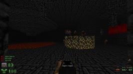
All of the portals in the city streets lead here. I love this room. I think of it as the focal point of the map. It’s almost a shame that it comes so late.
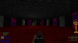
Again, this doesn’t make too much sense if you think about it. How did all those enemies fit in here? The arachnotrons alone would fill the space. I don’t think of this room as a literal shape of the space, or even a space that could literally exist — it’s a small slice of nowhere, floating in the void, that only exists because all of these portals happen to intersect here.
There are eight portals, eight pillars, and four different light sources to help you orient yourself. I put a lot of effort into the textures and the lighting on the pillars, too. At first I tried having the room literally float in the void — or at least, in an endless sea of lava beneath a hellish sky — but the impact of the portals is much more powerful with darkness behind them.
Seven of the portals lead back into the city. They’re arranged in roughly the same order in this nexus as in the city, mostly because I placed the city portals clockwise around the perimeter. One portal, to the left of that white tech lamp, leads somewhere new. That’s why I felt the need to add the red key: if you knew the map, all you had to do after leaving the apartment building was charge directly into the nearby portal to get to the nexus, then take the only portal that doesn’t lead back to the city.
Techbase
This is the home stretch. You need the red key to open that blast door.
There’s another secret behind the portal you arrive through, the third or fourth such secret. Unfortunately, the hallway bulges around the portal, and you can walk right around it. I added the bulge after someone managed to get themselves stuck in the wall after walking through the very edge of the portal, but I guess I overdid it! I’ll fix that before the final DUMP release.
This area, and in particular this shot, is the weakest of the map by far. It’s pretty gray and barren and indistinct. I might spruce it up a bit in the next couple days.
More important is what this does to the story. You’ve been passing through portals that connect Hell to a (now corrupted) city. The portals have always been opened from the Hell side, suggesting an invasion on their part.
But now, what’s this? One of them connects to this distant UAC base. Does this mean that the UAC is the original source of the portals, or that Hell is invading the base at the same time? I guess that’s up to you.
One of the Doom Mixtape videos mentions that almost every Doom megawad follows the same progression as Doom II — techbase, city, Hell — and that reversing that progression is much more interesting. I’ve basically done that here. You do start in the city, but it’s only a brief jaunt until you reach Hell. Alas, the reason the reverse progression is interesting is that it means the Hell levels are smaller and simpler whereas the techbase levels are large and sprawling, and I haven’t done that at all! This techbase area is fairly short and straightforward.
You may notice another use of 3D floors to make a hallway that passes under a platform. I watched some Let’s Plays of the original Quake some time ago, keeping an eye out specifically for where true 3D made the level design more interesting, and this kind of small opening beneath a larger platform was one of the biggest things that stood out to me.
This is down the hallway and to the right. I put a little last-minute effort into decorating this area. It looks okay, but it’s a shame that most of the detail isn’t actually visible from the hallway that leads here. Oops.
Decorating tech areas is surprisingly difficult. Stock Doom only has a handful of computer textures, and there are only so many times you can stick a recessed screen in the wall before it gets old. I slapped both some computers and some recessed screens here, and then I ran out of ideas.
I like lifts with sides that aren’t solid textures, suggesting the presence of an actual mechanism that raises or lowers the lift. I think I later changed these support struts to something more technical.
This switch reveals a teleporter alcove on the other side of the room. I added the lowering struts after someone reported being confused about what the switch did. Not only do the lowering struts mirror the way the teleporter alcove opens, but you can actually see the teleporter from here.
Endgame
Here’s where the teleporter leads. This room might actually be more interesting than the previous one — it’s simple, but it also serves a very simple purpose, so it doesn’t need to be too fancy.
On the other side of those computers are two switches and an extremely fancy glowing platform. You can press the switches in either order — ooh, nonlinearity! The first causes a small quake and extends some struts from the floor; the second causes a much larger quake and opens a penultimate portal.
I originally wanted the first switch to also activate the fancy light effect, but I couldn’t make that work. I might be missing something, but it seems as though you can’t change a sector to start using one of the built-in lighting effects during runtime. The only alternative is to recreate the lighting effect entirely with scripting, which I didn’t really want to do.
I even more originally wanted the finale to more conclusively blame the UAC for the portals and ask the player to shut down a portal generator. I didn’t even begin to build it before I realized a number of problems: pressing a switch isn’t very dramatic, telegraphing what the player had actually done would be tricky, and I would have to either make the switch the exit (which obscures its narrative function) or have the exit be something else you do afterwards (which is clumsy). This approach is a lot more satisfying, both in its adherence to the portal theme and its adherence to Doom.
The finale!
My first crack at this just had a cyberdemon come through the portal. It felt a little anticlimactic to me, building this huge room only for a single enemy to emerge, but I didn’t have any better ideas.
Then someone played through the map and actually complained that they’d found so many secrets and accumulated so much ammo that “only” fighting one cyberdemon at the end was a bit of a letdown. I’m armed to the teeth; where’s the cannon fodder?
That gave me a great idea. The ending is now dependent on the difficulty and how many secrets you found. You get an initial “score” from 0 to 40 depending on your secret rate; there are 13 secrets, so about 3 points per secret. If you’re playing on medium, you get an extra 30 points; if you’re playing on hard, you get an extra 60 points. The maximum possible score is then 100, if you play on UV and manage to find everything.
Then, for each 41 points, you get a cyberdemon. For each 7 points after that, you get a baron. For every point remaining, you get five imps. And everyone gets ten extra imps just for playing.
The result is a small army charging through this portal after you, but roughly scaled to match how good you are at the game and how many resources you should have left. In case of emergency, there’s a little more ammo sprinkled around this room, but I really wanted you to be able to deal with the onslaught with whatever you had on you.
I love coming up with goofy ad-hoc algorithms like that, by the way. It’s a straightforward problem, but the requirements are completely arbitrary, so the algorithm can be equally arbitrary. I chose odd numbers like 41 and 7 so that they wouldn’t divide evenly into each other and create predictable behavior or obvious discontinuities in difficulty. 41 in particular was chosen because it ensures that someone playing on easy will never get a cyberdemon — the maximum possible score on easy is 40. On the other hand, someone playing on medium will get a cyberdemon just from finding a couple secrets, and someone playing on hard will always get at least one cyberdemon, and possibly two.
The most spectacular part by far is the imp horde. If you’ve found any secrets at all, you’ll probably get a couple dozen imps, and they just keep popping out one after the other. If you don’t start killing them immediately, they seem to fill the room — but they’re still relatively low-level monsters and not a serious threat. I really love the effect of having a seemingly-endless army pour into the room from some elsewhere.
I did break my own rule here. The monsters are actually spawned, rather than being nudged through the portal from the other side. (I still give them a nudge and play the portal sound, so the difference is very hard to notice.) The number of monsters varies depending on your own actions, so they have to be spawned. That does mean the monster count is inaccurate, but since these are the last monsters of the map, I think it’s excusable.
The first release candidate of this map had a hilarious bug. See, the Doom engine mostly handles fractional values with “fixed-point” numbers, which are integers that have a fixed number of digits reserved for the fractional part. Currency is a good example: we write $1.25, but what we really mean is 125 cents. It’s an integer with two decimal digits reserved for the fractional part. Doom’s fixed-point is similar — it uses 32-bit integers, with 16 of those bits reserved for the fractional part. 1.0 is thus represented as 65536 (which is 2¹⁶).
Fixed-point isn’t built into very many programming languages, so the Doom source code has to have its own functions for handling arithmetic correctly. Unfortunately, the scripting language inherited this fault, and is possibly worse about it — it only understands integers, and can’t distinguish between real integers and fixed-point values. All of this is to say that I did this to scale the proportion of secrets found to a score out of 40:
1int difficulty = FixedDiv(found * 1.0, total * 1.0) * 40;
Seems reasonable enough. I want to divide the number of secrets found by the total number of secrets, but if I do it directly, it’ll just truncate to 0. So I multiply both values by 1.0 to make them fixed-point (the scripting language does understand that literal numbers with decimal points are fixed-points), then I use the FixedDiv function to perform a fixed-point division. Multiply by 40, and you have a score out of 40, right?
No, actually you have a score out of 40.0, because I never converted the result back to a regular integer. If you find one out of thirteen secrets, that’s 1.0 / 13.0 or 0.076923, times 40 is 3.076923. But remember, that’s really an integer being treated like it has decimal places, and the language can’t tell the difference. You have to multiply by 65536 to figure out the true value, which is 201649. And that’s your “score” for the finale. Divide by 41, and you will see that every secret you discover will cause an extra 4918 cyberdemons to be spawned in the ending. Oops!
I never noticed this because in my efforts to test the behavior of finding all secrets versus finding no secrets (without having to replay the entire map many times), I temporarily added a line like difficulty = 0; or difficulty = 40;. That replaced the bad result of the division and hid the bug. Double oops!
The fix was pretty easy. I want an integer in the end, so I don’t really need fixed-point numbers at all. If I do the division last, there’s no intermediate result less than 1 to be rounded into oblivion.
1int difficulty = 40 * found / total;
Fixed. Alas, this fix didn’t make it into the first test release of DUMP 2, so a few people had a fun surprise.
Of course, even if you do find yourself facing down dozens of cyberdemons, there’s always one final tactic that you really should have picked up on after all the time you’ve spent in the map.
You can ignore all the monsters and run through the back of the portal.
Xen
It’s not really Xen, though it bears a certain resemblence.
I don’t know where or what this is. I wanted a denouement, a calm ending that whisks you away from these shattered spaces to whatever the next map is. I’m a huge fan of stuff floating in the void, so I made some stuff floating in the void.
I interpret this as being “outside”, whatever you might take that to mean. You’ve traversed so many portals and come so far that you’re well beyond Earth or Hell any more. You’re just out here with some debris. Nowhere.
There are no enemies here. No threats of any kind. Ths space exists purely for the atmosphere, so the platforming is as easy as I could make it — running straight from one platform to the next generally works, gravity has been reduced drastically, and missing a jump will quietly teleport you back to the first platform.
Touching that last massive portal will end the level.
Closing thoughts
I’m amazed I managed to build this in a week.
I’m also not without regrets! I didn’t make very effective use of lighting; there’s some, but it could be much improved. Hell is pretty nicely-realized, but the human areas (especially the base) tend a bit drab and bland; towards the end, I just completely ran out of ideas for what to sprinkle in them. Some of the details I do have are cliché and obvious; I’m much happier with the oddball touches like the “stage” in the stucco building and the bizarre whole-room light fixture in the apartments. Despite the resounding advice of “take inspiration from real places”, I did the best work when I managed to stop worrying about real places and just build stuff.
After I made the map, I learned about ZDoom’s sound environments, which add reverb to an area of the map. A couple other maps in DUMP 2 use them, and the effect is really quite impressive. I wish I’d known before, but maybe I can find time to insert some before the project ends.
I have a map set vaguely in progress that I work on from time to time, and I’ll adapt this to fit in there. One down, 31 to go!

![[updates]](https://eev.ee/theme/images/category-updates.png)
