
 notepad
![[articles]](https://eev.ee/theme/images/category-articles.png)
I’ve been trying to paint more lately, which means I have to actually think about color. Like an artist, I mean. I’m okay at thinking about color as a huge nerd, but I’m still figuring out how to adapt that.
While I work on that, here is some stuff about color from the huge nerd perspective, which may or may not be useful or correct.
Hue
Hues are what we usually think of as “colors”, independent of how light or dim or pale they are: general categories like purple and orange and green.
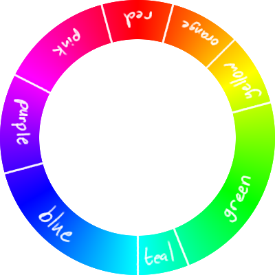
Strictly speaking, a hue is a specific wavelength of light. I think it’s really weird to think about light as coming in a bunch of wavelengths, so I try not to think about the precise physical mechanism too much. Instead, here’s a rainbow.

These are all the hues the human eye can see. (Well, the ones this image and its colorspace and your screen can express, anyway.) They form a nice spectrum, which wraps around so the two red ends touch.
(And here is the first weird implication of the physical interpretation: purple is not a real color, in the sense that there is no single wavelength of light that we see as purple. The actual spectrum runs from red to blue; when we see red and blue simultaneously, we interpret it as purple.)
The spectrum is divided by three sharp lines: yellow, cyan, and magenta. The areas between those lines are largely dominated by red, green, and blue. These are the two sets of primary colors, those hues from which any others can be mixed.
Red, green, and blue (RGB) make up the additive primary colors, so named because they add light on top of black. LCD screens work exactly this way: each pixel is made up of three small red, green, and blue rectangles. It’s also how the human eye works, which is fascinating but again a bit too physical.
Cyan, magenta, and yellow are the subtractive primary colors, which subtract light from white. This is how ink, paint, and other materials work. When you look at an object, you’re seeing the colors it reflects, which are the colors it doesn’t absorb. A red ink reflects red light, which means it absorbs green and blue light. Cyan ink only absorbs red, and yellow ink only absorbs blue; if you mix them, you’ll get ink that absorbs both red and blue green, and thus will appear green. A pure black is often included to make CMYK; mixing all three colors would technically get you black, but it might be a bit muddy and would definitely use three times as much ink.
The great kindergarten lie
Okay, you probably knew all that. What confused me for the longest time was how no one ever mentioned the glaring contradiction with what every kid is taught in grade school art class: that the primary colors are red, blue, and yellow. Where did those come from, and where did they go?
I don’t have a canonical answer for that, but it does make some sense. Here’s a comparison: the first spectrum is a full rainbow, just like the one above. The second is the spectrum you get if you use red, blue, and yellow as primary colors.
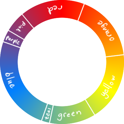
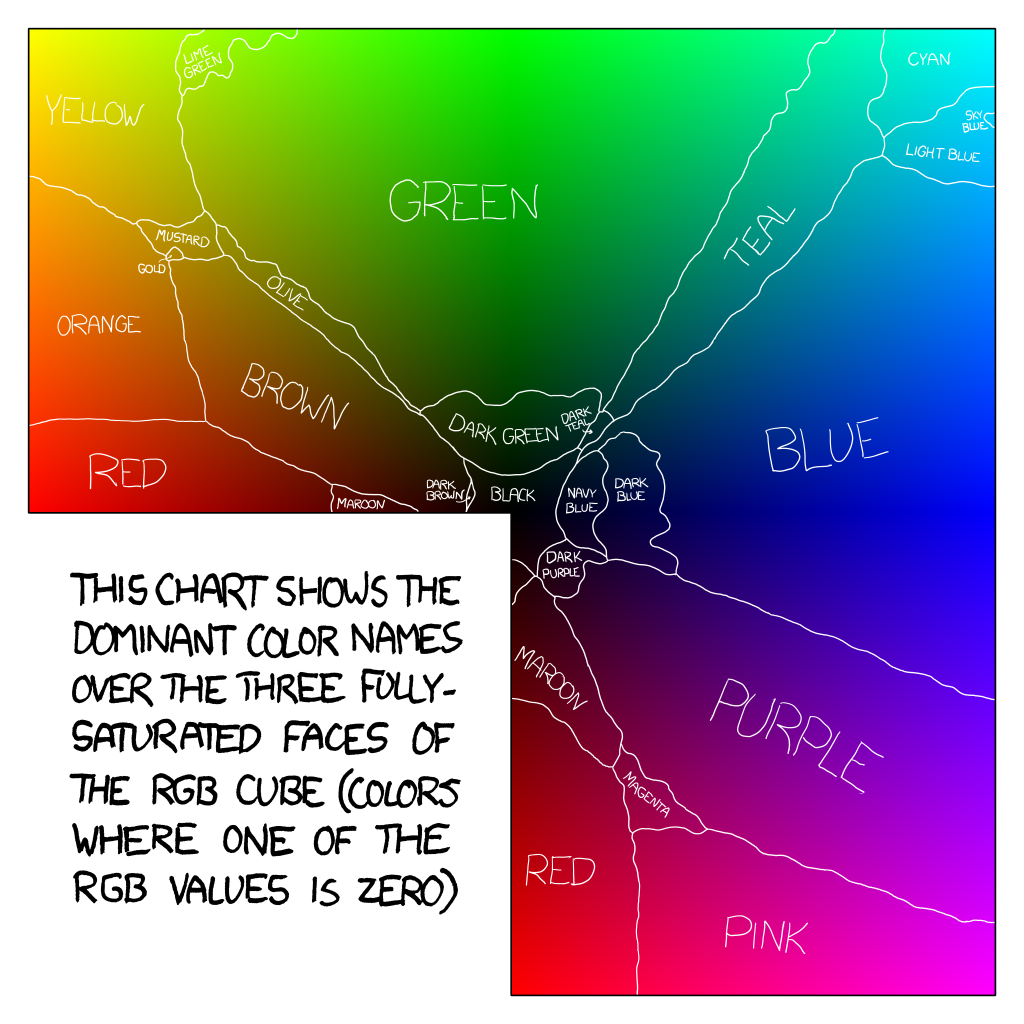
The color names come from xkcd’s color survey, which asked a massive number of visitors to give freeform names to a variety of colors. One of the results was a map of names for all the fully-saturated colors, providing a rough consensus for how English speakers refer to them.
The first wheel is what you get if you start with red, green, and blue — but since we’re talking about art class here, it’s really what you get if you start with cyan, magenta, and yellow. The color names are spaced fairly evenly, save for blue and green, which almost entirely consume the bottom half.
The second wheel is what you get if you start with red, blue, and yellow. Red has replaced magenta, and blue has replaced cyan, so neither color appears on the wheel — red and blue are composites in the subtractive model, and you can’t make primary colors like cyan or magenta out of composite colors.
Look what this has done to the distribution of names. Pink and purple have shrunk considerably. Green is half its original size and somewhat duller. Red, orange, and yellow now consume a full half of the wheel.
There’s a really obvious advantage here, if you’re a painter: people are orange.
Yes, yes, we subdivide orange into a lot of more specific colors like “peach” and “brown”, but peach is just pale orange, and brown is just dark orange. Everyone, of every race, is approximately orange. Sunburn makes you redder; fear and sickness make you yellower.
People really like to paint other people, so it makes perfect sense to choose primary colors that easily mix to make people colors.
Meanwhile, cyan and magenta? When will you ever use those? Nothing in nature remotely resembles either of those colors. The true color wheel is incredibly, unnaturally bright. The reduced color wheel is much more subdued, with only one color that stands out as bright: yellow, the color of sunlight.
You may have noticed that I even cheated a little bit. The blue in the second wheel isn’t the same as the blue from the first wheel; it’s halfway between cyan and blue, a tertiary color I like to call azure. True pure blue is just as unnatural as true cyan; azure is closer to the color of the sky, which is reflected as the color of water.
People are orange. Sunlight is yellow. Dirt and rocks and wood are orange. Skies and oceans are blue. Blush and blood and sunburn are red. Sunsets are largely red and orange. Shadows are blue, the opposite of yellow. Plants are green, but in sun or shade they easily skew more blue or yellow.
All of these colors are much easier to mix if you start with red, blue, and yellow. It may not match how color actually works, but it’s a useful approximation for humans. (Anyway, where will you find dyes that are cyan or magenta? Blue is hard enough.)
I’ve actually done some painting since I first thought about this, and would you believe they sell paints in colors other than bright red, blue, and yellow? You can just pick whatever starting colors you want and the whole notion of “primary” goes a bit out the window. So maybe this is all a bit moot.
More on color names
The way we name colors fascinates me.
A “basic color term” is a single, unambiguous, very common name for a group of colors. English has eleven: red, orange, yellow, green, blue, purple, black, white, gray, pink, and brown.
Of these, orange is the only tertiary hue; brown is the only name for a specifically low-saturation color; pink and grey are the only names for specifically light shades. I can understand grey — it’s handy to have a midpoint between black and white — but the other exceptions are quite interesting.
Looking at the first color wheel again, “blue” and “green” together consume almost half of the spectrum. That seems reasonable, since they’re both primary colors, but “red” is relatively small; large chunks of it have been eaten up by its neighbors.
Orange is a tertiary color in either RGB or CMYK: it’s a mix of red and yellow, a primary and secondary color. Yet we ended up with a distinct name for it. I could understand if this were to give white folks’ skin tones their own category, similar to the reasons for the RBY art class model, but we don’t generally refer to white skin as “orange”. So where did this color come from?
Sometimes I imagine a parallel universe where we have common names for other tertiary colors. How much richer would the blue/green side of the color wheel be if “chartreuse” or “azure” were basic color terms? Can you even imagine treating those as distinct colors, not just variants or green or blue? That’s exactly how we treat orange, even though it’s just a variant of red.
I can’t speak to whether our vocabulary truly influences how we perceive or think (and that often-cited BBC report seems to have no real source). But for what it’s worth, I’ve been trying to think of “azure” as distinct for a few years now, and I’ve had a much easier time dealing with blues in art and design. Giving the cyan end of blue a distinct and common name has given me an anchor, something to arrange thoughts around.
Come to think of it, yellow is an interesting case as well. A decent chunk of the spectrum was ultimately called “yellow” in the xkcd map; here’s that chunk zoomed in a bit.

How much of this range would you really call yellow, rather than green (or chartreuse!) or orange? Yellow is a remarkably specific color: mixing it even slightly with one of its neighbors loses some of its yellowness, and darkening it moves it swiftly towards brown.
I wonder why this is. When we see a yellowish-orange, are we inclined to think of it as orange because it looks like orange under yellow sunlight? Is it because yellow is between red and green, and the red and green receptors in the human eye pick up on colors that are very close together?
Most human languages develop their color terms in a similar order, with a split between blue and green often coming relatively late in a language’s development. Of particular interest to me is that orange and pink are listed as a common step towards the end — I’m really curious as to whether that happens universally and independently, or it’s just influence from Western color terms.
I’d love to see a list of the basic color terms in various languages, but such a thing is proving elusive. There’s a neat map of how many colors exist in various languages, but it doesn’t mention what the colors are. It’s easy enough to find a list of colors in various languages, like this one, but I have no idea whether they’re basic in each language. Note also that this chart only has columns for English’s eleven basic colors, even though Russian and several other languages have a twelfth basic term for azure. The page even mentions this, but doesn’t include a column for it, which seems ludicrous in an “omniglot” table.
The only language I know many color words in is Japanese, so I went delving into some of its color history. It turns out to be a fascinating example, because you can see how the color names developed right in the spelling of the words.
See, Japanese has a couple different types of words that function like adjectives. Many of the most common ones end in -i, like kawaii, and can be used like verbs — we would translate kawaii as “cute”, but it can function just as well as “to be cute”. I’m under the impression that -i adjectives trace back to Old Japanese, and new ones aren’t created any more.
That’s really interesting, because to my knowledge, only five Japanese color names are in this form: kuroi (black), shiroi (white), akai (red), aoi (blue), and kiiroi (yellow). So these are, necessarily, the first colors the language could describe. If you compare to the chart showing progression of color terms, this is the bottom cell in column IV: white, red, yellow, green/blue, and black.
A great many color names are compounds with iro, “color” — for example, chairo (brown) is cha (tea) + iro. Of the five basic terms above, kiiroi is almost of that form, but unusually still has the -i suffix. (You might think that shiroi contains iro, but shi is a single character distinct from i. kiiroi is actually written with the kanji for iro.) It’s possible, then, that yellow was the latest of these five words — and that would give Old Japanese words for white, red/yellow, green/blue, and black, matching the most common progression.
Skipping ahead some centuries, I was surprised to learn that midori, the word for green, was only promoted to a basic color fairly recently. It’s existed for a long time and originally referred to “greenery”, but it was considered to be a shade of blue (ao) until the Allied occupation after World War II, when teaching guidelines started to mention a blue/green distinction. (I would love to read more details about this, if you have any; the West’s coming in and adding a new color is a fascinating phenomenon, and I wonder what other substantial changes were made to education.)
Japanese still has a number of compound words that use ao (blue!) to mean what we would consider green: aoshingou is a green traffic light, aoao means “lush” in a natural sense, aonisai is a greenhorn (presumably from the color of unripe fruit), aojiru is a drink made from leafy vegetables, and so on.
This brings us to at least six basic colors, the fairly universal ones: black, white, red, yellow, blue, and green. What others does Japanese have?
From here, it’s a little harder to tell. I’m not exactly fluent and definitely not a native speaker, and resources aimed at native English speakers are more likely to list colors familiar to English speakers. (I mean, until this week, I never knew just how common it was for aoi to mean green, even though midori as a basic color is only about as old as my parents.)
I do know two curious standouts: pinku (pink) and orenji (orange), both English loanwords. I can’t be sure that they’re truly basic color terms, but they sure do come up a lot. The thing is, Japanese already has names for these colors: momoiro (the color of peach — flowers, not the fruit!) and daidaiiro (the color of, um, an orange). Why adopt loanwords for concepts that already exist?
I strongly suspect, but cannot remotely qualify, that pink and orange weren’t basic colors until Western culture introduced the idea that they could be — and so the language adopted the idea and the words simultaneously. (A similar thing happened with grey, natively haiiro and borrowed as guree, but in my limited experience even the loanword doesn’t seem to be very common.)
Based on the shape of the words and my own unqualified guesses of what counts as “basic”, the progression of basic colors in Japanese seems to be:
- black, white, red (+ yellow), blue (+ green) — Old Japanese
- yellow — later Old Japanese
- brown — sometime in the past millenium
- green — after WWII
- pink, orange — last few decades?
And in an effort to put a teeny bit more actual research into this, I searched the Leeds Japanese word frequency list (drawn from websites, so modern Japanese) for some color words. Here’s the rank of each. Word frequency is generally such that the actual frequency of a word is inversely proportional to its rank — so a word in rank 100 is twice as common as a word in rank 200. The five -i colors are split into both noun and adjective forms, so I’ve included an adjusted rank that you would see if they were counted as a single word, using ab / (a + b).
- white: 1010 ≈ 1959 (as a noun) + 2083 (as an adjective)
- red: 1198 ≈ 2101 (n) + 2790 (adj)
- black: 1253 ≈ 2017 (n) + 3313 (adj)
- blue: 1619 ≈ 2846 (n) + 3757 (adj)
- green: 2710
- yellow: 3316 ≈ 6088 (n) + 7284 (adj)
- orange: 4732 (orenji), n/a (daidaiiro)
- pink: 4887 (pinku), n/a (momoiro)
- purple: 6502 (murasaki)
- grey: 8472 (guree), 10848 (haiiro)
- brown: 10622 (chairo)
- gold: 12818 (kin’iro)
- silver: n/a (gin’iro)
- navy: n/a (kon)
“n/a” doesn’t mean the word is never used, only that it wasn’t in the top 15,000.
I’m not sure where the cutoff is for “basic” color terms, but it’s interesting to see where the gaps lie. I’m especially surprised that yellow is so far down, and that purple (which I hadn’t even mentioned here) is as high as it is. Also, green is above yellow, despite having been a basic color for less than a century! Go, green.
For comparison, in American English:
- black: 254
- white: 302
- red: 598
- blue: 845
- green: 893
- yellow: 1675
- brown: 1782
- golden: 1835
- græy: 1949
- pink: 2512
- orange: 3171
- purple: 3931
- silver: n/a
- navy: n/a
Don’t read too much into the actual ranks; the languages and corpuses are both very different.
Color models
There are numerous ways to arrange and identify colors, much as there are numerous ways to identify points in 3D space. There are also benefits and drawbacks to each model, but I’m often most interested in how much sense the model makes to me as a squishy human.
RGB is the most familiar to anyone who does things with computers — it splits a color into its red, green, and blue channels, and measures the amount of each from “none” to “maximum”. (HTML sets this range as 0 to 255, but you could just as well call it 0 to 1, or -4 to 7600.)
RGB has a couple of interesting problems. Most notably, it’s kind of difficult to read and write by hand. You can sort of get used to how it works, though I’m still not particularly great at it. I keep in mind these rules:
-
The largest channel is roughly how bright the color is.
This follows pretty easily from the definition of RGB: it’s colored light added on top of black. The maximum amount of every color makes white, so less than the maximum must be darker, and of course none of any color stays black.
-
The smallest channel is how pale (desaturated) the color is.
Mixing equal amounts of red, green, and blue will produce grey. So if the smallest channel is green, you can imagine “splitting” the color between a grey (green, green, green), and the leftovers (red - green, 0, blue - green). Mixing grey with a color will of course make it paler — less saturated, closer to grey — so the bigger the smallest channel, the greyer the color.
-
Whatever’s left over tells you the hue.
It might be time for an illustration. Consider the color (50%, 62.5%, 75%). The brightness is “capped” at 75%, the largest channel; the desaturation is 50%, the smallest channel. Here’s what that looks like.
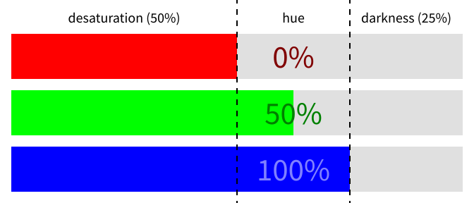
Cutting out the grey and the darkness leaves a chunk in the middle of actual differences between the colors. Note that I’ve normalized it to (0%, 50%, 100%), which is the percentage of that small middle range. Removing the smallest and largest channels will always leave you with a middle chunk where at least one channel is 0% and at least one channel is 100%. (Or it’s grey, and there is no middle chunk.)
The odd one out is green at 50%, so the hue of this color is halfway between cyan (green + blue) and blue. That hue is… azure! So this color is a slightly darkened and fairly dull azure. (The actual amount of “greyness” is the smallest relative to the largest, so in this case it’s about ⅔ grey, or about ⅓ saturated.) Here’s that color.

This is a bit of a pain to do in your head all the time, so why not do it directly?
HSV is what you get when you directly represent colors as hue, saturation, and value. It’s often depicted as a cylinder, with hue represented as an angle around the color wheel: 0° for red, 120° for green, and 240° for blue. Saturation ranges from grey to a fully-saturated color, and value ranges from black to, er, the color. The azure above is (210°, ⅓, ¾) in HSV — 210° is halfway between 180° (cyan) and 240° (blue), ⅓ is the saturation measurement mentioned before, and ¾ is the largest channel.
It’s that hand-waved value bit that gives me trouble. I don’t really know how to intuitively explain what value is, which makes it hard to modify value to make the changes I want. I feel like I should have a better grasp of this after a year and a half of drawing, but alas.
I prefer HSL, which uses hue, saturation, and lightness. Lightness ranges from black to white, with the unperturbed color in the middle. Here’s lightness versus value for the azure color. (Its lightness is ⅝, the average of the smallest and largest channels.)

The lightness just makes more sense to me. I can understand shifting a color towards white or black, and the color in the middle of that bar feels related to the azure I started with. Value looks almost arbitrary; I don’t know where the color at the far end comes from, and it just doesn’t seem to have anything to do with the original azure.
I’d hoped Wikipedia could clarify this for me. It tells me value is the same thing as brightness, but the mathematical definition on that page matches the definition of intensity from the little-used HSI model. I looked up lightness instead, and the first sentence says it’s also known as value. So lightness is value is brightness is intensity, but also they’re all completely different.
Wikipedia also says that HSV is sometimes known as HSB (where the “B” is for “brightness”), but I swear I’ve only ever seen HSB used as a synonym for HSL. I don’t know anything any more.
Oh, and in case you weren’t confused enough, the definition of “saturation” is different in HSV and HSL. Good luck!
Wikipedia does have some very nice illustrations of HSV and HSL, though, including depictions of them as a cone and double cone.
(Incidentally, you can use HSL directly in CSS now — there are hsl() and hsla() CSS3 functions which evaluate as colors. Combining these with Sass’s scale-color() function makes it fairly easy to come up with decent colors by hand, without having to go back and forth with an image editor. And I can even sort of read them later!)
An annoying problem with all of these models is that the idea of “lightness” is never quite consistent. Even in HSL, a yellow will appear much brighter than a blue with the same saturation and lightness. You may even have noticed in the RGB split diagram that I used dark red and green text, but light blue — the pure blue is so dark that a darker blue on top is hard to read! Yet all three colors have the same lightness in HSL, and the same value in HSV.
Clearly neither of these definitions of lightness or brightness or whatever is really working. There’s a thing called luminance, which is a weighted sum of the red, green, and blue channels that puts green as a whopping ten times brighter than blue. It tends to reflect how bright colors actually appear.
Unfortunately, luminance and related values are only used in fairly obscure color models, like YUV and Lab. I don’t mean “obscure” in the sense that nobody uses them, but rather that they’re very specialized and not often seen outside their particular niches: YUV is very common in video encoding, and Lab is useful for serious photo editing.
Lab is pretty interesting, since it’s intended to resemble how human vision works. It’s designed around the opponent process theory, which states that humans see color in three pairs of opposites: black/white, red/green, and yellow/blue. The idea is that we perceive color as somewhere along these axes, so a redder color necessarily appears less green — put another way, while it’s possible to see “yellowish green”, there’s no such thing as a “yellowish blue”.
(I wonder if that explains our affection for orange: we effectively perceive yellow as a fourth distinct primary color.)
Lab runs with this idea, making its three channels be lightness (but not the HSL lightness!), a (green to red), and b (blue to yellow). The neutral points for a and b are at zero, with green/blue extending in the negative direction and red/yellow extending in the positive direction.
Lab can express a whole bunch of colors beyond RGB, meaning they can’t be shown on a monitor, or even represented in most image formats. And you now have four primary colors in opposing pairs. That all makes it pretty weird, and I’ve actually never used it myself, but I vaguely aspire to do so someday.
I think those are all of the major ones. There’s also XYZ, which I think is some kind of master color model. Of course there’s CMYK, which is used for printing, but it’s effectively just the inverse of RGB.
With that out of the way, now we can get to the hard part!
Colorspaces
I called RGB a color model: a way to break colors into component parts.
Unfortunately, RGB alone can’t actually describe a color. You can tell me you have a color (0%, 50%, 100%), but what does that mean? 100% of what? What is “the most blue”? More importantly, how do you build a monitor that can display “the most blue” the same way as other monitors? Without some kind of absolute reference point, this is meaningless.
A color space is a color model plus enough information to map the model to absolute real-world colors. There are a lot of these. I’m looking at Krita’s list of built-in colorspaces and there are at least a hundred, most of them RGB.
I admit I’m bad at colorspaces and have basically done my best to not ever have to think about them, because they’re a big tangled mess and hard to reason about.
For example! The effective default RGB colorspace that almost everything will assume you’re using by default is sRGB, specifically designed to be this kind of global default. Okay, great.
Now, sRGB has gamma built in. Gamma correction means slapping an exponent on color values to skew them towards or away from black. The color is assumed to be in the range 0–1, so any positive power will produce output from 0–1 as well. An exponent greater than 1 will skew towards black (because you’re multiplying a number less than 1 by itself), whereas an exponent less than 1 will skew away from black.
What this means is that halfway between black and white in sRGB isn’t (50%, 50%, 50%), but around (73%, 73%, 73%). Here’s a great example, borrowed from this post (with numbers out of 255):
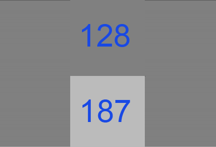
Which one looks more like the alternating bands of black and white lines? Surely the one you pick is the color that’s actually halfway between black and white.
And yet, in most software that displays or edits images, interpolating white and black will give you a 50% gray — much darker than the original looked. A quick test is to scale that image down by half and see whether the result looks closer to the top square or the bottom square. (Firefox, Chrome, and GIMP get it wrong; Krita gets it right.)
The right thing to do here is convert an image to a linear colorspace before modifying it, then convert it back for display. In a linear colorspace, halfway between white and black is still 50%, but it looks like the 73% grey. This is great fun: it involves a piecewise function and an exponent of 2.4.
It’s really difficult to reason about this, for much the same reason that it’s hard to grasp text encoding problems in languages with only one string type. Ultimately you still have an RGB triplet at every stage, and it’s very easy to lose track of what kind of RGB that is. Then there’s the fact that most images don’t specify a colorspace in the first place so you can’t be entirely sure whether it’s sRGB, linear sRGB, or something entirely; monitors can have their own color profiles; you may or may not be using a program that respects an embedded color profile; and so on. How can you ever tell what you’re actually looking at and whether it’s correct? I can barely keep track of what I mean by “50% grey”.
And then… what about transparency? Should a 50% transparent white atop solid black look like 50% grey, or 73% grey? Krita seems to leave it to the colorspace: sRGB gives the former, but linear sRGB gives the latter. Does this mean I should paint in a linear colorspace? I don’t know! (Maybe I’ll give it a try and see what happens.)
Something I genuinely can’t answer is what effect this has on HSV and HSL, which are defined in terms of RGB. Is there such a thing as linear HSL? Does anyone ever talk about this? Would it make lightness more sensible?
There is a good reason for this, at least: the human eye is better at distinguishing dark colors than light ones. I was surprised to learn that, but of course, it’s been hidden from me by sRGB, which is deliberately skewed to dedicate more space to darker colors. In a linear colorspace, a gradient from white to black would have a lot of indistinguishable light colors, but appear to have severe banding among the darks.

All three of these are regular black-to-white gradients drawn in 8-bit color (i.e., channels range from 0 to 255). The top one is the naïve result if you draw such a gradient in sRGB: the midpoint is the too-dark 50% grey. The middle one is that same gradient, but drawn in a linear colorspace. Obviously, a lot of dark colors are “missing”, in the sense that we could see them but there’s no way to express them in linear color. The bottom gradient makes this more clear: it’s a gradient of all the greys expressible in linear sRGB.
This is the first time I’ve ever delved so deeply into exactly how sRGB works, and I admit it’s kind of blowing my mind a bit. Straightforward linear color is so much lighter, and this huge bias gives us a lot more to work with. Also, 73% being the midpoint certainly explains a few things about my problems with understanding brightness of colors.
There are other RGB colorspaces, of course, and I suppose they all make for an equivalent CMYK colorspace. YUV and Lab are families of colorspaces, though I think most people talking about Lab specifically mean CIELAB (or “L*a*b*”), and there aren’t really any competitors. HSL and HSV are defined in terms of RGB, and image data is rarely stored directly as either, so there aren’t really HSL or HSV colorspaces.
I think that exhausts all the things I know.
Real world color is also a lie
Just in case you thought these problems were somehow unique to computers. Surprise! Modelling color is hard because color is hard.
I’m sure you’ve seen the checker shadow illusion, possibly one of the most effective optical illusions, where the presence of a shadow makes a gray square look radically different than a nearby square of the same color.
Our eyes are very good at stripping away ambient light effects to tell what color something “really” is. Have you ever been outside in bright summer weather for a while, then come inside and everything is starkly blue? Lingering compensation for the yellow sunlight shifting everything to be slightly yellow; the opposite of yellow is blue.
Or, here, I like this. I’m sure there are more drastic examples floating around, but this is the best I could come up with. Here are some Pikachu I found via GIS.
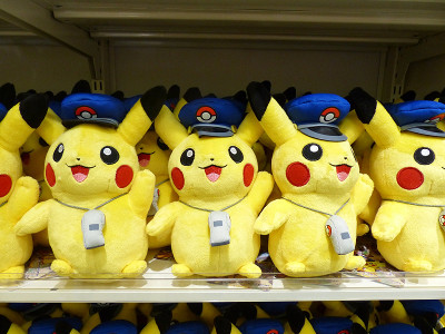
My question for you is: what color is Pikachu?
Would you believe… orange?
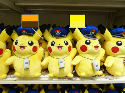
In each box, the bottom color is what I color-dropped, and the top color is the same hue with 100% saturation and 50% lightness. It’s the same spot, on the same plush, right next to each other — but the one in the background is orange, not yellow. At best, it’s brown.
What we see as “yellow in shadow” and interpret to be “yellow, but darker” turns out to be another color entirely. (The grey whistles are, likewise, slightly blue.)
Did you know that mirrors are green? You can see it in a mirror tunnel: the image gets slightly greener as it goes through the mirror over and over.
Distant mountains and other objects, of course, look bluer.
This all makes painting rather complicated, since it’s not actually about painting things the color that they “are”, but painting them in such a way that a human viewer will interpret them appropriately.
I, er, don’t know enough to really get very deep here. I really should, seeing as I keep trying to paint things, but I don’t have a great handle on it yet. I’ll have to defer to Mel’s color tutorial. (warning: big)
Blending modes
You know, those things in Photoshop.
I’ve always found these remarkably unintuitive. Most of them have names that don’t remotely describe what they do, the math doesn’t necessarily translate to useful understanding, and they’re incredibly poorly-documented. So I went hunting for some precise definitions, even if I had to read GIMP’s or Krita’s source code.
In the following, A is a starting image, and B is something being drawn on top with the given blending mode. (In the case of layers, B is the layer with the mode, and A is everything underneath.) Generally, the same operation is done on each of the RGB channels independently. Everything is scaled to 0–1, and results are generally clamped to that range.
I believe all of these treat layer alpha the same way: linear interpolation between A and the combination of A and B. If B has alpha t, and the blending mode is a function f, then the result is t × f(A, B) + (1 - t) × A.
If A and B themselves have alpha, the result is a little more complicated, and probably not that interesting. It tends to work how you’d expect. (If you’re really curious, look at the definition of BLEND() in GIMP’s developer docs.)
-
Normal:
B. No blending is done; new pixels replace old pixels. -
Multiply:
A × B. As the name suggests, the channels are multiplied together. This is very common in digital painting for slapping on a basic shadow or tinting a whole image.I think the name has always thrown me off just a bit because “Multiply” sounds like it should make things bigger and thus brighter — but because we’re dealing with values from 0 to 1, Multiply can only ever make colors darker.
Multiplying with black produces black. Multiplying with white leaves the other color unchanged. Multiplying with a gray is equivalent to blending with black. Multiplying a color with itself squares the color, which is similar to applying gamma correction.
Multiply is commutative — if you swap
AandB, you get the same result. -
Screen:
1 - (1 - A)(1 - B). This is sort of an inverse of Multiply; it multiplies darkness rather than lightness. It’s defined as inverting both colors, multiplying, and inverting the result. Accordingly, Screen can only make colors lighter, and is also commutative. All the properties of Multiply apply to Screen, just inverted. -
Hard Light: Equivalent to Multiply if
Bis dark (i.e., less than 0.5), or Screen ifBis light. There’s an additional factor of 2 included to compensate for how the range ofBis split in half: Hard Light withB = 0.4is equivalent to Multiply withB = 0.8, since 0.4 is 0.8 of the way to 0.5. Right.This seems like a possibly useful way to apply basic highlights and shadows with a single layer? I may give it a try.
The math is commutative, but since
Bis checked andAis not, Hard Light is itself not commutative. -
Soft Light: Like Hard Light, but softer. No, really. There are several different versions of this, and they’re all a bit of a mess, not very helpful for understanding what’s going on.
If you graphed the effect various values of
Bhad on a color, you’d have a straight line from 0 up to 1 (atB = 0.5), and then it would abruptly change to a straight line back down to 0. Soft Light just seeks to get rid of that crease. Here’s Hard Light compared with GIMP’s Soft Light, whereAis a black to white gradient from bottom to top, andBis a black to white gradient from left to right.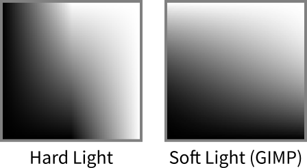
You can clearly see the crease in the middle of Hard Light, where
B = 0.5and it transitions from Multiply to Screen. -
Overlay: Equivalent to either Hard Light or Soft Light, depending on who you ask. In GIMP, it’s Soft Light; in Krita, it’s Hard Light except the check is done on
Arather thanB. Given the ambiguity, I think I’d rather just stick with Hard Light or Soft Light explicitly. -
Difference:
abs(A - B). Does what it says on the tin. I don’t know why you would use this? Difference with black causes no change; Difference with white inverts the colors. Commutative. -
Addition and Subtract:
A + BandA - B. I didn’t think much of these until I discovered that Krita has a built-in brush that uses Addition mode. It’s essentially just a soft spraypaint brush, but because it uses Addition, painting over the same area with a dark color will gradually turn the center white, while the fainter edges remain dark. The result is a fiery glow effect, which is pretty cool. I used it manually as a layer mode for a similar effect, to make a field of sparkles. I don’t know if there are more general applications.Addition is commutative, of course, but Subtract is not.
-
Divide:
A ÷ B. Apparently this is the same as changing the white point to1 - B. Accordingly, the result will blow out towards white very quickly asBgets darker. -
Dodge and Burn:
A ÷ (1 - B)and1 - (1 - A) ÷ B. Inverses in the same way as Multiply and Screen. Similar to Divide, but withBinverted — so Dodge changes the white point toB, with similar caveats as Divide. I’ve never seen either of these effects not look horrendously gaudy, but I think photographers manage to use them, somehow. -
Darken Only and Lighten Only:
min(A, B)andmax(A, B). Commutative. -
Linear Light:
(2 × A + B) - 1. I think this is the same as Sai’s “Lumi and Shade” mode, which is very popular, at least in this house. It works very well for simple lighting effects, and shares the Soft/Hard Light property that darker colors darken and lighter colors lighten, but I don’t have a great grasp of it yet and don’t know quite how to explain what it does. So I made another graph:
Super weird! Half the graph is solid black or white; you have to stay in that sweet zone in the middle to get reasonable results.
This is actually a combination of two other modes, Linear Dodge and Linear Burn, combined in much the same way as Hard Light. I’ve never encountered them used on their own, though.
-
Hue, Saturation, Value: Work like you might expect: converts
Ato HSV and replaces either its hue, saturation, or value withB‘s. -
Color: Uses HSL, unlike the above three. Combines
B‘s hue and saturation withA‘s lightness. -
Grain Extract and Grain Merge:
A - B + 0.5andA + B - 0.5. These are clearly related to film grain, somehow, but their exact use eludes me.I did find this example post where someone combines a photo with a blurred copy using Grain Extract and Grain Merge. Grain Extract picked out areas of sharp contrast, and Grain Merge emphasized them, which seems relevant enough to film grain. I might give these a try sometime.
Those are all the modes in GIMP (except Dissolve, which isn’t a real blend mode; also, GIMP doesn’t have Linear Light). Photoshop has a handful more. Krita has a preposterous number of other modes, no, really, it is absolutely ridiculous, you cannot even imagine.
I may be out of things
There’s plenty more to say about color, both technically and design-wise — contrast and harmony, color blindness, relativity, dithering, etc. I don’t know if I can say any of it with any particular confidence, though, so perhaps it’s best I stop here.
I hope some of this was instructive, or at least interesting!
