I’ve been dipping my toes into Doom mapping again recently. Obviously I’ve done it successfully once before, but I’m having trouble doing it a second time.
I have three major problems: drawing everything too small, drawing everything too rectangular, and completely blanking on what to do next. Those last two are a bit tricky, but struggling with scale? That sounds like a problem I can easily solve with charts and diagrams and math.
Some fundamental metrics
Doom’s mapping rules and built-in textures offer a few fixed reference points.
The z planes — floor and ceiling — are a 64×64 grid anchored at the origin. All “flat” textures are aligned to this grid. (ZDoom lets you rotate, scale, and offset flats, but in vanilla Doom, you sometimes have to design architecture around texture alignment.)
All actors (objects) are square and axis-aligned. Doomguy is 32×56. However, it’s very difficult for an actor to move down a corridor of the same width, and the axis-alignment means a 32-unit square couldn’t fit down a 32-unit diagonal hallway. (It’s rare to see a hallway narrower than 64 or a room height shorter than 64.)
The viewport is 41 pixels above the ground. Doomguy’s maximum step height is 24, which is actually fairly large, almost half his height. Doomguy can balance on a ledge of any width.
The vast majority of Doom’s wall textures are 64×128. A few larger textures are 128×128, and a handful of very large outdoor textures are 256×128. A few “strut” textures and door borders are 8 or 16 wide. Some interesting exceptions:
DOOR3, the door you appear to have entered from in many Doom maps, is 64×72. So isDOOR1.EXITDOORhas some extra stuff on it, but the actual door part is also 64×72.BIGDOOR1, the silver door with the UAC logo on it, is 128×96.MIDBARS3is a railing texture that’s 64×72.- The Icon of Sin is built out of a 3x3 grid of textures. The full image is 768×384.
EXITSIGNis 64×16, though only half of it is the actual part that says “EXIT”; the rest is the sides of the sign.- The
STEPtextures are all 16 high.
Since Doom’s textures tend to be 128 tall, we can conclude that a standard room tends to be no more than 128 tall. Any more and the texture would start to tile, which works poorly with a lot of textures.
The problem
Vertical distance is fine. Doom doesn’t have a lot of vertical movement, so vertical distances tend not to get too outlandish in the first place.
The trouble is that I don’t know how big spaces are. I draw rooms and they turn out, much later, to be far too cramped. I draw buildings and outdoor areas and they turn out to not really have enough space to fit everything I want.
An obvious approach is to find a conversion between Doom units and real-world units, then judge distances based on real-world units. That sounds great, but I don’t have a good sense of real-world units, either. How big is the room I’m in now? Somewhere between ten and a hundred feet, I guess? Thirty? How much is thirty feet, is that a lot?
How long is my car, say? I guess two of me could lie down end-to-end beside it, so that’s twelve feet? That sounds like I’m underestimating. Fifteen? Are these reasonable guesses? I don’t know.
Hm, well. The answer turns out to be exactly halfway between at thirteen and a half feet, so I don’t know what we’ve learned here exactly.
Okay, so let’s consider in terms of architecture. How long is the quiet residential street in front of my house? I have no idea. The next biggest thing is a house, and I don’t know how wide a house is, or how many houses there are on this street. I could estimate the street in terms of house lengths, and estimate a house in terms of car lengths, and estimate a car length in terms of my height, but that’s enough wild guesses that the final answer could be a whole order of magnitude off.
I never have any reason to appreciate or internalize length measurements, especially moderately large ones. I have no reference point.
Also, Doom’s grid and texture sizes mean that everything is done in multiples of powers of two. I know the powers of two, but I don’t actually know every single multiple of 64 up to 32768, so I occasionally run into the problem that the numbers lose all meaning. How many 64s are in 768, again…?
Also, Doom doesn't make any sense
The other problem with relating to real-world sizes is that it assumes there’s a way to convert between Doom and the real world. Alas, the universe of Doom has much more in common with the exaggerated and cartoony scale of platformers than with the hyper-realism in modern shooters.
Consider Doomguy. Here’s his default forward-facing sprite, PLAYA1. The pink area is his 32×56 collision box, the red dot is where he fires from, and the yellow dot is the location of the viewport.
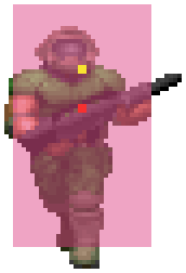
The collision box is the same height as the sprite itself, but it gets shifted upwards slightly because of the sprite offsets. (Every sprite has an offset indicating where its bottom center is, since that’s where the game tracks an object’s position. If Doomguy’s sprite were just drawn from the bottom, he’d look like he were standing on his tiptoes.)
It is generally accepted — by which I mean “Doom Wiki says so” — that 32 units of height correspond to one meter (39”), which makes Doomguy about 5 feet 8 inches tall. It also makes him one meter wide, which seems rather extreme. The usual handwave is to say that vertical and horizontal scales are different (because pixels weren’t square in the original game), so 32 units of width correspond to ¾ of a meter (just shy of 30”).
That doesn’t really make sense to me. If the architecture were truly distorted to compensate for the pixel size, then surely wall textures would be, too. They aren’t. Switches are perfect 32×32 squares. Several floor textures also exist separately as wall textures, and they weren’t distorted in any way. This is a cute explanation that neatly ties together several bits of Doom trivia, but I don’t think it was a deliberate design decision.
Plus, according to this sprite, Doomguy’s collision box is significantly wider than his actual appearance. I don’t know why this is — perhaps the extra space is where he keeps his hundred rockets and half a dozen spare weapons. If we’re interested in aesthetics, surely we should be going by Doomguy’s sprite rather than his in-game dimensions.
More importantly… this weird ratio still doesn’t jive with most architecture. Consider the fast skinny doors introduced in Doom II, which are 64×128. At 32u = 1m, those are two meters wide and four meters tall, or 78” × 157”. The Internet tells me that an interior residential doorway is around 32” × 80” (2:5), and a human being is around 18” × 69” (~1:4).
Here are those measurements alongside the supposed sizes of Doomguy and a skinny door. Something seems slightly off.
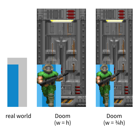
The light blue boxes are the collision boxes; the dark blue boxes are Doomguy’s apparent visible size. I’m using his waist rather than his shoulders, because most people’s (or at least, my) shoulders are not too much wider than their hips — however Doomguy is a beefcake carved out of pure muscle and doors would not be designed for him.
It seems as though all the architecture in Doom is about twice the size it should be, for whatever reason. Look what happens if I shrink the door, but not Doomguy:
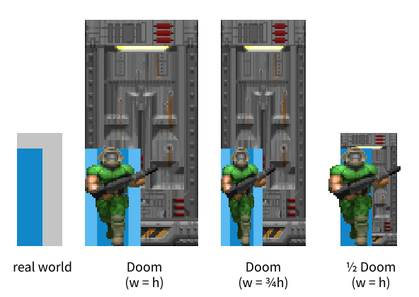
If I use some ZDoom shenanigans to shrink a door within the game, it looks rather more like a real door. (You’d have a hard time fitting through it without modifying the player’s radius, though.)
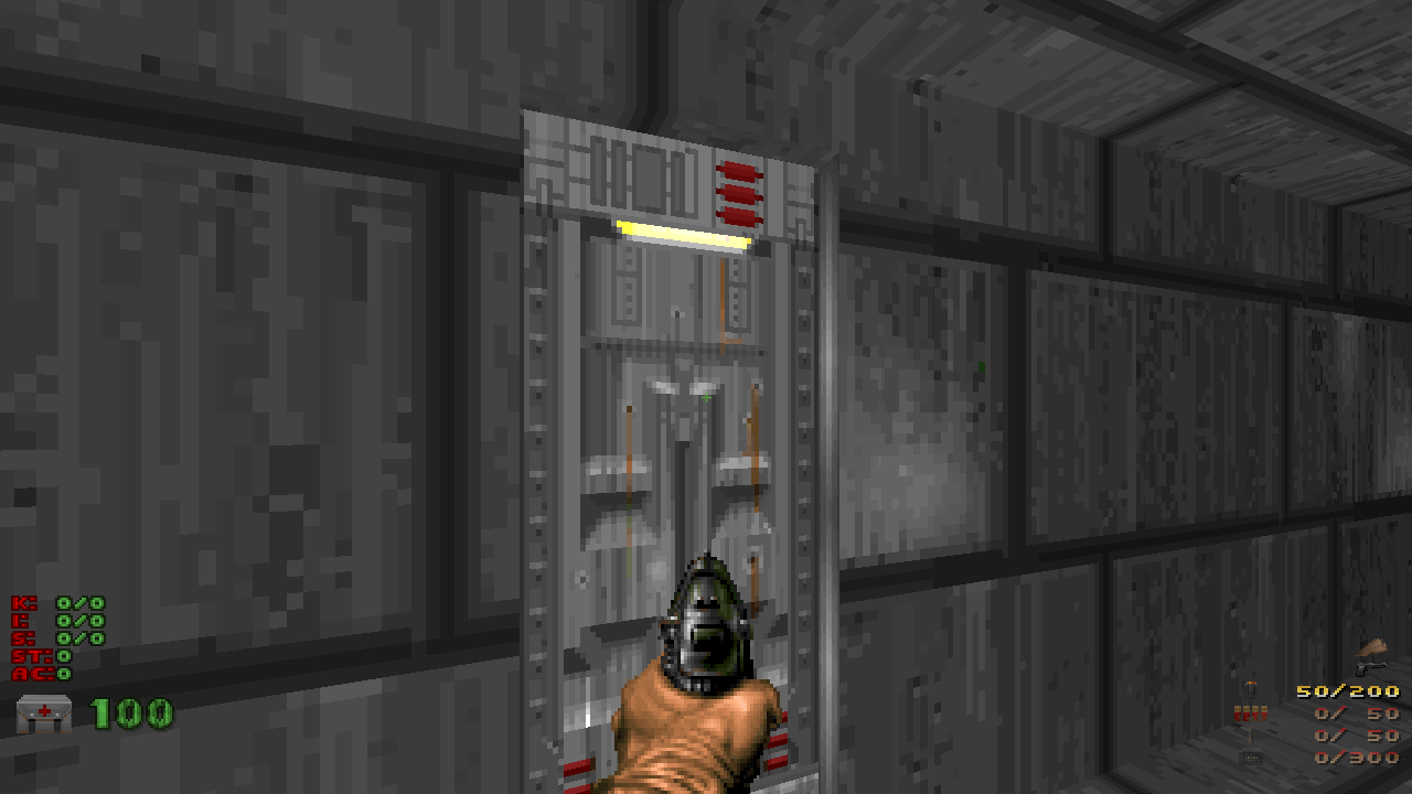
It’s not just architecture! Keycard sprites are 14×16, which would be about a foot and a half square. The shotgun is 63 pixels long, a whopping 77”. A shotgun shell is 7 pixels long, almost 9”. The candelabra is 61 pixels tall — taller than Doomguy! — which is just over six feet. This is ridiculous. Halving all of these lengths makes them closer to something reasonable.
It appears, for whatever reason, that the world of Doom is roughly twice the size of the world we’re used to. (Or perhaps Doomguy has been shrunk by half.) That matches my attempts at replicating real-world places to scale — they turned out unusually cramped.
64 units equal 1 meter, then. Problem solved.
Ah, well, about that. The 64×128 doors make sense, but… real doorways don’t span the full height of a room, yet many Doom rooms are 128 tall. Or less. The starting area in E1M1, the hallway in MAP01, and the DOOR1 “entrance” door are all 72 units tall, which converts to less than four feet.
Let’s try something else. Tom Hall says in the Doom Bible that the 128-unit walls in Wolfenstein 3D were eight feet thick, i.e. 16 units equal 1 foot. The 64-unit grid is thus four feet, which seems reasonable. The maximum step height would be 18 inches, and shallow steps would be 6 inches, which also seem reasonable — the stairs in my house are 7” tall, and the most I can comfortably step up is 3 at a time.
But this still makes those 72-unit rooms be only four and a half feet tall.
This isn’t a problem that can be solved with different height and width scaling, because we’ve come down to a conflict between door/room height and step height. If those 72-unit rooms are a more reasonable eight feet tall (the standard) then 9 units are 1 foot, and Doomguy’s step height is over two and a half feet. Also, those 64×128 doors are over nine feet tall.
The fact is, Doomguy has goofy proportions, and the environment was designed around them. The textures have a gritty semi-realistic aesthetic, but comparing the levels to real-world architecture makes about as much sense as designing Mario levels around real places. Actual humans cannot jump several times their own height, so the design language doesn’t translate at all.
Better reference points
If I can’t use the real world to get a sense of scale, I might as well use Doom itself.
I’ve gone through some large areas that are particularly memorable to me, areas that I have a good sense of, and measured their dimensions.
However, I’ve tried using a new kind of unit: Doom grid cells. All of the numbers in parentheses are counts of 64-unit cells (for horizontal units only). It turns out to be much easier to grapple with 22 vs 24 than 1408 vs 1536.
-
E1M1: Hangar
The iconic starting room is 640×768 (10×12) and 72 tall. The recessed area in the middle is 448×320 (7×5) and 216 tall.
-
E3M8: Dis
The entire shuriken fits in a 3712×3584 (58×56) box. The sky is 256 units above the inner part of the ground.
-
MAP01: Entryway
The opening room is 640×448 (10×7) and 256 tall. The subsequent hallway is 128 (2) wide and 72 tall.
The large room before the exit is 960 (15) deep and 192 tall. Wow! I always think 1024 (16) sounds really huge, but this one humble room is almost that big.
-
MAP02: Underhalls
The entire area with the little brick “house” is 576×896 (9×14), measured from the water. The surrounding walkway is 88 tall; the grass is 216 below the sky.
The whole map fits in a 1920×1920 (30×30) box.
-
MAP03: The Gantlet
The main large outdoor area is carved from a 1664×832 (26×13) rectangle. The water is 264 below the sky.
The entire starting area just about fits in a 704×704 (11×11) box. The hallway is 128 tall; the center room is 160 tall.
-
MAP07: Dead Simple
The inner part, including the walkway, is 1536×1472 (24×23). The outdoor parts are 120 tall; the roof is 80 above the walkway.
-
MAP08: Tricks and Traps
The starting room is 448×448 (7×7) and 192 tall.
The cacodemon room is 448 (7) wide, 1792 (28) from the door to the far wall, and 288 tall.
The cyberdemon room is roughly 896×448 (14×7) and varies between 96 and 128 tall.
The room you teleport to with the pain elementals is 704×704 (11×11) and 144 tall.
-
MAP12: The Factory
The entire map is 3776×4288 (59×67). Outdoors is 208 tall. The outer wall is 96 tall, and the main raised outdoor part is 80 high, 128 below the sky.
The main “factory” interior is 2560×1536 (40×24).
-
MAP14: The Inmost Dens, the most detailed map in Doom II
Water to sky is 200, and the floor is 16 above the water. The brick wall surrounding everything is 32 high. The pillars between areas are 88 tall.
The entire map fits in a 3520×3904 (55×61) box.
-
MAP15: Industrial Zone
Ground to sky is 600.
The central structure — the one you jump off to reach the other side of the map — is 1600×1600 (25×25).
The entire map, excluding the purely aesthetic waterfront, fits in a particularly pleasing 4416×6144 (69×96) box.
-
MAP18: Courtyard
The grassy courtyard itself is, very roughly, 2112×1920 (33×30). Grass to sky is 192.
The surrounding area with the columns is 576 (9) at its deepest.
The separate cacodemon area with the blue key is 768×1216 (12×19) and 272 tall.
-
MAP23: Barrels o’ Fun
The starting hallway is 2240 (35) long, 384 (6) wide, and 256 tall.
The blood pit is 960×1024 (15×16) and a whopping 384 tall. The hallways leading to it are 64×528 (1×8¼) and 80 tall.
-
MAP27: Monster Condo
The starting area plus library form a rough 2624×1728 (41×27) rectangle. The other main area plus pain elemental room form a rough 2432×1600 (38×25) rectangle. Both are 128 tall.
The twin marble rooms are about 576×1024 (9×16), not counting the 128 (2)-deep closets on the sides and backs. Total height is 256, and the walkway is 80 above the floor.
-
MAP29: The Living End
The huge central blood pit is 3072×2816 (48×44) and a whopping 696 tall, which is almost five and a half 128s. The platform you first see it from is 200 above the floor.
The central exit slab is 1216×1216 (19×19).
-
MAP30: Icon of Sin
The main area is 2688×1728 (42×27) and 768 tall. Each platform is 128 above the next. Pressing the switch up top raises the lift by 512, or four 128s.
-
MAP32: Grosse
The main room is a 2176×2944 (34×46) rectangle, plus a 1024 (16)-deep lead-in bit.
It might help to know that the player’s maximum run speed is about 583 units per second… or just over 9 grid cells per second. With straferunning, it’s about 11⅔ grid cells.
I also ran all of these maps through a slightly modified wad2svg and combined them into a single image, depicting all of them at the same scale. (If you like, I also have a large SVG version.)
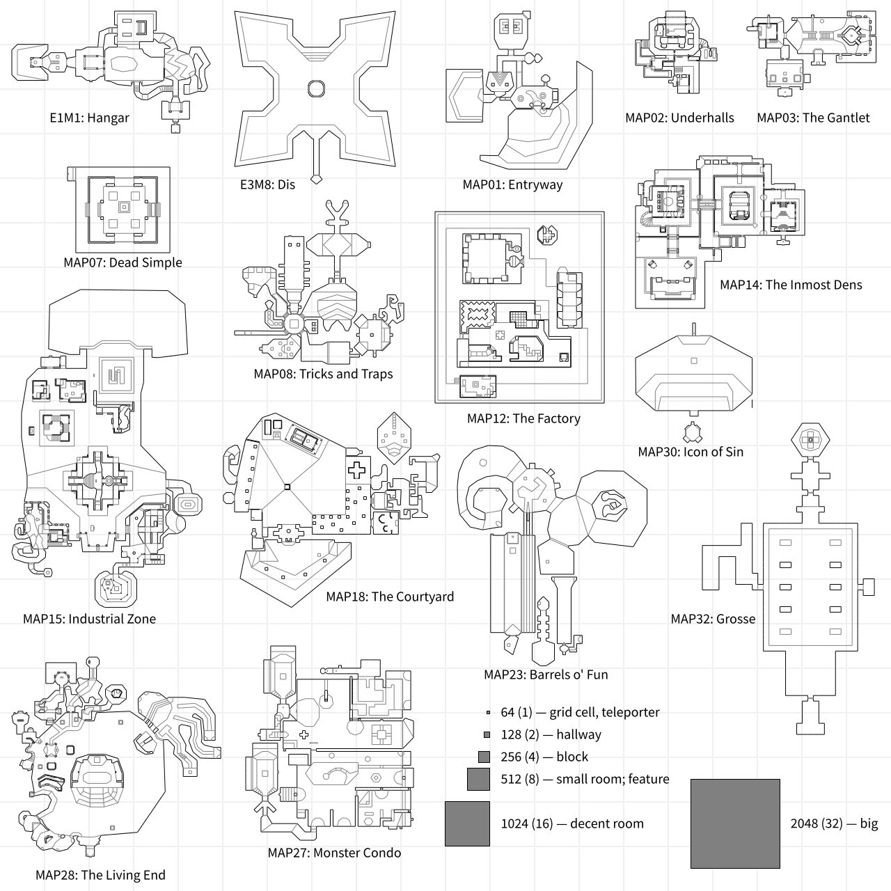
One pixel is 16 Doom units; four pixels are 64 units or one grid cell; the grid lines mark 1024 units or 16 grid cells. The player can run across one grid cell in 1.8 seconds, or 1.4 seconds when straferunning.
I don’t know if I’ve absorbed anything intuitively from this yet, but it’ll give me something to refer back to the next time I try to map. Seeing that the entirety of Underhalls just about fits inside the Icon of Sin room, for example, is downright fascinating and says a lot about the importance of breaking space up.
Ah, you got me, this whole post was an excuse to list those dimensions and make a collage of Doom maps.
Postscript
What if I fixed the player size?
Assuming Tom Hall is correct that 1 real-world foot is equal to 16 Doom units, a six-foot-tall Marine should be 96 units tall. With the magic of ZDoom, I can make that happen. I can also fix the heights of the humanoid enemies.
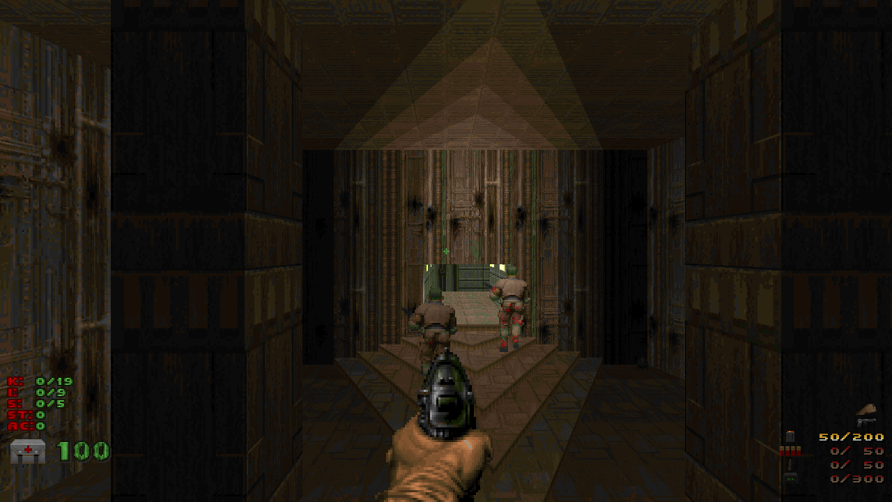
The results are pretty hilarious. Highly recommend running around for a bit with one of these. Hint: you may want to bind a key to “crouch”.

![[articles]](https://eev.ee/theme/images/category-articles.png)
