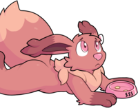
Inktober is an ancient and hallowed art tradition, dating all the way back to sometime, when it was started by someone. The idea is simple: draw something in ink every day. Real ink. You know. On paper.
I tried this last year. I quit after four days. Probably because I tried to do it without pencil sketches, and I’m really not very good at drawing things correctly the first time. I’d hoped that forcing myself to do it would spark some improvement, but all it really produced was half a week of frustration and bad artwork.
This year, I was convinced to try again without unnecessarily handicapping myself, so I did that. Three weeks and more than forty ink drawings later, here are some thoughts.
Some background
I’ve been drawing seriously since the beginning of 2015. I spent the first few months working primarily in pencil, until I was gifted a hand-me-down tablet in March; almost everything has been digital since then.
I’ve been fairly lax about learning to use color effectively — I have enough trouble just producing a sketch I like, so I’ve mostly been trying to improve there. Doesn’t feel worth the effort to color a sketch I’m not really happy with, and by the time I’m really happy with it, I’m itching to draw something else. Whoops. Until I get quicker or find some mental workaround, monochrome ink is a good direction to try.
I have an ongoing “daily” pokémon series, so I’ve been continuing that in ink. (Everyone else seems to be using some list of single-word prompts, but I didn’t even know about that until after I’d started, so, whoops.)
I’ve got a few things I want to get better at:
-
Detailing, whatever that means. Part of the problem is that I’m not sure what it means. My art is fairly simple and cartoony, and I know it’s possible to be more detailed without doing realistic shading, but I don’t have a grasp of how to think about that.
-
Better edges, which mostly means line weight. I mentally categorize this as a form of scale, which also includes tips like “don’t let parallel lines get too close together” and “don’t draw one or two very small details”.
-
Better backgrounds and environments. Or, let’s be honest, any backgrounds and environments — I draw an awful lot of single characters floating in an empty white void. My fixed-size canvas presents an obvious and simple challenge: fill the page!
-
More interesting poses, and relatedly, getting a better hang of anatomy. I started drawing the pokémon series partly for this reason: a great many pokémon have really unusual shapes I’ve tried drawing before. Dealing with weird anatomy and trying to map it to my existing understanding should hopefully flex some visualization muscles.
-
Lighting, probably? I’m aware that things not facing a light source are in shadow, but my understanding doesn’t extend very far beyond that. How does light affect a large outdoor area? How can you represent the complexity of light and shadow with only a single pen? Art, especially cartoony art, has an entire vocabulary of subtle indicators of shadow and volume that I don’t know much about.
Let’s see what exactly I’ve learned.
Analog materials are very different
I’ve drawn plenty of pencil sketches on paper, and I’ve done a few watercolors, but I’ve never done this volume of “serious” art on paper before.
All my inks so far are in a 3.5” × 5” sketchbook. I’ll run out of pages in a few days, at which point I’ll finish up the month in a bigger sketchbook. It’s been a mixed blessing: I have less page to fill, but details are smaller and more fiddly, so mistakes are more obvious. I also don’t have much room for error with the composition.
I started out drawing with a small black Faber–Castell “PITT artist pen”. Around day five, I borrowed C3 and C7 (light and dark cool greys) Copic sketch markers from Mel; later I got a C5 as well. A few days ago I bought a Lamy Safari fountain pen with Noodler’s Heart of Darkness ink.
Both the FC pen and the fountain pen are ultimately still pens, but they have some interesting differences in edge cases. Used very lightly at an extreme angle, the FC pen produces very scratchy-looking lines… sometimes. Sometimes it does nothing instead, and you must precariously tilt the pen until you find the magical angle, hoping you don’t suddenly get a solid line where you didn’t want it. The Lamy has been much more consistent: it’s a little more willing to draw thinner lines than it’s intended for, and it hasn’t created any unpleasant surprises. The Lamy feels much smoother overall, like it flows, which is appropriate since that’s how fountain pens work.
Markers are interesting. The last “serious” art I did on paper was watercolor, which is pretty fun — I can water a color down however much I want, and if I’m lucky and fast, I can push color around on the paper a bit before it dries. Markers, ah, not so much. Copics are supposed to be blendable, but I’ve yet to figure out how to make that happen. It might be that my sketchbook’s paper is too thin, but the ink seems to dry within seconds, too fast for me to switch markers and do much of anything. For the same reason, I have to color an area by… “flood-filling”? I can’t let the edge of the colored area dry, or when I go back to extend that edge, I’ll be putting down a second layer of ink and create an obvious dark band. I’ve learned to keep the edge wet as much as possible.
On the plus side, going over dry ink in the same color will darken it, and I’ve squeezed several different shades of gray out of just the light marker. The brush tip can be angled in several different ways to make different shapes; I’ve managed a grassy background and a fur texture just by holding the marker differently. Marker ink does bleed very slightly, but it tends to stop at pen ink, a feature I’ve wanted in digital art for at least a century. I can also kinda make strokes that fade out by moving the marker quickly and lifting it off the paper as I go; surely there are more clever things to be done here, but I’ve yet to figure them out.
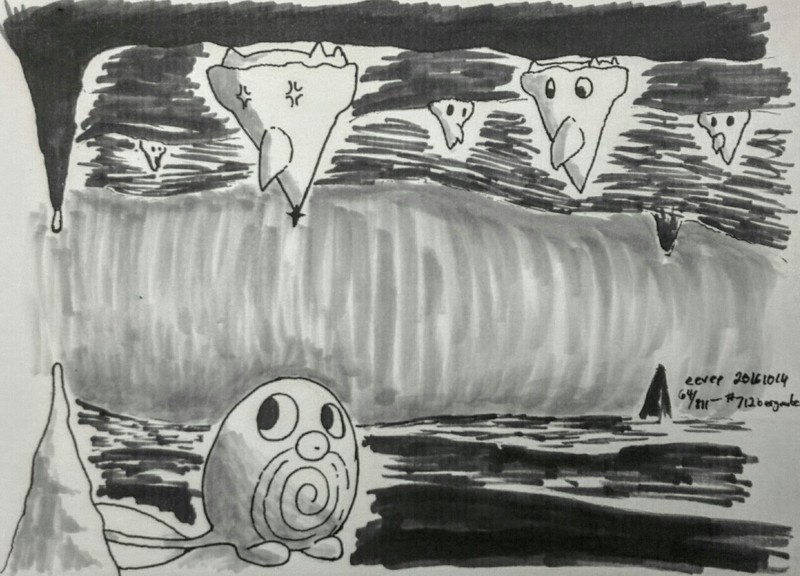
The drawing of bergmite above was done as the light marker started to run dry, which is not a problem I was expecting. The marker still worked, but not very well. The strokes on the cave wall in the background aren’t a deliberate effect; those are the strokes the marker was making, and I tried to use them as best I could. I didn’t have the medium marker yet, and the dark marker is very dark — almost black. I’d already started laying down marker, so I couldn’t very well finish the picture with just the pen, and I had to improvise.
Ink is permanent
Well. Obviously.
I have to be pretty careful about what I draw, which creates a bit of a conflict. If I make smooth, confident strokes, I’m likely to fuck them up, and I can’t undo and try again. If I make a lot of short strokes, I get those tell-tale amateurish scratchy lines. If I trace my sketch very carefully and my hand isn’t perfectly steady, the resulting line will be visibly shaky.
I probably exacerbated the shaky lines with my choice of relatively small paper; there’s no buffer between those tiny wobbles and the smallest level of detail in the drawing itself. I can’t always even see where my tiny sketch is going, because my big fat fingers are in the way.
I’ve also had the problem that my sketch is such a mess that I can’t tell where a line is supposed to be going… until I’ve drawn it and it’s obviously wrong. Again, small paper exacerbates this by compressing sketches.
Since I can’t fix mistakes, I’ve had to be a little creative about papering over them.
-
I did one ink with very stark contrast: shadows were completely filled with ink, highlights were bare paper. No shading, hatching, or other middle ground. I’d been meaning to try the approach anyway, but I finally did it after making three or four glaring mistakes. In the final work, they’re all hidden in shadow, so you can’t really tell anything ever went wrong.
-
I’ve managed to disguise several mistakes of the “curved this line too early” variety just by adding some more parallel strokes and pretending I intended to hatch it all along.
-
One of the things I’ve been trying to figure out is varying line weight, and one way to vary it is to make edges thicker when in shadows. A clever hack has emerged here.
You see, it’s much easier for me to draw an upwards arc than a downwards arc. (I think this is fairly universal?) I can of course just rotate the paper, but if I’m drawing a cylinder, it’s pretty obvious when the top was drawn with a slight bias in one direction and the bottom was drawn with a slight bias in the other direction.
My lifehack is to draw the top and bottom with the paper oriented the same way, then gradually thicken the bottom, “carving” it into the right shape as I go. I can make a lot of small adjustments and still end up with a single smooth line that looks more or less deliberate.
-
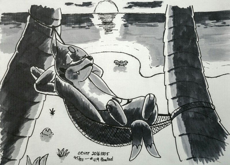
As a last resort… leave it and hope no one notices. That’s what I did for the floatzel above, who has a big fat extra stroke across their lower stomach. It’s in one of the least interesting parts of the picture, though, so it doesn’t really stand out, even though it’s on one of the lightest surfaces.
Ink takes a while
Ink drawings feel like they’ve consumed my entire month. Sketching and then lining means drawing everything twice. Using physical ink means I have to nail the sketch — but I’m used to digital, where I can sketch sloppily and then fixing up lines as I go. I also can’t rearrange the sketch, move it around on the paper if I started in the wrong place, or even erase precisely, so I’ve had to be much more careful and thoughtful even with pencil. That’s a good thing — I don’t put nearly enough conscious thought into what I’m drawing — but it definitely takes longer. In a few thorny cases I’ve even resorted to doing a very loose digital sketch, then drawing the pencil sketch based off of that.
All told, each one takes maybe two hours, and I’ve been doing two at a time… but wait, that’s still only four hours, right? How are they taking most of a day?
I suspect a bunch of factors are costing me more time than expected. If I can’t think of a scene idea, I’ll dawdle on Twitter for a while. Two “serious” attempts in a medium I’m not used to can be a little draining and require a refractory period. Fragments of time between or around two larger tasks are, of course, lost forever. And I guess there’s that whole thing where I spent half the month waking up in the middle of the night for no reason and then being exhausted by late evening.
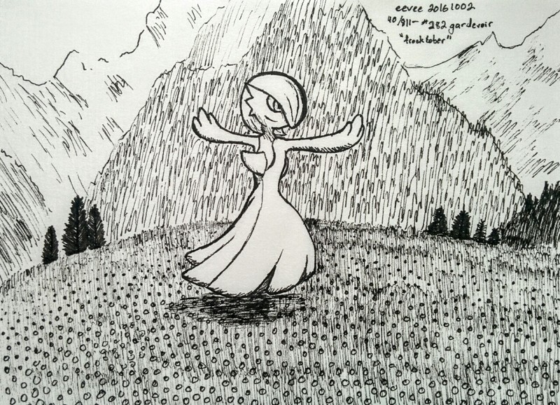
Occasionally I’ve experimented with some approach that turns out to be incredibly tedious and time-consuming, like the early Gardevoir above. You would not believe how long that damn grass took. Or maybe you would, if you’d ever tried similar. Even the much lazier tree-covered mountain in the background seemed to take a while. And this is on a fairly small canvas!
I’m feeling a bit exhausted with ink work at this point, which is not the best place to be after buying a bunch of ink supplies. I definitely want to do more of it in the future, but maybe not daily. I also miss being able to undo. Sweet, sweet undo.
Precision is difficult, and I am bad at planning
These turn out to be largely the same problem.
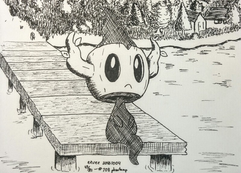
I’m not a particularly patient person, so I like to jump from the sketch into the inking as soon as possible. Sometimes this means I overlook some details. Here’s that whole “not consciously thinking enough” thing again. Consider, in the above image,
-
The two buildings at the top right are next to each other, yet the angles of their roofs suggest they’re facing in slightly different directions, which doesn’t make a lot of sense for artificial structures.
-
The path leading from the dock doesn’t quite make sense, and the general scale of the start of the dock versus the shrubs and trees is nonsense. The trees themselves are pretty cool, but it looks like I plopped them down individually without really having a full coherent plan going in. Which is exactly what happened.
Imagining spaces in enough detail to draw them is tough, and not something I’ve really had to do much before. It’s ultimately the same problem I have with game level design, though, so hopefully a breakthrough in one will help me with the other.
-
Phantump’s left eye has a clear white edge showing the depth of the hole in the trunk, but the right eye’s edge was mostly lost to some errant strokes and subsequent attempts to fix them. Also, even the left margin is nowhere near as thick as the trunk’s bottom edge.
-
The crosshatched top of phantump’s head blends into the noisy grassy background. The fix for this is to leave a thin white edge around the top of the head. I think I intended to do this, then completely forgot about it as I was drawing the grass. I suppose I’m not used to reasoning about negative space; I can’t mark or indicate it in any way, nor erase the ink if I later realize I laid down too much.
-
The pupils don’t quite match, but I’d already carved them down a good bit. Negative space problem again. Highlights on dark areas have been a recurring problem all month, especially with markers.
I have no idea how people make beautifully precise inkwork. At the same time, I’ve long had the suspicion that I worry too much about precision and should be a lot looser. I’m missing something here, and I don’t know what it is.
What even is pokémon anatomy
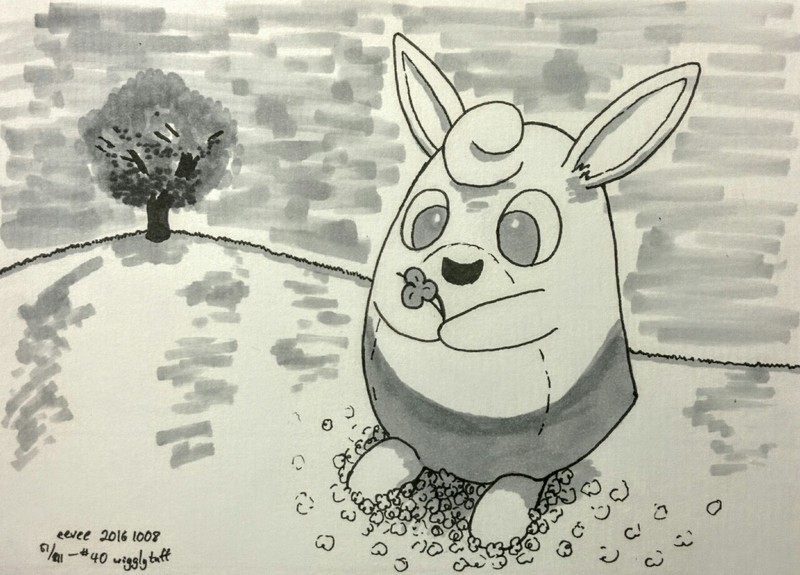
This is a wigglytuff. Wigglytuffs are tall blobs with ears.
I had such a hard time sketching this. (Probably why I rushed the background.)
It turns out that if you draw a wigglytuff even slightly off, the result is a tall blob with ears rather than a wigglytuff. That makes no sense, especially given that wigglytuffs are balloons. Surely, the shape shouldn’t be such a strong part of the wigglytuff identity, and yet it is.
Maybe half of the pokémon I’ve drawn have had some anatomical surprise, even ones I thought I was familiar with. Aerodactyl and huntail have a really pronounced lower jaw. Palpitoad has no arms at all. Pelipper is 70% mouth. Zangoose seems like a straightforward mammal at first glance, but the legs and body and head are all kind of a single blob. Numerous pokémon have no distinct neck, or no distinct shoulders, or a very round abdomen with legs kind of arbitrarily attached somewhere.
Progress, maybe
I don’t know what precisely I’ve gotten out of this experience. I can’t measure artistic progress from one day to the next. I do feel like I’ve gleaned some things, but they seem to be very abstract things. I’m out of the total beginner weeds and solidly into the intermediate hell of just picking up hundreds of little things no one really talks about. All I can do is cross my fingers and push forwards.
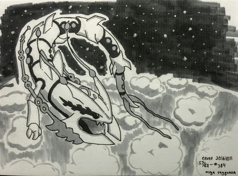
The crowd favorite so far is this mega rayquaza, which is kinda funny to me because I don’t feel like I did anything special here. I just copied a bunch of fiddly details. It looks cool, but it felt more like rote work than a struggle to do a new thing.
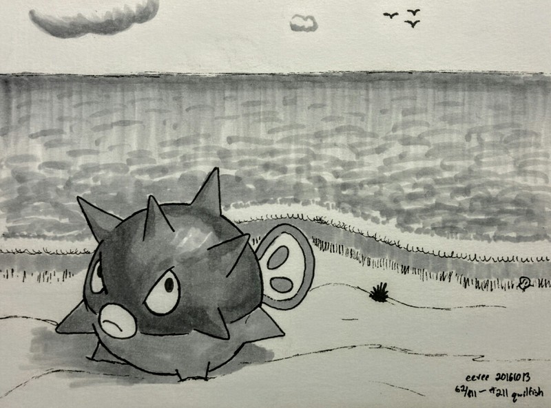
My own favorite is this much simpler qwilfish. It’s the culmination of several attempts to draw water that I liked, and it came out the best by far. The highlight is also definitely the best I’ve drawn this month. Interesting how that works out.
The rest are on on Tumblr, or in this single Twitter thread.
![[updates]](https://eev.ee/theme/images/category-updates.png)
