Another Patreon request from Nova Dasterin:
Maybe something about level design. In relation to a vertical shmup since I’m working on one of those.
I’ve been thinking about level design a lot lately, seeing as how I’ve started… designing levels. Shmups are probably the genre I’m the worst at, but perhaps some general principles will apply universally.
And speaking of general principles, that’s something I’ve been thinking about too.
I’ve been struggling to create a more expansive tileset for a platformer, due to two general problems: figuring out what I want to show, and figuring out how to show it with a limited size and palette. I’ve been browsing through a lot of pixel art from games I remember fondly in the hopes of finding some inspiration, but so far all I’ve done is very nearly copy a dirt tile someone submitted to my potluck project.
Recently I realized that I might have been going about looking for inspiration all wrong. I’ve been sifting through stuff in the hopes of finding something that would create some flash of enlightenment, but so far that aimless tourism has only found me a thing or two to copy.
I don’t want to copy a small chunk of the final product; I want to understand the underlying ideas that led the artist to create what they did in the first place. Or, no, that’s not quite right either. I don’t want someone else’s ideas; I want to identify what I like, figure out why I like it, and turn that into some kinda of general design idea. Find the underlying themes that appeal to me and figure out some principles that I could apply. You know, examine stuff critically.
I haven’t had time to take a deeper look at pixel art this way, so I’ll try it right now with level design. Here, then, are some levels from various games that stand out to me for whatever reason; the feelings they evoke when I think about them; and my best effort at unearthing some design principles from those feelings.
Doom II: MAP10, Refueling Base
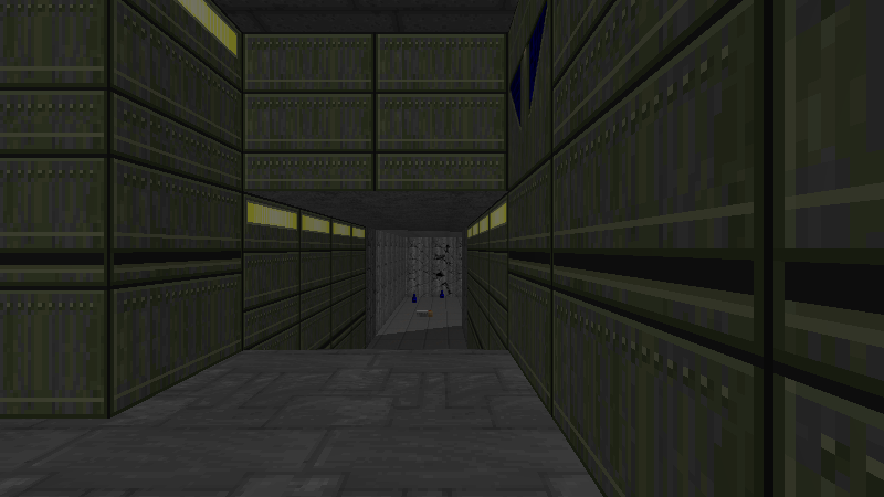
screenshots mine — map via doom wiki — see also textured perspective map (warning: large!) via ian albert — pistol start playthrough
I’m surprising myself by picking Refueling Base. I would’ve expected myself to pick MAP08, Tricks and Traps, for its collection of uniquely bizarre puzzles and mechanisms. Or MAP13, Downtown, the map that had me convinced (erroneously) that Doom levels supported multi-story structures. Or at least MAP08, The Pit, which stands out for the unique way it feels like a plunge into enemy territory.
(Curiously, those other three maps are all Sandy Petersen’s sole work. Refueling Base was started by Tom Hall in the original Doom days, then finished by Sandy for Doom II.)
But Refueling Base is the level I have the most visceral reaction to: it terrifies me.
See, I got into Doom II through my dad, who played it on and off sometimes. My dad wasn’t an expert gamer or anything, but as a ten-year-old, I assumed he was. I watched him play Refueling Base one night. He died. Again, and again, over and over. I don’t even have very strong memories of his particular attempts, but watching my parent be swiftly and repeatedly defeated — at a time when I still somewhat revered parents — left enough of an impression that hearing the level music still makes my skin crawl.
This may seem strange to bring up as a first example in a post about level design, but I don’t think it would have impressed on me quite so much if the level weren’t designed the way it is. (It’s just a video game, of course, and since then I’ve successfully beaten it from a pistol start myself. But wow, little kid fears sure do linger.)
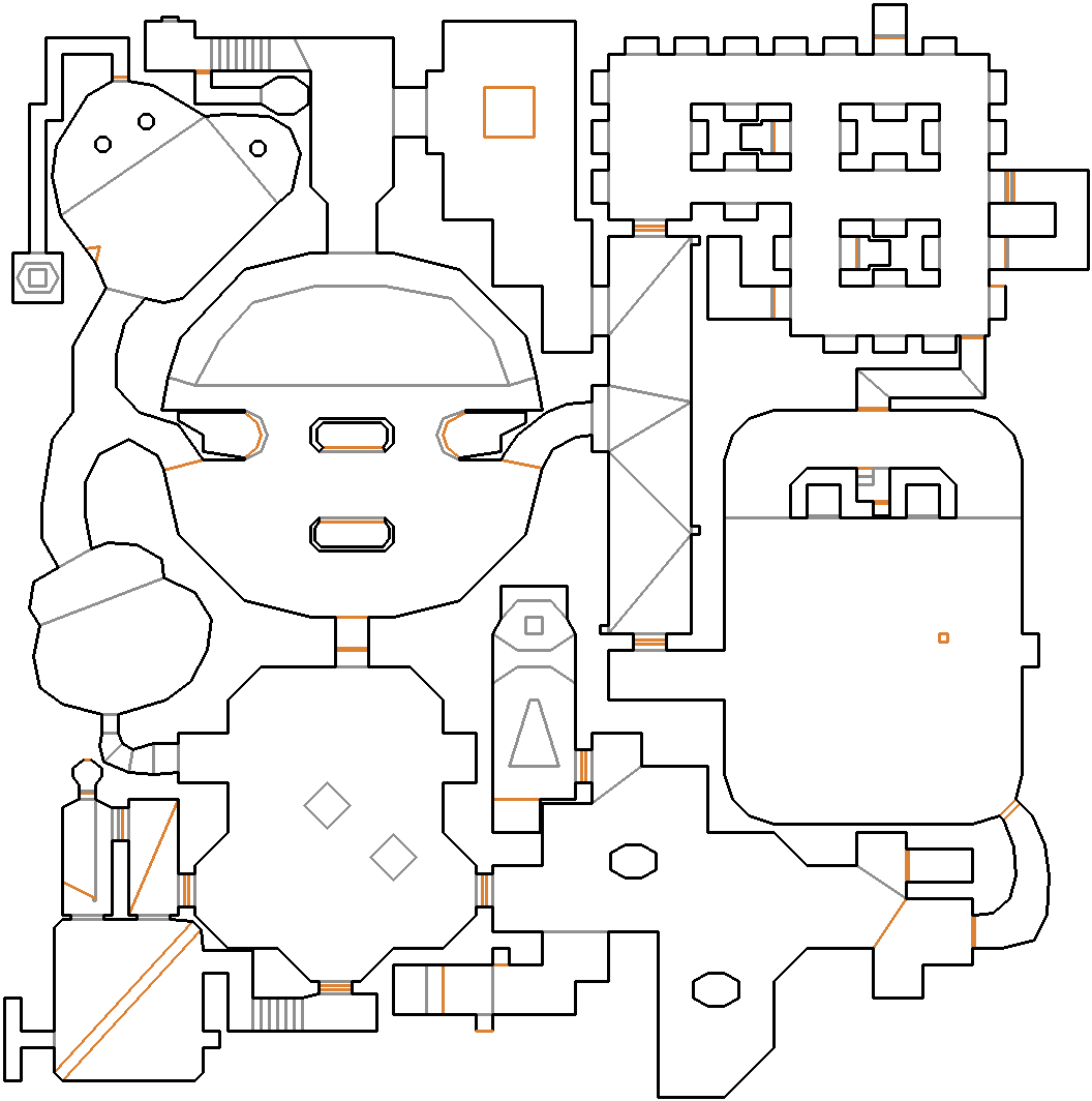
The one thing that most defines the map has to be its interconnected layout. Almost every major area (of which there are at least half a dozen) has at least three exits. Not only are you rarely faced with a dead end, but you’ll almost always have a choice of where to go next, and that choice will lead into more choices.
This hugely informs the early combat. Many areas near the beginning are simply adjacent with no doors between them, so it’s easy for monsters to start swarming in from all directions. It’s very easy to feel overwhelmed by an endless horde; no matter where you run, they just seem to keep coming. (In fact, Refueling Base has the most monsters of any map in the game by far: 279. The runner up is the preceding map at 238.) Compounding this effect is the relatively scant ammo and health in the early parts of the map; getting very far from a pistol start is an uphill battle.
The connections between rooms also yield numerous possible routes through the map, as well as several possible ways to approach any given room. Some of the connections are secrets, which usually connect the “backs” of two rooms. Clearing out one room thus rewards you with a sneaky way into another room that puts you behind all the monsters.
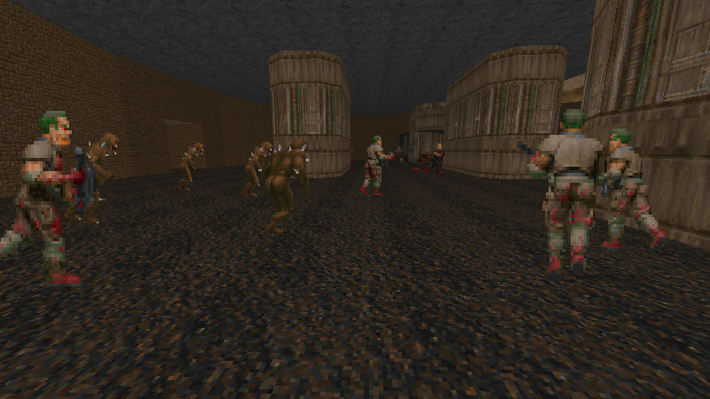
In fact, the map rewards you for exploring it in general.
Well, okay. It might be more accurate to say that that map punishes you for not exploring it. From a pistol start, the map is surprisingly difficult — the early areas offer rather little health and ammo, and your best chance of success is a very specific route that collects weapons as quickly as possible. Many of the most precious items are squirrelled away in (numerous!) secrets, and you’ll have an especially tough time if you don’t find any of them — though they tend to be telegraphed.
One particularly nasty surprise is in the area shown above, which has three small exits at the back. Entering or leaving via any of those exits will open one of the capsule-shaped pillars, revealing even more monsters. A couple of those are pain elementals, monsters which attack by spawning another monster and shooting it at you — not something you want to be facing with the starting pistol.
But nothing about the level indicates this, so you have to make the association the hard way, probably after making several mad dashes looking for cover. My successful attempt avoided this whole area entirely until I’d found some more impressive firepower. It’s fascinating to me, because it’s a fairly unique effect that doesn’t make any kind of realistic sense, yet it’s still built out of familiar level mechanics: walk through an area and something opens up. Almost like 2D sidescroller design logic applied to a 3D space. I really like it, and wish I saw more of it. So maybe that’s a more interesting design idea: don’t be afraid to do something weird only once, as long as it’s built out of familiar pieces so the player has a chance to make sense of it.
A similarly oddball effect is hidden in a “barracks” area, visible on the far right of the map. A secret door leads to a short U-shaped hallway to a marble skull door, which is themed nothing like the rest of the room. Opening it seems to lead back into the room you were just in, but walking through the doorway teleports you to a back entrance to the boss fight at the end of the level.
It sounds so bizarre, but the telegraphing makes it seem very natural; if anything, the “oh, I get it!” moment overrides the weirdness. It stops being something random and becomes something consciously designed. I believe that this might have been built by someone, even if there’s no sensible reason to have built it.
In fact, that single weird teleporter is exactly the kind of thing I’d like to be better at building. It could’ve been just a plain teleporter pad, but instead it’s a strange thing that adds a lot of texture to the level and makes it much more memorable. I don’t know how to even begin to have ideas like that. Maybe it’s as simple as looking at mundane parts of a level and wondering: what could I do with this instead?
I think a big problem I have is limiting myself to the expected and sensible, to the point that I don’t even consider more outlandish ideas. I can’t shake that habit simply by bolding some text in a blog post, but maybe it would help to keep this in mind: you can probably get away with anything, as long as you justify it somehow. Even “justify” here is too strong a word; it takes only the slightest nod to make an arbitrary behavior feel like part of a world. Why does picking up a tiny glowing knight helmet give you 1% armor in Doom? Does anyone care? Have you even thought about it before? It’s green and looks like armor; the bigger armor pickup is also green; yep, checks out.
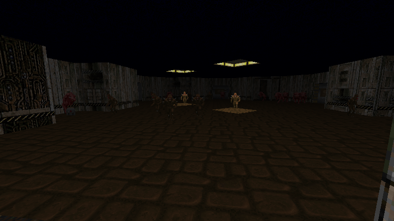
On the other hand, the map as a whole ends up feeling very disorienting. There’s no shortage of landmarks, but every space is distinct in both texture and shape, so everything feels like a landmark. No one part of the map feels particularly central; there are a few candidates, but they neighbor other equally grand areas with just as many exits. It’s hard to get truly lost, but it’s also hard to feel like you have a solid grasp of where everything is. The space itself doesn’t make much sense, even though small chunks of it do. Of course, given that the Hellish parts of Doom were all just very weird overall, this is pretty fitting.
This sort of design fascinates me, because the way it feels to play is so different from the way it looks as a mapper with God Vision. Looking at the overhead map, I can identify all the familiar places easily enough, but I don’t know how to feel the way the map feels to play; it just looks like some rooms with doors between them. Yet I can see screenshots and have a sense of how “deep” in the level they are, how difficult they are to reach, whether I want to visit or avoid them. The lesson here might be that most of the interesting flavor of the map isn’t actually contained within the overhead view; it’s in the use of height and texture and interaction.
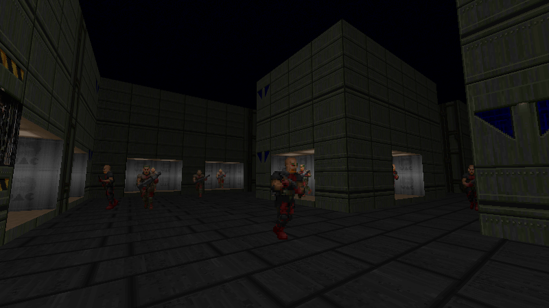
I realize as I describe all of this that I’m really just describing different kinds of contrast. If I know one thing about creative work (and I do, I only know one thing), it’s that effectively managing contrast is super duper important.
And it appears here in spades! A brightly-lit, outdoor, wide-open round room is only a short jog away from a dark, cramped room full of right angles and alcoves. A wide straight hallway near the beginning is directly across from a short, curvy, organic hallway. Most of the monsters in the map are small fry, but a couple stronger critters are sprinkled here and there, and then the exit is guarded by the toughest monster in the game. Some of the connections between rooms are simple doors; others are bizarre secret corridors or unnatural twisty passages.
You could even argue that the map has too much contrast, that it starts to lose cohesion. But if anything, I think this is one of the more cohesive maps in the first third of the game; many of the earlier maps aren’t so much places as they are concepts. This one feels distinctly like it could be something. The theming is all over the place, but enough of the parts seem deliberate.
I hadn’t even thought about it until I sat down to write this post, but since this is a “refueling base”, I suppose those outdoor capsules (which contain green slime, inset into the floor) could be the fuel tanks! I already referred to that dark techy area as “barracks”. Elsewhere is a rather large barren room, which might be where the vehicles in need of refueling are parked? Or is this just my imagination, and none of it was intended this way?
It doesn’t really matter either way, because even in this abstract world of ambiguity and vague hints, all of those rooms still feel like a place. I don’t have to know what the place is for it to look internally consistent.
I’m hesitant to say every game should have the loose design sense of Doom II, but it might be worth keeping in mind that anything can be a believable world as long as it looks consciously designed. And I’d say this applies even for natural spaces — we frequently treat real-world nature as though it were “designed”, just with a different aesthetic sense.
Okay, okay. I’m sure I could clumsily ramble about Doom forever, but I do that enough as it is. Other people have plenty to say if you’re interested.
I do want to stick in one final comment about MAP13, Downtown, while I’m talking about theming. I’ve seen a few people rag on it for being “just a box” with a lot of ideas sprinkled around — the map is basically a grid of skyscrapers, where each building has a different little mini encounter inside. And I think that’s really cool, because those encounters are arranged in a way that very strongly reinforces the theme of the level, of what this place is supposed to be. It doesn’t play quite like anything else in the game, simply because it was designed around a shape for flavor reasons. Weird physical constraints can do interesting things to level design.
Braid: World 4-7, Fickle Companion
screenshots via StrategyWiki — playthrough — playthrough of secret area
I love Braid. If you’re not familiar (!), it’s a platformer where you have the ability to rewind time — whenever you want, for as long as you want, all the way back to when you entered the level.
The game starts in world 2, where you do fairly standard platforming and use the rewind ability to do some finnicky jumps with minimal frustration. It gets more interesting in world 3 with the addition of glowing green objects, which aren’t affected by the reversal of time.
And then there’s world 4, “Time and Place”. I love world 4, so much. It’s unlike anything I’ve ever seen in any other game, and it’s so simple yet so clever.
The premise is this: for everything except you, time moves forwards as you move right, and backwards as you move left.
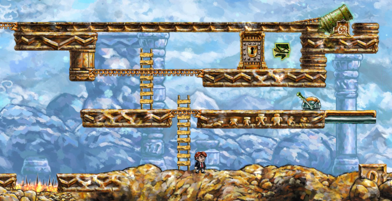
This has some weird implications, which all come together in the final level of the world, Fickle Companion. It’s so named because you have to use one (single-use) key to open three doors, but that key is very easy to lose.
Say you pick up the key and walk to the right with it. Time continues forwards for the key, so it stays with you as expected. Now you climb a ladder. Time is frozen since you aren’t moving horizontally, but the key stays with you anyway. Now you walk to the left. Oops — the key follows its own path backwards in time, going down the ladder and back along the path you carried it in the first place. You can’t fix this by walking to the right again, because that will simply advance time normally for the key; since you’re no longer holding it, it will simply fall to the ground and stay there.
You can see how this might be a problem in the screenshot above (where you get the key earlier in the level, to the left). You can climb the first ladder, but to get to the door, you have to walk left to get to the second ladder, which will reverse the key back down to the ground.
The solution is in the cannon in the upper right, which spits out a Goomba-like critter. It has the timeproof green glow, so the critters it spits out have the same green glow — making them immune to both your time reversal power and to the effect your movement has on time. What you have to do is get one of the critters to pick up the key and carry it leftwards for you. Once you have the puzzle piece, you have to rewind time and do it again elsewhere. (Or, more likely, the other way around; this next section acts as a decent hint for how to do the earlier section.)
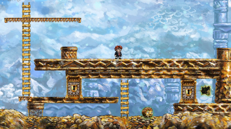
It’s hard to convey how bizarre this is in just text. If you haven’t played Braid, it’s absolutely worth it just for this one world, this one level.
And it gets even better, slash more ridiculous: there’s a super duper secret hidden very cleverly in this level. Reaching it involves bouncing twice off of critters; solving the puzzle hidden there involves bouncing the critters off of you. It’s ludicrous and perhaps a bit too tricky, but very clever. Best of all, it’s something that an enterprising player might just think to do on a whim — hey, this is possible here, I wonder what happens if I try it. And the game rewards the player for trying something creative! (Ironically, it’s most rewarding to have a clever idea when it turns out the designer already had the same idea.)
What can I take away from this? Hm.
Well, the underlying idea of linking time with position is pretty novel, but getting to it may not be all that hard: just combine different concepts and see what happens.
A similar principle is to apply a general concept to everything and see what happens. This is the first sighting of a timeproof wandering critter; previously timeproofing had only been seen on keys, doors, puzzle pieces, and stationary monsters. Later it even applies to Tim himself in special circumstances.
The use of timeproofing on puzzle pieces is especially interesting, because the puzzle pieces — despite being collectibles that animate moving into the UI when you get them — are also affected by time. If the pieces in this level weren’t timeproof, then as soon as you collected one and moved left to leave its alcove, time would move backwards and the puzzle piece would reverse out of the UI and right back into the world.
Along similar lines, the music and animated background are also subject to the flow of time. It’s obvious enough that the music plays backwards when you rewind time, but in world 4, the music only plays at all while you’re moving. It’s a fantastic effect that makes the whole world feel as weird and jerky as it really is under these rules. It drives the concept home instantly, and it makes your weird influence over time feel all the more significant and far-reaching. I love when games weave all the elements of the game into the gameplay like this, even (especially?) for the sake of a single oddball level.
Admittedly, this is all about gameplay or puzzle mechanics, not so much level design. What I like about the level itself is how simple and straightforward it is: it contains exactly as much as it needs to, yet still invites trying the wrong thing first, which immediately teaches the player why it won’t work. And it’s something that feels like it ought to work, except that the rules of the game get in the way just enough. This makes for my favorite kind of puzzle, the type where you feel like you’ve tried everything and it must be impossible — until you realize the creative combination of things you haven’t tried yet. I’m talking about puzzles again, oops; I guess the general level design equivalent of this is that players tend to try the first thing they see first, so if you put required parts later, players will be more likely to see optional parts.
I think that’s all I’ve got for this one puzzle room. I do want to say (again) that I love both endings of Braid. The normal ending weaves together the game mechanics and (admittedly loose) plot in a way that gave me chills when I first saw it; the secret ending completely changes both how the ending plays and how you might interpret the finale, all by making only the slightest changes to the level.
Portal: Testchamber 18 (advanced)
screenshot mine — playthrough of normal map — playthrough of advanced map
I love Portal. I blazed through the game in a couple hours the night it came out. I’d seen the trailer and instantly grasped the concept, so the very slow and gentle learning curve was actually a bit frustrating for me; I just wanted to portal around a big playground, and I finally got to do that in the six “serious” tests towards the end, 13 through 18.
Valve threw an interesting curveball with these six maps. As well as being more complete puzzles by themselves, Valve added “challenges” requiring that they be done with as few portals, time, or steps as possible. I only bothered with the portal challenges — time and steps seemed less about puzzle-solving and more about twitchy reflexes — and within them I found buried an extra layer of puzzles. All of the minimum portal requirements were only possible if you found an alternative solution to the map: skipping part of it, making do with only one cube instead of two, etc. But Valve offered no hints, only a target number. It was a clever way to make me think harder about familiar areas.
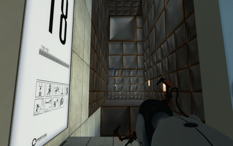
Alongside the challenges were “advanced” maps, and these blew me away. They were six maps identical in layout to the last six test chambers, but with a simple added twist that completely changed how you had to approach them. Test 13 has two buttons with two boxes to place on them; the advanced version removes a box and also changes the floor to lava. Test 14 is a live fire course with turrets you have to knock over; the advanced version puts them all in impenetrable cages. Test 17 is based around making extensive use of a single cube; the advanced version changes it to a ball.
But the one that sticks out the most to me is test 18, a potpourri of everything you’ve learned so far. The beginning part has you cross several large pits of toxic sludge by portaling from the ceilings; the advanced version simply changes the ceilings to unportalable metal. It seems you’re completely stuck after only the first jump, unless you happen to catch a glimpse of the portalable floor you pass over in mid-flight. Or you might remember from the regular version of the map that the floor was portalable there, since you used it to progress further. Either way, you have to fire a portal in midair in a way you’ve never had to do before, and the result feels very cool, like you’ve defeated a puzzle that was intended to be unsolvable. All in a level that was fairly easy the first time around, and has been modified only slightly.
I’m not sure where I’m going with this. I could say it’s good to make the player feel clever, but that feels wishy-washy. What I really appreciated about the advanced tests is that they exploited inklings of ideas I’d started to have when playing through the regular game; they encouraged me to take the spark of inspiration this game mechanic gave me and run with it.
So I suppose the better underlying principle here — the most important principle in level design, in any creative work — is to latch onto what gets you fired up and run with it. I am absolutely certain that the level designers for this game loved the portal concept as much as I do, they explored it thoroughly, and they felt compelled to fit their wilder puzzle ideas in somehow.
More of that. Find the stuff that feels like it’s going to burst out of your head, and let it burst.
Chip's Challenge: Level 122, Totally Fair and Level 131, Totally Unfair
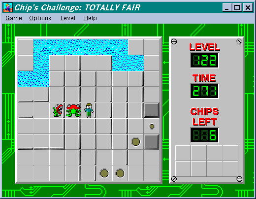
screenshots mine — full maps of both levels — playthrough of Totally Fair — playthrough of Totally Unfair
I mention this because Portal reminded me of it. The regular and advanced maps in Portal are reminiscent of parallel worlds or duality or whatever you want to call the theme. I extremely dig that theme, and it shows up in Chip’s Challenge in an unexpected way.
Totally Fair is a wide open level with a little maze walled off in one corner. The maze contains a monster called a “teeth”, which follows Chip at a slightly slower speed. (The second teeth, here shown facing upwards, starts outside the maze but followed me into it when I took this screenshot.)
The goal is to lure the teeth into standing on the brown button on the right side. If anything moves into a “trap” tile (the larger brown recesses at the bottom), it cannot move out of that tile until/unless something steps on the corresponding brown button. So there’s not much room for error in maneuvering the teeth; if it falls in the water up top, it’ll die, and if it touches the traps at the bottom, it’ll be stuck permanently.
The reason you need the brown button pressed is to acquire the chips on the far right edge of the level.
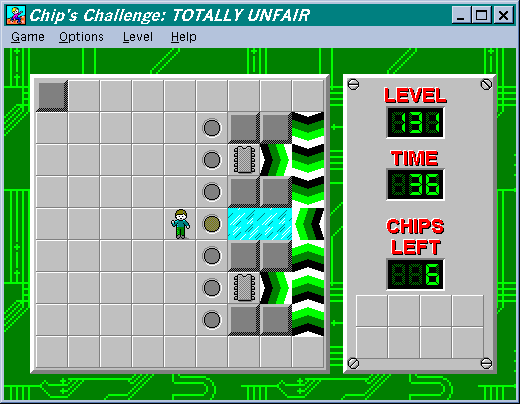
The gray recesses turn into walls after being stepped on, so once you grab a chip, the only way out is through the force floors and ice that will send you onto the trap. If you haven’t maneuvered the teeth onto the button beforehand, you’ll be trapped there.
Doesn’t seem like a huge deal, since you can go see exactly how the maze is shaped and move the teeth into position fairly easily. But you see, here is the beginning of Totally Fair.
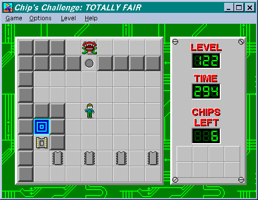
The gray recess leads up into the maze area, so you can only enter it once. A force floor in the upper right lets you exit it.
Totally Unfair is exactly identical, except the second teeth has been removed, and the entrance to the maze looks like this.
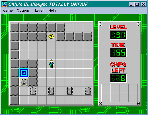
You can’t get into the maze area. You can’t even see the maze; it’s too far away from the wall. You have to position the teeth completely blind. In fact, if you take a single step to the left from here, you’ll have already dumped the teeth into the water and rendered the level impossible.
The hint tile will tell you to “Remember sjum”, where SJUM is the password to get back to Totally Fair. So you have to learn that level well enough to recreate the same effect without being able to see your progress.
It’s not impossible, and it’s not a “make a map” faux puzzle. A few scattered wall blocks near the chips, outside the maze area, are arranged exactly where the edges of the maze are. Once you notice that, all you have to do is walk up and down a few times, waiting a moment each time to make sure the teeth has caught up with you.
So in a sense, Totally Unfair is the advanced chamber version of Totally Fair. It makes a very minor change that force you to approach the whole level completely differently, using knowledge gleaned from your first attempt.
And crucially, it’s an actual puzzle! A lot of later Chip’s Challenge levels rely heavily on map-drawing, timing, tedium, or outright luck. (Consider, if you will, Blobdance.) The Totally Fair + Totally Unfair pairing requires a little ingenuity unlike anything else in the game, and the solution is something more than just combinations of existing game mechanics. There’s something very interesting about that hint in the walls, a hint you’d have no reason to pick up on when playing through the first level. I wish I knew how to verbalize it better.
Anyway, enough puzzle games; let’s get back to regular ol’ level design.
Link's Awakening: Level 7, Eagle's Tower
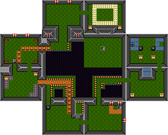
maps via vgmaps and TCRF — playthrough with commentary
Link’s Awakening was my first Zelda (and only Zelda for a long time), which made for a slightly confusing introduction to the series — what on earth is a Zelda and why doesn’t it appear in the game?
The whole game is a blur of curiosities and interesting little special cases. It’s fabulously well put together, especially for a Game Boy game, and the dungeons in particular are fascinating microcosms of design. I never really appreciated it before, but looking at the full maps, I’m struck by how each dungeon has several large areas neatly sliced into individual screens.
Much like with Doom II, I surprise myself by picking Eagle’s Tower as the most notable part of the game. The dungeon isn’t that interesting within the overall context of the game; it gives you only the mirror shield, possibly the least interesting item in the game, second only to the power bracelet upgrade from the previous dungeon. The dungeon itself is fairly long, full of traps, and overflowing with crystal switches and toggle blocks, making it possibly the most frustrating of the set. Getting to it involves spending some excellent quality time with a flying rooster, but you don’t really do anything — mostly you just make your way through nondescript caves and mountaintops.
Having now thoroughly dunked on it, I’ll tell you what makes it stand out: the player changes the shape of the dungeon.
That’s something I like a lot about Doom, as well, but it’s much more dramatic in Eagle’s Tower. As you might expect, the dungeon is shaped like a tower, where each floor is on a 4×4 grid. The top floor, 4F, is a small 2×2 block of rooms in the middle — but one of those rooms is the boss door, and there’s no way to get to that floor.
(Well, sort of. The “down” stairs in the upper-right of 3F actually lead up to 4F, but the connection is bogus and puts you in a wall, and both of the upper middle rooms are unreachable during normal gameplay.)
The primary objective of the dungeon is to smash four support columns on 2F by throwing a huge iron ball at them, which causes 4F to crash down into the middle of 3F.
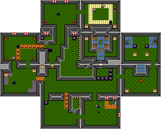
Even the map on the pause screen updates to reflect this. In every meaningful sense, you, the player, have fundamentally reconfigured the shape of this dungeon.
I love this. It feels like I have some impact on the world, that I came along and did something much more significant than mere game mechanics ought to allow. I saw that the tower was unsolvable as designed, so I fixed it.
It’s clear that the game engine supports rearranging screens arbitrarily — consider the Wind Fish’s Egg — but this is s wonderfully clever and subtle use of that. Let the player feel like they have an impact on the world.
The cutting room floor
This is getting excessively long so I’m gonna cut it here. Some other things I thought of but don’t know how to say more than a paragraph about:
-
Super Mario Land 2: Six Golden Coins has a lot of levels with completely unique themes, backed by very simple tilesets but enhanced by interesting one-off obstacles and enemies. I don’t even know how to pick a most interesting one. Maybe just play the game, or at least peruse the maps.
-
This post about density of detail in Team Fortress 2 is really good so just read that I guess. It’s really about careful balance of contrast again, but through the lens of using contrasting amounts of detail to draw the player’s attention, while still carrying a simple theme through less detailed areas.
-
Metroid Prime is pretty interesting in a lot of ways, but I mostly laugh at how they spaced rooms out with long twisty hallways to improve load times — yet I never really thought about it because they all feel like they belong in the game.
One thing I really appreciate is level design that hints at a story, that shows me a world that exists persistently, that convinces me this space exists for some reason other than as a gauntlet for me as a player. But it seems what comes first to my mind is level design that’s clever or quirky, which probably says a lot about me. Maybe the original Fallouts are a good place to look for that sort of detail.
Conversely, it sticks out like a sore thumb when a game tries to railroad me into experiencing the game As The Designer Intended. Games are interactive, so the more input the player can give, the better — and this can be as simple as deciding to avoid rather than confront enemies, or deciding to run rather than walk.
I think that’s all I’ve got in me at the moment. Clearly I need to meditate on this a lot more, but I hope some of this was inspiring in some way!

![[articles]](https://eev.ee/theme/images/category-articles.png)
