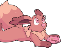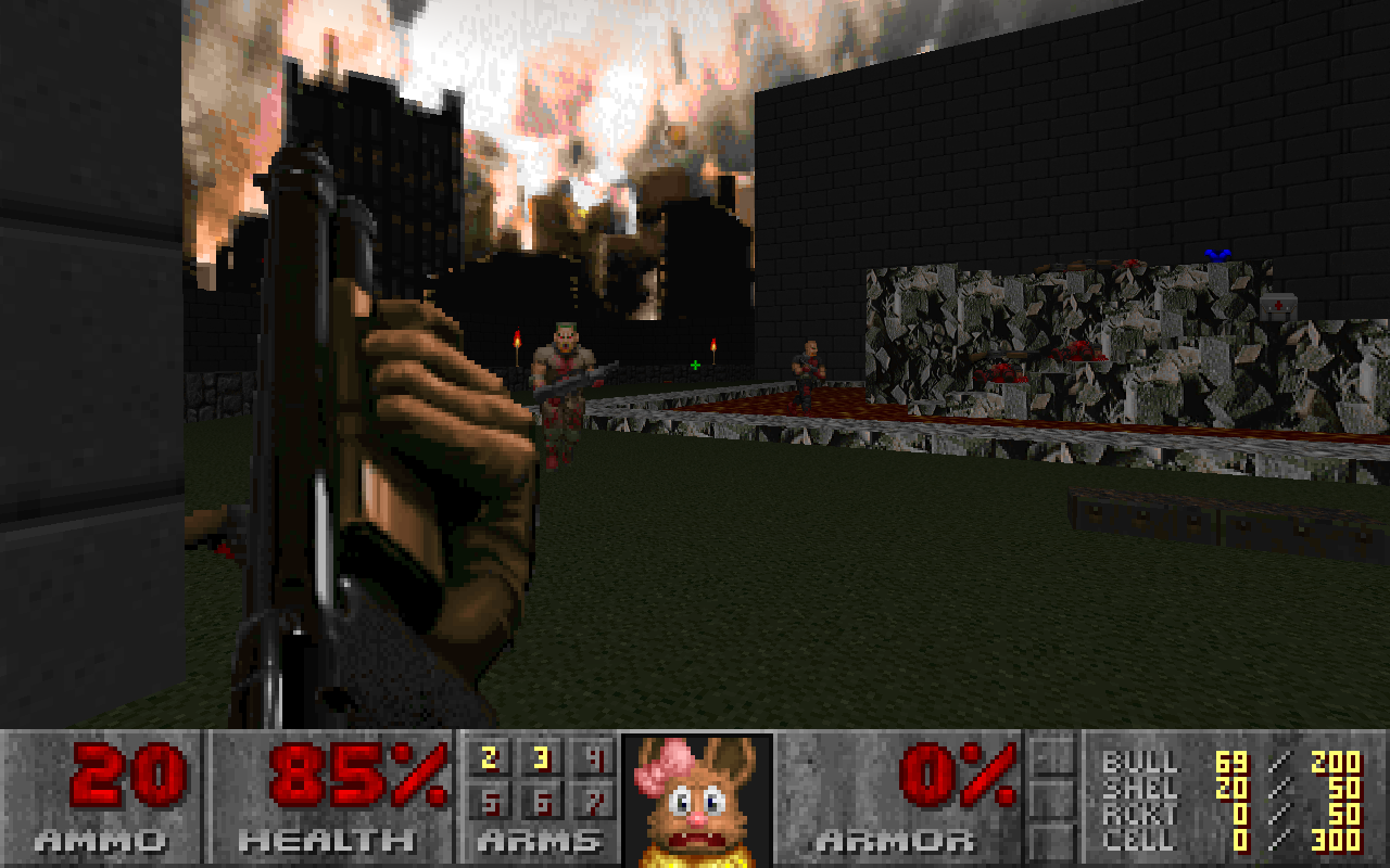
A full replacement of Doomguy’s vast array of 42 expressions.
You can get it yourself if you want to play Doom as me, for some reason? It does nothing but replace a few sprites, so it works with any Doom flavor (including vanilla) on 1, 2, or Final. Just run Doom with -file eeveemug.wad. With GZDoom, you can load it automatically.
I don’t entirely know why I did this. I drew the first one on a whim, then realized there was nothing really stopping me from making a full set, so I spent a day doing that.
The funny thing is that I usually play Doom with ZDoom’s “alternate” HUD. It’s a full-screen overlay rather than a huge bar, and — crucially — it does not show the mugshot. It can’t even be configured to show the mugshot. As far as I’m aware, it can’t even be modded to show the mugshot. So I have to play with the OG status bar if I want to actually use the thing I made.
I’m pretty happy with the results overall! I think I did a decent job emulating the Doom “surreal grit” style. I did the shading with Aseprite‘s shading mode — instead of laying down a solid color, it shifts pixels along a ramp of colors you select every time you draw over them. Doom’s palette has a lot of browns, so I made a ramp out of all of them and kept going over furry areas, nudging pixels into being lighter or darker, until I liked the texture. It was a lot like making a texture in a sketch with a lot of scratchy pencil strokes.
I also gleaned some interesting things about smoothness and how the eye interprets contours? I tried to explain this on Twitter and had a hell of a time putting it into words, but the short version is that it’s amazing to see the difference a single misplaced pixel can make, especially as you slide that pixel between dark and light.
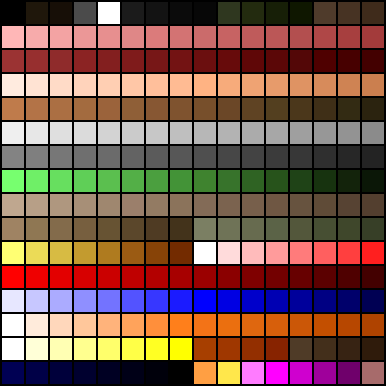
Speaking of which, Doom’s palette is incredibly weird to work with. Thank goodness Eevees are brown! The game does have to draw arbitrary levels of darkness all with the same palette, which partly explains the number of dark colors and gradients — but I believe a number of the colors are exact duplicates, so close they might as well be duplicates, or completely unused in stock Doom assets. I guess they had no reason to optimize for people trying to add arbitrary art to the game 25 years later, though. (And nowadays, GZDoom includes a truecolor software renderer, so the palette is becoming less and less important.)
I originally wanted the god mode sprite to be a Sylveon, but Sylveon is made of pink and azure and blurple, and I don’t think I could’ve pulled it off with this set of colors. I even struggled with the color of the mane a bit — I usually color it with pretty pale colors, but Doom only has a couple of those, and they’re very saturated. I ended up using a lot more dark yellows than I would normally, and thankfully it worked out pretty well.
The most significant change I made between the original sprite and the final set was the eye color:

(This is STFST20, a frame from the default three-frame “glacing around” animation that plays when the player has between 40 and 59 health. Doom Wiki has a whole article on the mugshot if you’re interested.)
The blue eyes in my original just do not work at all. The Doom palette doesn’t have a lot of subtle colors, and its blues in particular are incredibly bad. In the end, I made the eyes basically black, though with a couple pixels of very dark blue in them.
After I decided to make the full set, I started by making a neutral and completely healthy front pose, then derived the others from that (with a very complicated system of layers). You can see some of the side effects of that here: the face doesn’t actually turn when glancing around, because hoo boy that would’ve been a lot of work, and so the cheek fluff is visible on both sides.
I also notice that there are two columns of identical pixels in each eye! I fixed that in the glance to the right, but must’ve forgotten about it here. Oh, well; I didn’t even notice until I zoomed in just now.
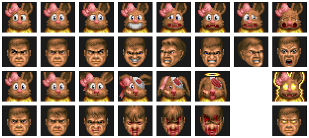
The original sprites might not be quite aligned correctly in the above image. The available space in the status bar is 35×31, of which a couple pixels go to an inset border, leaving 33×30. I drew all of my sprites at that size, but the originals are all cropped and have varying offsets (part of the Doom sprite format). I extremely can’t be assed to check all of those offsets for over a dozen sprites, so I just told ImageMagick to center them. (I only notice right now that some of the original sprites are even a full 31 pixels tall and draw over the top border that I was so careful to stay out of!)
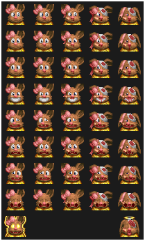
Anyway, this is a representative sample of the Doom mugshot poses.
The top row shows all eight frames at full health. The first three are the “idle” state, drawn when nothing else is going on; the sprite usually faces forwards, but glances around every so often at random. The forward-facing sprite is the one I finalized first.
I tried to take a lot of cues from the original sprite, seeing as I wanted to match the style. I’d never tried drawing a sprite with a large palette and a small resolution before, and the first thing that struck me was Doomguy’s lips — the upper lip, lips themselves, and shadow under the lower lip are all created with only one row of pixels each. I thought that was amazing. Now I even kinda wish I’d exaggerated that effect a bit more, but I was wary of going too dark when there’s a shadow only a couple pixels away. I suppose Doomguy has the advantage of having, ah, a chin.
I did much the same for the eyebrows, which was especially necessary because Doomguy has more of a forehead than my Eevee does. I probably could’ve exaggerated those a bit more, as well! Still, I love how they came out — especially in the simple looking-around frames, where even a two-pixel eyebrow raise is almost comically smug.
The fourth frame is a wild-ass grin (even named STFEVL0), which shows for a short time after picking up a new weapon. Come to think of it, that’s a pretty rare occurrence when playing straight through one of the Doom games; you keep your weapons between levels.
The fifth through seventh are also a set. If the player takes damage, the status bar will briefly show one of these frames to indicate where the damage is coming from. You may notice that where Doomguy bravely faces the source of the pain, I drew myself wincing and recoiling away from it.
The middle frame of that set also appears while the player is firing continuously (regardless of damage), so I couldn’t really make it match the left and right ones. I like the result anyway. It was also great fun figuring out the expressions with the mouth — that’s another place where individual pixels make a huge difference.
Finally, the eighth column is the legendary “ouch” face, which appears when the player takes more than 20 damage at once. It may look completely alien to you, because vanilla Doom has a bug that only shows this face when the player gains 20 or more health while taking damage. This is vanishingly rare (though possible!), so the frame virtually never appears in vanilla Doom. Lots of source ports have fixed this bug, making the ouch face it a bit better known, but I usually play without the mugshot visible so it still looks super weird to me. I think my own spin on it is a bit less, ah, body horror?
The second row shows deterioration. It is pretty weird drawing yourself getting beaten up.
A lot of Doomguy’s deterioration is in the form of blood dripping from under his hair, which I didn’t think would translate terribly well to a character without hair. Instead, I went a little cartoony with it, adding bandages here and there. I had a little bit of a hard time with the bloodshot eyes at this resolution, which I realize as I type it is a very poor excuse when I had eyes three times bigger than Doomguy’s. I do love the drooping ears, with the possible exception of the fifth state, which I’m not sure is how that would actually look…? Oh well. I also like the bow becoming gradually unravelled, eventually falling off entirely when you die.
Oh, yes, the sixth frame there (before the gap) is actually for a dead player. Doomguy’s bleeding becomes markedly more extreme here, but again that didn’t really work for me, so I went a little sillier with it. A little. It’s still pretty weird drawing yourself dead.
That leaves only god mode, which is incredible. I love that glow. I love the faux whisker shapes it makes. I love how it fades into the background. I love that 100% pure “oh this is pretty good” smile. It all makes me want to just play Doom in god mode forever.
Now that I’ve looked closely at these sprites again, I spy a good half dozen little inconsistencies and nitpicks, which I’m going to refrain from spelling out. I did do this in only a day, and I think it came out pretty dang well considering.
Maybe I’ll try something else like this in the future. Not quite sure what, though; there aren’t many small and self-contained sets of sprites like this in Doom. Monsters are several times bigger and have a zillion different angles. Maybe some pickups, which only have one frame?
Hmm. Parting thought: I’m not quite sure where I should host this sort of one-off thing. It arguably belongs on Itch, but seems really out of place alongside entire released games. It also arguably belongs on the idgames archive, but I’m hesitant to put it there because it’s such an obscure thing of little interest to a general audience. At the moment it’s just a file I’ve uploaded to wherever on my own space, but I now have three little Doom experiments with no real permanent home.
![[updates]](https://eev.ee/theme/images/category-updates.png)
