Wow! My Patreon experiment has been successful enough that I’m finally obliged to write one post per month, and this is the first such post. Let us celebrate with a post about something near and dear to everyone’s heart: fonts. Or rather, about fontconfig.
fontconfig is a pretty impressive piece of work. If you’re on Linux, it’s probably the thing that picks default fonts, handles Unicode fallback, and magically notices when new fonts are installed without having to restart anything. It’s invisible and great.
And unfortunately once in a great while it’s wrong. There is no common GUI for configuring fontconfig, so you’re stuck manually editing XML configuration files — for which the documentation is atrocious.
Lucky for you, and unlucky for me, I have twice now had to delve down this rabbit hole. Here is my story, that others may be saved from this madness.
Trial the First: Monospace font falling back to proportional Unicode glyph
As I explained almost a year ago, while live-tweeting my exploration of this problem:
i typed “☺foo” and then took a screenshot. i stress that my cursor is /actually/ positioned AFTER the second “o”.
Now, there’s definitely a Konsole bug here — terminal text should never be allowed to escape the grid, and the cursor should absolutely not get out of sync with the text.
But this got me wondering. I know for a fact that I have a monospace font somewhere that contains the ☺ glyph. I’ve seen it fit perfectly well in a terminal before. So why is Konsole falling back to a proportional font?
The monospace font I was using at the time was Source Code Pro, a relative newcomer. Could that have been related? (Hint: yes.)
Here’s a further hint. If you use fc-match -s <font>, you get a sorted list of the fonts fontconfig will use for fallback. Let’s try it with Source Code Pro:
 1⚘ fc-match -s 'Source Code Pro'
 2SourceCodePro-Regular.otf: "Source Code Pro" "Regular"
 3PowerlineSymbols.otf: "PowerlineSymbols" "Medium"
 4SourceSansPro-Regular.otf: "Source Sans Pro" "Regular"
 5SourceHanSansJP-Normal.otf: "Source Han Sans JP" "Normal"
 6DejaVuSans.ttf: "DejaVu Sans" "Book"
 7DejaVuSans.ttf: "DejaVu Sans" "Book"
 8DejaVuSansExtraLight.ttf: "DejaVu Sans" "ExtraLight"
 9DejaVuSans-Bold.ttf: "DejaVu Sans" "Bold"
10...
Something is distinctly wrong with this list.
I’ll just jump to the payoff: unless it’s told otherwise, fontconfig assumes every font is sans-serif.
It turns out there’s nothing inherent to a particular font that makes it serif, sans-serif, monospace, cursive, or whathaveyou. These are purely human categorizations. Manual human categorizations. fontconfig actually ships with configuration files that assign generic family names to a hardcoded and ultimately arbitrary set of fonts. Here’s part of my /etc/fonts/conf.d/45-latin.conf:
 1<fontconfig>
 2<!--
 3Mark common families with their generics so we'll get
 4something reasonable
 5-->
 6
 7<!--
 8Serif faces
 9-->
10    <alias>
11        <family>Bitstream Vera Serif</family>
12        <default><family>serif</family></default>
13    </alias>
14    <alias>
15        <family>DejaVu Serif</family>
16        <default><family>serif</family></default>
17    </alias>
18    <alias>
19        <family>Liberation Serif</family>
20        <default><family>serif</family></default>
21    </alias>
22    <alias>
23        <family>Times New Roman</family>
24        <default><family>serif</family></default>
25    </alias>
26    ...
And /etc/fonts/conf.d/49-sansserif.conf contains the fallback for fonts not yet assigned a generic family:
 1<fontconfig>
 2<!--
 3If the font still has no generic name, add sans-serif
 4-->
 5    <match target="pattern">
 6        <test qual="all" name="family" compare="not_eq">
 7            <string>sans-serif</string>
 8        </test>
 9        <test qual="all" name="family" compare="not_eq">
10            <string>serif</string>
11        </test>
12        <test qual="all" name="family" compare="not_eq">
13            <string>monospace</string>
14        </test>
15        <edit name="family" mode="append_last">
16            <string>sans-serif</string>
17        </edit>
18    </match>
19</fontconfig>
This is preposterous. This is unthinkable. And yet what might be even more incredible is that I’d never noticed before, because covering the most popular fonts works well enough.
Computers, right?
Anyway, so, all I have to do then is tell fontconfig that Source Code Pro is actually a monospace font. I stuck this in my ~/.config/fontconfig/fonts.conf:
1<alias>
2    <family>Source Code Pro</family>
3    <default>
4        <family>monospace</family>
5    </default>
6</alias>
I ran fc-cache and… absolutely nothing was different.
Skipping past my pain and suffering again: it turns out that there’s not actually anything special about the generic family names, and so fontconfig doesn’t bat an eye if you give two generic families to the same font. User configuration applies just after that sans-serif fallback, so this naïve approach ended up with Source Code Pro falling back to both sans-serif and monospace.
The solution, thankfully, is fairly simple:
 1<!-- by default fontconfig assumes any unrecognized font is sans-serif, so -->
 2<!-- the fonts above now have /both/ families.  fix this. -->
 3<!-- note that "delete" applies to the first match -->
 4<match>
 5    <test compare="eq" name="family">
 6        <string>sans-serif</string>
 7    </test>
 8    <test compare="eq" name="family">
 9        <string>monospace</string>
10    </test>
11    <edit mode="delete" name="family"/>
12</match>
fontconfig’s XML-powered expression engine is a little weird, but this does pretty much what it looks like: if a font claims to be in both the sans-serif and monospace families, delete the sans-serif family.
With that, my ☺ rendering was fixed, and fc-match gave much more sensible output:
1SourceCodePro-Regular.otf: "Source Code Pro" "Regular"
2PowerlineSymbols.otf: "PowerlineSymbols" "Medium"
3SourceSansPro-Regular.otf: "Source Sans Pro" "Regular"
4SourceHanSansJP-Normal.otf: "Source Han Sans JP" "Normal"
5DejaVuSansMono.ttf: "DejaVu Sans Mono" "Book"
6DejaVuMonoSans.ttf: "DejaVu Sans Mono" "Book"
7DejaVuSansMono-Bold.ttf: "DejaVu Sans Mono" "Bold"
8...
There’s also a simpler solution here, which has only occurred to me now. Like I said, Source Code Pro was my default monospace font, done with this simple incantation:
1<alias>
2    <family>monospace</family>
3    <prefer>
4        <family>Source Code Pro</family>
5    </prefer>
6</alias>
So I could just… only ever refer to it as “monospace” in applications. Then when a glyph is missing, fontconfig would look for a fallback for monospace (the actual font I claim to want) rather than Source Code Pro (the first fallback fontconfig already selected). Alas, at the time, my terminal was using Source Code Pro directly, and I never realized this might be a problem.
The above way is a wee bit more robust, though.
Trial the Second: Kill Comic Sans
Between the fonts I happen to have installed and fontconfig’s built-in defaults, my default “cursive” font ends up being… Comic Sans. I don’t see it too often, but it tends to crop up if, say, a website tries to use some curly Windows-only font with only “cursive” as the fallback.
Enter Comic Neue, a moderately successful attempt at bringing some respectability to Comic Sans. Okay, neat. I’ll just set that as my default cursive font, then.
1<alias>
2    <family>cursive</family>
3    <prefer>
4        <family>Comic Neue</family>
5    </prefer>
6</alias>
And now cursive text is displaying in… Comic Sans.
Hm. Well. That’s interesting.
After six hours of investigating this on and off, I finally discovered the problem. Are you ready for this? It’s great.
Comic Neue doesn’t have glyphs for caret or backtick.
Thus, fontconfig decided it didn’t have a full set of English glyphs, and so wasn’t appropriate to use for English text.
No, really.
Here’s my grotesque solution:
 1<!-- comic neue is missing a few glyphs and fontconfig thinks it's -->
 2<!-- unsuitable for english text, oops!  fix this forcibly. -->
 3<!-- once the font is fixed, the above rule is good enough -->
 4<match>
 5    <test compare="contains" name="lang">
 6        <string>en</string>
 7    </test>
 8    <test name="family">
 9        <string>cursive</string>
10    </test>
11    <edit mode="delete_all" name="lang"/>
12    <edit mode="prepend" name="family">
13        <string>Comic Neue</string>
14    </edit>
15</match>
i.e.: if we’re looking for a font called “cursive” for English text, just drop the language requirement, and put Comic Neue at the beginning of the list. Hacky, but it does work.
You may also want to do the same dance as with Source Code Pro: make Comic Neue fall back to other cursive fonts, then remove the extra sans-serif family.
As an aside: I distinctly remember testing this in Firefox, but now it doesn’t work at all. I don’t know if I’m direly misremembering or was hallucinating or what, but there is a fifteen year old bug complaining that Firefox on Linux doesn’t specify cursive/fantasy CSS fonts at all. So they fall back to… I don’t know, something totally arbitrary? Anyway I fixed that by cracking open about:config and adding a font.name.cursive.x-western pref with a value of cursive. Yes, apparently, Firefox doesn’t even use fontconfig’s cursive for CSS cursive out of the box. But I swear it did a year ago when I was doing this. I think.
I’m starting to doubt my perceptions of reality here. That’s how intense font configuration is.
But one more thing before we move on — let’s really go out on a limb here, and ensure we never see Comic Sans again. If anyone tries to use it explicitly, substitute Comic Neue instead! But make it bold by default, since Comic Neue’s regular weight is way lighter than Comic Sans.
 1<!-- Replace Comic Sans with Comic Neue bold -->
 2<match>
 3    <test name="family">
 4        <string>Comic Sans MS</string>
 5    </test>
 6    <edit binding="same" mode="assign" name="family">
 7        <string>Comic Neue</string>
 8    </edit>
 9    <edit binding="weak" mode="assign" name="style">
10        <string>Bold</string>
11    </edit>
12</match>
I thought using a “weak” binding here would mean that someone could explicitly ask for “light” Comic Sans and get light Comic Neue, but that doesn’t seem to be working now that I’m actually trying it. But fucking whatever, right? It’s Comic Sans, who cares.
Trial the Third: Japanese fonts are junk for some reason
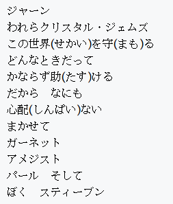
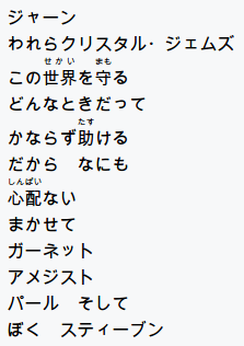
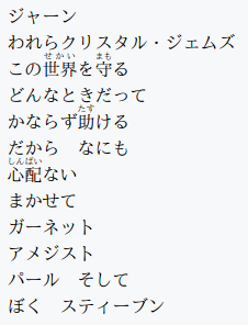
I was celebrating the addition of ruby (furigana) support to Firefox, and went to go show someone that the prior version did not in fact support it very well. But then I noticed something else curious. Compare these screenshots of the same page, in Firefox (left) versus Chrome (right):


Firefox’s choice of font looks like total ass! I wonder why.
Okay so it’s because the surrounding font was a serif font, so naturally the CSS fallback was “serif”, so Firefox was asking fontconfig for a serif Japanese font. Lo and behold, in fontconfig’s configuration spaghetti, I found /etc/fonts/conf.d/65-nonlatin.conf:
1<fontconfig>
2    <alias>
3        <family>serif</family>
4        <prefer>
5            ...
6            <family>MS Mincho</family> <!-- han (ja) -->
7            <family>SimSun</family> <!-- han (zh-cn,zh-tw) -->
8            <family>PMingLiu</family> <!-- han (zh-tw) -->
9            ...
The first Japanese serif font that fontconfig prefers is MS Mincho, which I happen to have installed (it’s in the Microsoft core fonts package, which we’ll get back to shortly). Firefox dev tools confirmed that this was the ugly font being used.
I did find a bug on fontconfig objecting to this ordering for a variety of reasons, but that doesn’t help me too much.
Anyway, I went hunting for some really nice Japanese fonts, and I found two: IPAMincho for serif, Source Han Sans JP for sans-serif. It was easy enough to force them to be preferred; I just stuck them below my preferred Western fonts.
 1<alias>
 2    <family>serif</family>
 3    <prefer>
 4        <family>Source Serif Pro</family>
 5        <family>IPAMincho</family>
 6    </prefer>
 7</alias>
 8<alias>
 9    <family>sans-serif</family>
10    <prefer>
11        <family>Source Sans Pro</family>
12        <family>Source Han Sans JP</family>
13    </prefer>
14</alias>
Result:

Gorgeous.
Trial the Fourth: Fuck Helvetica
In the process of installing Source Han Sans, at one point I accidentally put it first, causing even Roman text to be rendered by that ostensibly Japanese font.
But it actually looked, uh, really nice. Really nice. Like, I was blown away by how gorgeous some Python documentation (which used my default sans-serif font) suddenly looked. Wow! Way nicer than I expected from some fallback glyphs in a Japanese font. I looked into this and it turned out that the glyphs had been ported pretty directly from Adobe’s Western font, Source Sans Pro. I was already using Source Code Pro, so at this point I was strongly considering just drinking all of Adobe’s font Kool-Aid. (The configuration above is from after I did this.)
At this point I was suddenly struck by how not gorgeous the Twitter web interface looked in comparison. I had a peek, and the entire thing was, and always had been…
rendering…
in…
Arial.
This was caused by the perfect storm of font shenanigans.
- I didn’t have Helvetica installed, because this isn’t a fucking Mac.
- I did have the Microsoft core fonts installed. I want to say this is because Steam under Wine would either crash or just not render any text whatsoever if it couldn’t find some particular Windows font.
- fontconfig ships a
30-metric-aliases.conffile that supplies some font fallback rules for fonts with very similar glyph shapes, such as… having Helvetica fall back to Arial. (Arial was deliberately designed to fill this role, because font licensing.)
Well, fuck your Helvetica, and doublefuck your Arial. I installed Source Sans Pro and Source Serif Pro, and set about fixing this posthaste.
1<!-- fuck helvetica -->
2<match>
3    <test name="family">
4        <string>Helvetica</string>
5    </test>
6    <edit binding="same" mode="assign" name="family">
7        <string>Source Sans Pro</string>
8    </edit>
9</match>
Here is Twitter Web, before and after.


DAMN.
Some hot parting tips
fc-cache will force fontconfig to pick up any changes. There’s a -f, but in all my fighting with fontconfig it never once made a difference.
As far as I can tell, there is no reason to ever run sudo fc-cache -vf. This has been floating around the Internet for years, but it seems to be apocryphal copy/paste. You don’t need to flush root‘s fontconfig cache unless you’re running GUI stuff as root.
fc-match <font> will tell you what font will be used in practice. You might think that’s what fc-query does, and you’d be wrong. fc-query‘s primary use is to produce bizarre error messages when you accidentally use it instead of fc-match.
It is really fucking difficult to figure out what font will be used for a specific glyph. There are two approaches:
-
Do it in a browser. Make a URL like this:
1data:text/html,<meta charset="utf8"><p style="font-family: monospace;">☺</p>Then pop open your dev tools, and look for where it tells you the fonts that are actually being used. Firefox’s Inspector has a dedicated “fonts” tab in the panel on the right; Chromium’s Elements lists fonts at the bottom of the “computed” tab.
Fair warning: this is one level removed from fontconfig, because CSS font rules may interfere. This bit me above when I tried to confirm my new cursive font in Firefox!
Another warning: while Firefox picks up fontconfig changes more or less instantly (after an
fc-cache), Chromium does not. Worse, Chromium seems to outright ignore fontconfig when it feels like it, such as when it used a sans serif Japanese font for text styled as serif. -
You can also do this nonsense in a terminal:
1DISPLAY=:0 FC_DEBUG=4 pango-view --font=monospace -t ☺ | grep family:pango-viewis a tiny program that just pops open a window containing some text in a particular font.FC_DEBUGis an environment variable to make fontconfig spit out mountains of fucking text on stdout. Thegrepcuts it down to something a little more manageable. Most likely the last family you see listed is the font actually being used to render your favorite glyph.
If you’re really curious how the <match> blocks work, good news: they are the one thing the fontconfig docs actually kind of explain. And of course your /etc/fonts/conf.d is probably full of real-world practical examples.
I haven’t put my fontconfig font config (…) in my rc.git; it seems pretty specific to my desktop’s particular setup. But here’s the whole thing in a gist, if you’re interested.

![[articles]](https://eev.ee/theme/images/category-articles.png)

