 notepad
![[articles]](https://eev.ee/theme/images/category-articles.png)
I love emoji. I love Unicode in general. I love seeing plain text become more expressive and more universal.
But, Internet, I’ve noticed a worrying trend. Both popular media and a lot of tech circles tend to assume that “emoji” de facto means Apple’s particular font.
I have some objections.
A not so brief history of emoji
The Unicode Technical Report on emoji also goes over some of this.
Emoji are generally traced back to the Japanese mobile carrier NTT DoCoMo, which in February 1999 released a service called i-mode which powered a line of wildly popular early smartphones. Its messenger included some 180 small pixel-art images you could type as though they were text, because they were text, encoded using unused space in Shift JIS.
(Quick background, because I’d like this to be understandable by a general audience: computers only understand numbers, not text, so we need a “character set” that lists all the characters you can type and what numbers represent them. So in ASCII, for example, a capital “A” is passed around as the number 65. Computers always deal with bytes, which can go up to 255, but ASCII only lists characters up to 127 — so everything from 128 to 255 is just unused space. Shift JIS is Japan’s equivalent to ASCII, and had a lot more unused space, and that’s where early emoji were put.)
Naturally, other carriers added their own variations. Naturally, they used different sets of images, but often in a different order, so the same character might be an apple on one phone and a banana on another. They came up with tables for translating between carriers, but that wouldn’t help if your friend tried to send you an image that your phone just didn’t have. And when these characters started to leak outside of Japan, they had no hope whatsoever of displaying as anything other than garbage.
This is kind of like how Shift JIS is mostly compatible with ASCII, except that for some reason it has the yen sign ¥ in place of the ASCII backslash \, producing hilarious results. Also, this is precisely the problem that Unicode was invented to solve.
I’ll get back to all this in a minute, but something that’s left out of emoji discussions is that the English-speaking world was developing a similar idea. As far as I can tell, we got our first major exposure to graphical emoticons with the release of AIM 4.0 circa May 2000 and these infamous “smileys”:

Even though AIM was a closed network where there was little risk of having private characters escape, these were all encoded as ASCII emoticons. That simple smiley on the very left would be sent as :-) and turned into an image on your friend’s computer, which meant that if you literally typed :-) in a message, it would still render graphically. Rather than being an extension to regular text, these images were an enhancement of regular text, showing a graphical version of something the text already spelled out. A very fancy ligature.
Little ink has been spilled over this, but those humble 4-bit graphics became a staple of instant messaging, by which I mean everyone immediately ripped them off. ICQ, MSN Messenger, Yahoo! Messenger, Pidgin (then Gaim), Miranda, Trillian… I can’t name a messenger since 2003 that didn’t have smileys included. All of them still relied on the same approach of substituting graphics for regular ASCII sequences. That had made sense for AIM’s limited palette of faces, but during its heyday MSN Messenger included 67 graphics, most of them not faces. If you sent a smiling crescent moon to someone who had the graphics disabled (or used an alternative client), all they’d see was a mysterious (S).
So while Japan is generally credited as the source of emoji, the US was quite busy making its own mess of things.
Anyway, Japan had this mess of several different sets of emoji in common use, being encoded in several different incompatible ways. That’s exactly the sort of mess Unicode exists to sort out, so in mid-2007, several Google employees (one of whom was the co-founder of the Unicode Consortium, which surely helped) put together a draft proposal for adding the emoji to Unicode. The idea was to combine all the sets, drop any duplicates, and add to Unicode whatever wasn’t already there.
(Unicode is intended as a unification of all character sets. ASCII has \, Shift JIS has ¥, but Unicode has both — so an English speaker and a Japanese speaker can both use both characters without getting confused, as long as they’re using Unicode. And so on, for thousands of characters in dozens of character sets. Part of the problem with sending the carriers’ emoji to American computers was that the US was pretty far along in shifting everything to use Unicode, but the emoji simply didn’t exist in Unicode. Obvious solution: add them!)
Meanwhile, the iPhone launched in Japan in 2008. iOS 2.2, released in November, added the first implementation of emoji — but using SoftBank’s invented encoding, since they were only on one carrier and the characters weren’t yet in Unicode. A couple Apple employees jumped on the bandwagon around that time and coauthored the first official proposal, published in January 2009. Unicode 6.0, the first version to include emoji, was released in October 2010.
iPhones worldwide gained the ability to use its emoji (now mapped to Unicode) with the release of iOS 5.0 in October 2011.
Android didn’t get an emoji font at all until version 4.3, in July 2013. I’m at a loss for why, given that Google had proposed emoji in the first place, and Android had been in Japan since the HTC Magic in May 2009. It was even on NTT DoCoMo, the carrier that first introduced emoji! What the heck, Google.
The state of things
Consider this travesty of an article from last week. This Genius Theory Will Change the Way You Use the “Pink Lady” Emoji:
Unicode, creators of the emoji app, call her the “Information Desk Person.”
Oh, dear. Emoji aren’t an “app”, Unicode didn’t create them, and the person isn’t necessarily female. But the character is named “Information Desk Person”, so at least that part is correct.
It’s non-technical clickbait, sure. But notice that neither “Apple” nor the names of any of its platforms appear in the text. As far as this article and author are concerned, emoji are Apple’s presentation of them.
I see also that fileformat.info is now previewing emoji using Apple’s font. Again, there’s no mention of Apple that I can find here; even the page that credits the data and name sources doesn’t mention Apple. The font is even called “Apple Color Emoji”, so you’d think that might show up somewhere.
Telegram and WhatsApp both use Apple’s font for emoji on every platform; you cannot use your system font. Slack lets you choose, but defaults to Apple’s font. (I objected to Android Telegram’s jarring use of a non-native font; the sole developer explained simply that they like Apple’s font more, and eventually shut down the issue tracker to stop people from discussing it further.)
The latest revision of Google’s emoji font even made some questionable changes, seemingly just for the sake of more closely resembling Apple’s font. I’ll get into that a bit later, but suffice to say, even Google is quietly treating Apple’s images as a de facto standard.
The Unicode Consortium will now let you “adopt” a character. If you adopt an emoji, the certificate they print out for you uses Apple’s font.
It’s a little unusual that this would happen when Android has been more popular than the iPhone almost everywhere, even since iOS first exposed its emoji keyboard worldwide. Also given that Apple’s font is not freely-licensed (so you’re not actually allowed to use it in your project), whereas Google’s whole font family is. And — full disclosure here — quite a few of them look to me like they came from a disquieting uncanny valley populated by plastic people.

Granted, the iPhone did have a 20-month head start at exposing the English-speaking world to emoji. Plus there’s that whole thing where Apple features are mysteriously assumed to be the first of their kind. I’m not entirely surprised that Apple’s font is treated as canonical; I just have some objections.
Some objections
I’m writing this in a terminal that uses Source Code Pro. You’re (probably) reading it on the web in Merriweather. Miraculously, you still understand what all the letters mean, even though they appear fairly differently.
Emoji are text, just like the text you’re reading now, not too different from those goofy :-) smileys in AIM. They’re often displayed with colorful graphics, but they’re just ideograms, similar to Egyptian hieroglyphs (which are also in Unicode). It’s totally okay to write them a little differently sometimes.
This the only reason emoji are in Unicode at all — the only reason we have a universal set of little pictures. If they’d been true embedded images, there never would have been any reason to turn them into characters.
Having them as text means we can use them anywhere we can use text — there’s no need to hunt down a graphic and figure out how to embed it. You want to put emoji in filenames, in source code, in the titlebar of a window? Sure thing — they’re just text.
Treating emoji as though they are a particular set of graphics rather defeats the point. At best, it confuses people’s understanding of what the heck is going on here, and I don’t much like that.
I’ve encountered people who genuinely believed that Apple’s emoji were some kind of official standard, and anyone deviating from them was somehow wrong. I wouldn’t be surprised if a lot of lay people believed Apple invented emoji. I can hardly blame them, when we have things like World Emoji Day, based on the date on Apple’s calendar glyph. This is not a good state of affairs.
Along the same lines, nothing defines an emoji, as I’ve mentioned before. Whether a particular character appears as a colored graphic is purely a property of the fonts you have installed. You could have a font that rendered all English text in sparkly purple letters, if you really wanted to. Or you could have a font that rendered emoji as simple black-and-white outlines like other characters — which is in fact what I have.
Well… that was true, but mere weeks before that post was published, the Unicode Consortium published a list of characters with a genuine “Emoji” property.
But, hang on. That list isn’t part of the actual Unicode database; it’s part of a “technical report”, which is informative only. In fact, if you look over the Unicode Technical Report on emoji, you may notice that the bulk of it is merely summarizing what’s being done in the wild. It’s not saying what you must do, only what’s already been done. The very first sentence even says that it’s about interoperability.
If that doesn’t convince you, consider that the list of “emoji” characters includes # and *. Yes, the ASCII characters on a regular qwerty keyboard. I don’t think this is a particularly good authoritative reference.
Speaking of which, the same list also contains ©, ®, and ™ — and Twitter’s font has glyphs for all three of them: ©, ®, ™. They aren’t used on web Twitter, but if you naïvely dropped twemoji into your own project, you’d see these little superscript characters suddenly grow to fit large full-width squares. (Worse, all three of them are a single solid color, so they’ll be unreadable on a dark background.) There’s an excellent reason for this, believe it or not: Shift JIS doesn’t contain any of these characters, so the Japanese carriers faked it by including them as emoji.
Anyway, the technical report proper is a little more nuanced, breaking emoji into a few coarse groups based on who implements them. (Observe that it uses Apple’s font for all 1282 example emoji.)
I care about all this because I see an awful lot of tech people link this document as though it were a formal specification, which leads to a curious cycle.
- Apple does a thing with emoji.
- Because Apple is a major vendor, the thing it did is added to the technical report.
- Other people look at the report, believe it to be normative, and also do Apple’s thing because it’s “part of Unicode”.
- (Wow, Apple did this first again! They’re so ahead of the curve!)
After I wrote the above list, I accidentally bumbled upon this page from emojipedia, which states:
In addition to emojis approved in Unicode 8.0 (mid-2015), iOS 9.1 also includes emoji versions of characters all the way back to Unicode 1.1 (1993) that have retroactively been deemed worthy of emoji presentation by the Unicode Consortium.
That’s flat-out wrong. The Unicode Consortium has never deemed characters worthy of “emoji presentation” — it’s written reports about the characters that vendors like Apple have given colored glyphs. This paragraph congratulates Apple for having an emoji font that covers every single character Apple decided to put in their emoji font!
This is a great segue into what happened with Google’s recent update to its own emoji font.
Google's emoji font changes
Android 6.0.1 was released in December 2015, and contained a long-overdue update to its emoji font, Noto Color Emoji. It added newly-defined emoji like 🌭 U+1F32D HOT DOG and 🦄 U+1F984 UNICORN FACE, so, that was pretty good.
ZWJ sequences
How is this a segue, you ask? Well, see, there are these curious chimeras called ZWJ sequences — effectively new emoji created by mashing multiple emoji together with a special “glue” character in the middle. Apple used (possibly invented?) this mechanism to create “diverse” versions of several emoji like 💏 U+1F48F KISS. The emoji for two women kissing looks like a single image, but it’s actually written as seven characters: woman + heart + kiss + woman with some glue between them. It’s a lot like those AIM smileys, only not ASCII under the hood.
So, that’s fine, it makes sense, I guess. But then Apple added a new chimera emoji: a speech bubble with an eyeball in it, written as eye + speech bubble. It turned out to be some kind of symbol related to an anti-bullying campaign, dreamed up in conjunction with the Ad Council (?!). I’ve never seen it used and never heard about this campaign outside of being a huge Unicode nerd.
Lo and behold, it appeared in the updated font. And Twitter’s font. And Emoji One.
Is this how we want it to work? Apple is free to invent whatever it wants by mashing emoji together, and everyone else treats it as canonical, with no resistance whatsoever? Apple gets to deliberately circumvent the Unicode character process?
Apple appreciated the symbol, too. “When we first asked about bringing this emoji to the official Apple keyboard, they told us it would take at least a year or two to get it through and approved under Unicode,” says Wittmark. The company found a way to fast-track it, she says, by combining two existing emoji.
Maybe this is truly a worthy cause. I don’t know. All I know is that Apple added a character (designed by an ad agency) basically on a whim, and now it’s enshrined forever in Unicode documents. There doesn’t seem to be any real incentive for them to not do this again. I can’t wait for apple + laptop to become the MacBook Pro™ emoji.
(On the other hand, I can absolutely get behind ninja cat.)
Gender diversity
I take issue with using this mechanism for some of the “diverse” emoji as well. I didn’t even realize the problem until Google copied Apple’s implementation.
The basic emoji in question are 💏 U+1F48F KISS and 💑 U+1F491 COUPLE WITH HEART. The emoji technical report contains the following advice, emphasis mine:
Some multi-person groupings explicitly indicate gender: MAN AND WOMAN HOLDING HANDS, TWO MEN HOLDING HANDS, TWO WOMEN HOLDING HANDS. Others do not: KISS, COUPLE WITH HEART, FAMILY (the latter is also non-specific as to the number of adult and child members). While the default representation for the characters in the latter group should be gender-neutral, implementations may desire to provide (and users may desire to have available) multiple representations of each of these with a variety of more-specific gender combinations.
This reinforces the document’s general advice about gender which comes down to: if the name doesn’t explicitly reference gender, the image should be gender-neutral. Makes sense.
Here’s how 💏 U+1F48F KISS and 💑 U+1F491 COUPLE WITH HEART look, before and after the font update.
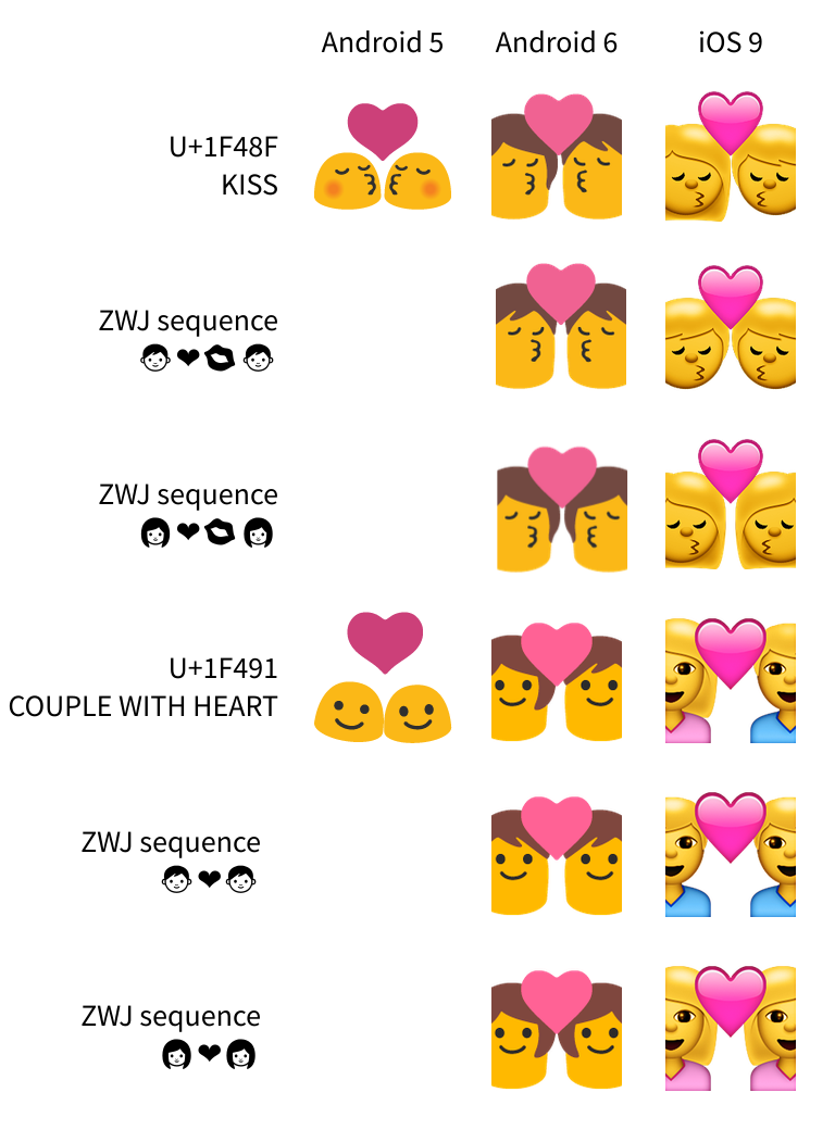
Before, both images were gender-agnostic blobs. Now, with the increased “diversity”, you can choose from various combinations of genders… but the genderless version is gone. The default — what you get from the single characters on their own, without any chimera gluing stuff — is heteromance.
In fact, almost every major font does this for both KISS and COUPLE WITH HEART, save for Microsoft’s. (HTC’s KISS doesn’t, but only because it doesn’t show people at all.)
Google’s font has changed from “here are two people” to “heterosexuals are the default, but you can use some other particular combinations too”. This isn’t a step towards diversity; this is a step backwards. It also violates the advice in the very document that’s largely based on “whatever Apple and Google are doing”, which is confounding.
Sometimes, Apple is wrong
It also highlights another problem with treating Apple’s font as canonical, which is that Apple is occasionally wrong. I concede that “wrong” is a fuzzy concept here, but I think “surprising, given the name of the character” is a reasonable definition.
In that sense, everyone but Microsoft is wrong about 💏 U+1F48F KISS and 💑 U+1F491 COUPLE WITH HEART, since neither character mentions gender.
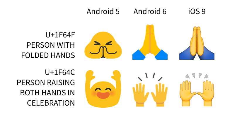
You might expect 🙌 U+1F64C PERSON RAISING BOTH HANDS IN CELEBRATION and 🙏 U+1F64F PERSON WITH FOLDED HANDS to depict people, but Apple only shows a pair of hands for both of them. This is particularly bad with PERSON WITH FOLDED HANDS, which just looks like a high five. Almost every other font has followed suit (…CELEBRATION, …FOLDED HANDS). Google used to get this right, but changed it with the update.
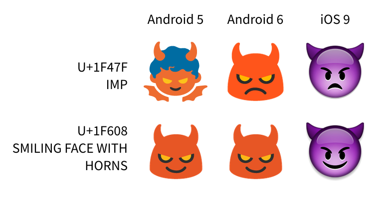
👿 U+1F47F IMP suggests, er, an imp, especially since it’s right next to other “monster” characters like 👾 U+1F47E ALIEN MONSTER and 👹 U+1F479 JAPANESE OGRE. Apple appears to have copied its own 😈 U+1F608 SMILING FACE WITH HORNS from the emoticons block and changed the smile to a frown, producing something I would never guess is meant to be an imp. Google followed suit, just like most other fonts, resulting in the tragic loss of one of my favorite Noto glyphs and the only generic representation of a demon.
👯 U+1F46F WOMAN WITH BUNNY EARS suggests a woman. Apple has two, for some reason, though that hasn’t been copied quite as much.
⬜ U+2B1C WHITE LARGE SQUARE needs a little explanation. Before Unicode contained any emoji (several of which are named with explicit colors), quite a few character names used “black” to mean “filled” and “white” to mean “empty”, referring to how the character would look when printed in black ink on white paper. “White large square” really means the outline of a square, in contrast to ⬛ U+2B1B BLACK LARGE SQUARE, which is solid. Unfortunately, both of these characters somehow ended up in virtually every emoji font, despite not being in the original lists of Japanese carriers’ emoji… and everyone gets it wrong, save for Microsoft. Every single font shows a solid square colored white. Except Google, who colors it blue. And Facebook, who has some kind of window frame, which it colors black for the BLACK glyph.
When Apple screws up and doesn’t fix it, everyone else copies their screw-up for the sake of compatibility — and as far as I can tell, the only time Apple has ever changed emoji is for the addition of skin tones and when updating images of their own products. We’re letting Apple set a de facto standard for the appearance of text, even when they’re incorrect, because… well, I’m not even sure why.
Hand gestures
Returning briefly to the idea of diversity, Google also updated the glyphs for its dozen or so “hand gesture” emoji:
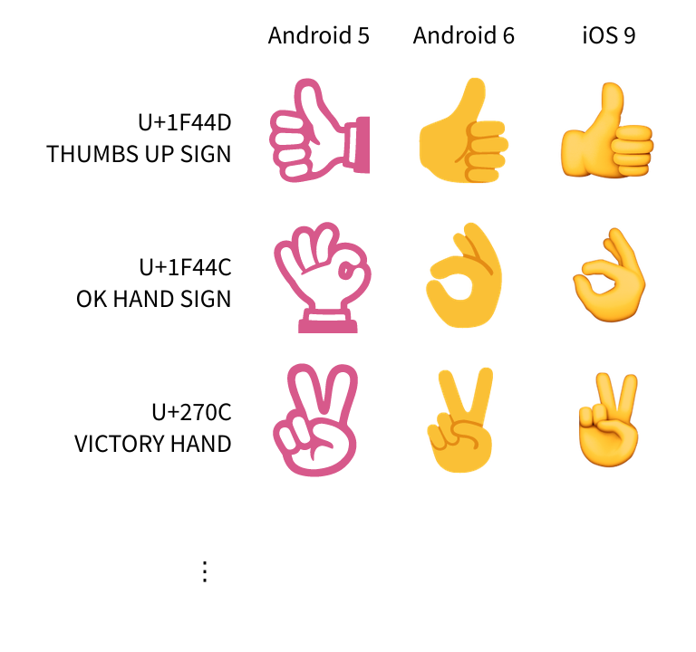
They used to be pink outlines with a flat white fill, but now are a more realistic flat style with the same yellow as the blob faces and shading. This is almost certainly for the sake of supporting the skin tone modifiers later, though Noto doesn’t actually support them yet.
The problem is, the new ones are much harder to tell apart at a glance! The shadows are very subtle, especially at small sizes, so they might as well all be yellow splats.
I always saw the old glyphs as abstract symbols, rather than a crop of a person, even a cartoony person. That might be because I’m white as hell, though. I don’t know. If people of color generally saw them the same way, it seems a shame to have made them all less distinct.
It’s not like the pink and white style would’ve prevented Noto from supporting skin tones in the future, either. Nothing says an emoji with a skin tone has to look exactly like the same emoji without one. The font could easily use the more abstract symbols by default, and switch to this more realistic style when combined with a skin tone.
💩
And finally, some kind of tragic accident has made 💩 U+1F4A9 PILE OF POO turn super goofy and grow a face.
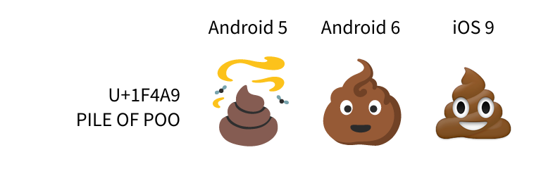
Why? Well, you see, Apple’s has a face. And so does almost everyone else’s, now.
I looked at the original draft proposal for this one, and SoftBank (the network the iPhone first launched on in Japan) also had a face for this character, whereas KDDI did not. So the true origin is probably just that one particular carrier happened to strike a deal to carry the iPhone first.
Interop and confusion
I’m sure the rationale for many of these changes was to reduce confusion when Android and iOS devices communicate. I’m sure plenty of people celebrated the changes on those grounds.
I was subscribed to several Android Telegram issues about emoji before the issue tracker was shut down, so I got a glimpse into how people feel about this. One person was particularly adamant that in general, the recipient should always see exactly the same image that the sender chose. Which sounds… like it’s asking for embedded images. Which Telegram supports. So maybe use those instead?
I grew up on the Internet, in a time when ^_^ looked terrible in mIRC’s default font of Fixedsys but just fine in PIRCH98. Some people used MS Comic Chat, which would try to encode actions in a way that looked like annoying noise to everyone else. Abbreviations were still a novelty, so you might not know what “ttfn” means.
Somehow, we all survived. We caught on, we asked for clarification, we learned the rules, and life went on. All human communication is ambiguous, so it baffles me when people bring up “there’s more than one emoji font” as though it spelled the end of civilization. Someone might read what you wrote and interpret it differently than you intended? Damn, that is definitely a new and serious problem that we have no idea how to handle.
It sounds to me how this would’ve sounded in 1998:
A: ^_^
B: Wow, that looks totally goofy over here. I’m using mIRC.
A: Oh, I see the problem. Every IRC client should use Arial, like PIRCH does.
That is, after all, the usual subtext: every font should just copy whatever Apple does. Let’s not.
Look, science!
Conveniently for me, someone just did a study on this. Here’s what I found most interesting:
Overall, we found that if you send an emoji across platform boundaries (e.g., an iPhone to a Nexus), the sender and the receiver will differ by about 2.04 points on average on our -5 to 5 sentiment scale. However, even within platforms, the average difference is 1.88 points.
In other words, people still interpret the same exact glyph differently — just like people sometimes interpret the same words differently.
The gap between same-glyph and different-glyph is a mere 0.16 points out of a 10-point scale, a mere 1.6%. The paper still concludes that the designs should move closer together, and sure, they totally should — towards what the characters describe.
To underscore that idea, note the summary page discusses U+1F601 😁 GRINNING FACE WITH SMILING EYES across five different fonts. Surely this should express something positive, right? Grins are positive, smiling eyes are positive; this might be the most positive face in Unicode. Indeed, every font was measured as expressing a very positive emotion, except Apple’s, which was apparently controversial but averaged out to slightly negative. Looking at the various renderings, I can totally see how Apple’s might be construed as a grimace.
So in the name of interoperability, what should font vendors do here? Push Apple (and Twitter and Facebook, by the look of it) to change their glyph? Or should everyone else change, so we end up in a world where two-thirds of people think “grinning face with smiling eyes” is expressing negativity?
A diversion: fonts
Perhaps the real problem here is font support itself.
You can’t install fonts or change default fonts on either iOS or Android (sans root). That Telegram developer who loves Apple’s emoji should absolutely be able to switch their Android devices to use Apple’s font… but that’s impossible.
It’s doubly impossible because of a teensy technical snag. You see,
-
Apple added support for embedding PNG images in an OpenType font to OS X and iOS.
-
Google added support for embedding PNG images in an OpenType font to FreeType, the font rendering library used on Linux and Android. But they did it differently from Apple.
-
Microsoft added support for color layers in OpenType, so all of its emoji are basically several different monochrome vector images colored and stacked together. It’s actually an interesting approach — it makes the font smaller, it allows pieces to be reused between characters, and it allows the same emoji to be rendered in different palettes on different background colors almost for free.
-
Mozilla went way out into the weeds and added support for embedding SVG in OpenType. If you’re using Firefox, please enjoy these animated emoji. Those are just the letter “o” in plain text — try highlighting or copy/pasting it. The animation is part of the font. (I don’t know whether this mechanism can adapt to the current font color, but these particular soccer balls do not.)
We have four separate ways to create an emoji font, all of them incompatible, none of them standard (yet? I think?). You can’t even make one set of images and save it as four separate fonts, because they’re all designed very differently: Apple and Google only support regular PNG images, Microsoft only supports stacked layers of solid colors, and Mozilla is ridiculously flexible but still prefers vectors. Apple and Google control the mobile market, so they’re likely to win in the end, which seems a shame since their approaches are the least flexible in terms of size and color and other text properties.
I don’t think most people have noticed this, partly because even desktop operating systems don’t have an obvious way to change the emoji font (so who would think to try?), and partly because emoji mostly crop up on desktops via web sites which can quietly substitute images (like Twitter and Slack do). It’s not a situation I’d like to see become permanent, though.
Consider, if you will, that making an emoji font is really hard — there are over 1200 high-resolution images to create, if you want to match Apple’s font. If you used any web forums or IM clients ten years ago, you’re probably also aware that most smiley packs are pretty bad. If you’re stuck on a platform where the default emoji font just horrifies you (for example), surely you’d like to be able to change the font system-wide.
Disconnecting the fonts from the platforms would actually make it easier to create a new emoji font, because the ability to install more than one side-by-side means that no one font would need to cover everything. You could make a font that provides all the facial expressions, and let someone else worry about the animals. Or you could make a font that provides ZWJ sequences for every combination of an animal face and a facial expression. (Yes, please.) Or you could make a font that turns names of Pokémon into ligatures, so e-e-v-e-e displays as ![]() , similar to how Sans Bullshit Sans works.
, similar to how Sans Bullshit Sans works.
But no one can do any of this, so long as there’s no single extension that works everywhere.
(Also, for some reason, I’ve yet to get Google’s font to work anywhere in Linux. I’m sure there are some fascinating technical reasons, but the upshot is that Google’s browser doesn’t support Google’s emoji font using Google’s FreeType patch that implements Google’s own font extension. It’s been like this for years, and there’s been barely any movement on it, leaving Linux as the only remotely-major platform that can’t seem to natively render color emoji glyphs — even though Android can.)
Appendix
Some miscellaneous thoughts:
-
I’m really glad that emoji have forced more developers to actually handle Unicode correctly. Having to deal with commonly-used characters outside of ASCII is a pretty big kick in the pants already, but most emoji are also in Plane 1, which means they don’t fit in a single JavaScript “character” — an issue that would otherwise be really easy to overlook.
-
On the other hand, it’s a shame that the rise of emoji keyboards hasn’t necessarily made the rest of Unicode accessible. There are still plenty of common symbols, like ♫, that I can only type on my phone using the Japanese keyboard. I do finally have an input method on my desktop that lets me enter characters by name, which is nice. We’ve certainly improved since the olden days, when you just had to memorize that Alt0233 produced an é… or, wait, maybe English Windows users still have to do that.
-
Breadth of font support is still a problem outside of emoji, and in a plaintext environment there’s just no way to provide any fallback. Google’s Noto font family aspires to have full coverage — it’s named for “no tofu”, referring to the small boxes that often appear for undisplayable characters — but there are still quite a few gaps. Also, on Android, a character that you don’t have a font for just doesn’t appear at all, with no indication you’re missing anything. That’s one way to get no tofu, I guess.
-
Brands™ running ad campaigns revolving around emoji are probably the worst thing. Hey, if we had a standard way to make colored fonts, then Guinness could’ve just released a font with a darker 🍺 U+1F37A BEER MUG and 🍻 U+1F37B CLINKING BEER MUGS, rather than running a ridiculous ad campaign asking Unicode to add a stout emoji.
-
If you’re on a platform that doesn’t ship with an emoji font, you should really really get Symbola. It covers a vast swath of Unicode with regular old black-and-white vector glyphs, usually using the example glyphs from Unicode’s own documents.
-
The plural is “emoji”, dangit. ∎
