
 notepad
![[articles]](https://eev.ee/theme/images/category-articles.png)
I’ve now made a few small games. One of the trickiest and most interesting parts of designing them has been making them accessible.
I mean that in a very general and literal sense. I want as many people as possible to experience as much of my games as possible. Finding and clearing out unnecessary hurdles can be hard, but every one I leave risks losing a bunch of players who can’t or won’t clear it.
I’ve noticed three major categories of hurdle, all of them full of tradeoffs. Difficulty is what makes a game challenging, but if a player can’t get past a certain point, they can never see the rest of the game. Depth is great, but not everyone has 80 hours to pour into a game, and it’s tough to spend weeks of dev time on stuff most people won’t see. Distribution is a question of who can even get your game in the first place.
Here are some thoughts.
Mario Maker
Mario Maker is most notable for how accessible it is to budding game designers, which is important but also a completely different sense of accessibility.
The really nice thing about Mario Maker is that its levels are also accessible to players. Virtually everyone who’s heard of video games has heard of Mario. You don’t need to know many rules to be able to play. Move to the right, jump over/on things, and get to the flag.
(The “distribution” model is a bit of a shame, though — you need to own a particular console and a $60 game. If I want people to play a single individual level I made, that’s a lot of upfront investment to ask for. Ultimately Nintendo is in this to sell their own game more than to help people show off their own.)
But the emergent depth of Mario Maker’s myriad objects — the very property that makes the platform more than a toy — also makes it less accessible. Everyone knows you move around and jump, but not everyone knows you can pick up an item with B, or that you can put on a hat you’re carrying by pressing ↓, or that you can spinjump on certain hazards. And these are fairly basic controls — Mario Maker contains plenty of special interactions between more obscure objects, and no manual explaining them all.
I thought it was especially interesting that Nintendo’s own comic series on building Mario Maker levels specifically points out that running jumps don’t come naturally to everyone. It’s hard to imagine too many people playing Mario Maker and not knowing how to jump while running.
And yet.
And yet, imagine being one such person, and encountering a level that requires a running jump early on. You can’t get past it. You might not even understand how to get past it; perhaps you don’t even know Mario can run. Now what? That’s it, you’re stuck. You’ll never see the rest of that level. It’s a hurdle, in a somewhat more literal sense.
Why make the level that way in the first place, then? Does any seasoned Mario player jump over a moderate-width gap and come away feeling proud for having conquered it? Seems unlikely.
I’ve tried playing through 100 Mario Challenge on Expert a number of times (without once managing to complete it), and I’ve noticed three fuzzy categories. Some levels are an arbitrary mess of hazards right from the start, so I don’t expect them to get any easier. Some levels are clearly designed as difficult obstacle courses, so again, I assume they’ll be just as hard all the way through. In both cases, if I give up and skip to the next level, I don’t feel like I’m missing out on anything — I’m not the intended audience.
But there are some Expert-ranked levels that seem pretty reasonable… until this one point where all hell breaks loose. I always wonder how deliberate those parts are, and I vaguely regret skipping them — would the rest of the level have calmed back down and been enjoyable?
That’s the kind of hurdle I think about when I see conspicuous clusters of death markers in my own levels. How many people died there and gave up? I make levels intending for people to play them, to see them through, but how many players have I turned off with some needlessly tricky part?
One of my levels is a Boo house with a few cute tricks in it. Unfortunately, I also put a ring of Boos right at the beginning that’s tricky to jump through, so it’s very easy for a player to die several times right there and never see anything else.
I wanted my Boo house to be interesting rather than difficult, but I let difficulty creep in accidentally, and so I’ve reduced the number of people who can appreciate the interestingness. Every level I’ve made since then, I’ve struggled to keep the difficulty down, and still sometimes failed. It’s easy to make a level that’s very hard; it’s surprisingly hard to make a level that’s fairly easy. All it takes is a single unintended hurdle — a tricky jump, an awkwardly-placed enemy — to start losing players.
This isn’t to say that games should never be difficult, but difficulty needs to be deliberately calibrated, and that’s a hard thing to do. It’s very easy to think only in terms of “can I beat this”, and even that’s not accurate, since you know every nook and cranny of your own level. Can you beat it blind, on the first few tries? Could someone else?
Those questions are especially important in Mario Maker, where the easiest way to encounter an assortment of levels is to play 100 Mario Challenge. You have 100 lives and need to beat 16 randomly-chosen levels. If you run out of lives, you’re done, and you have to start over. If I encounter your level here, I can’t afford to burn more than six or seven lives on it, or I’ll game over and have wasted my time. So if your level looks ridiculously hard (and not even in a fun way), I’ll just skip it and hope I get a better level next time.
I wonder if designers forget to calibrate for this. When you spend a lot of time working on something, it’s easy to imagine it exists in a vacuum, to assume that other people will be as devoted to playing it as you were to making it.
Mario Maker is an extreme case: millions of levels are available, and any player can skip to another one with the push of a button. That might be why I feel like I’ve seen a huge schism in level difficulty: most Expert levels are impossible for me, whereas most Normal levels are fairly doable with one or two rough patches. I haven’t seen much that’s in the middle, that feels like a solid challenge. I suspect that people who are very good at Mario are looking for an extreme challenge, and everyone else just wants to play some Mario, so moderate-difficulty levels just aren’t as common. The former group will be bored by them, and the latter group will skip them.
Or maybe that’s a stretch. It’s hard to generalize about the game’s pool of levels when they number in the millions, and I can’t have played more than a few hundred.
What Mario Maker has really taught me is what a hurdle looks like. The game keeps track of everywhere a player has ever died. I may not be able to watch people play my levels, but looking back at them later and seeing clumps of death markers is very powerful. Those are the places people failed. Did they stop playing after that? Did I intend for those places to be so difficult?
Doom
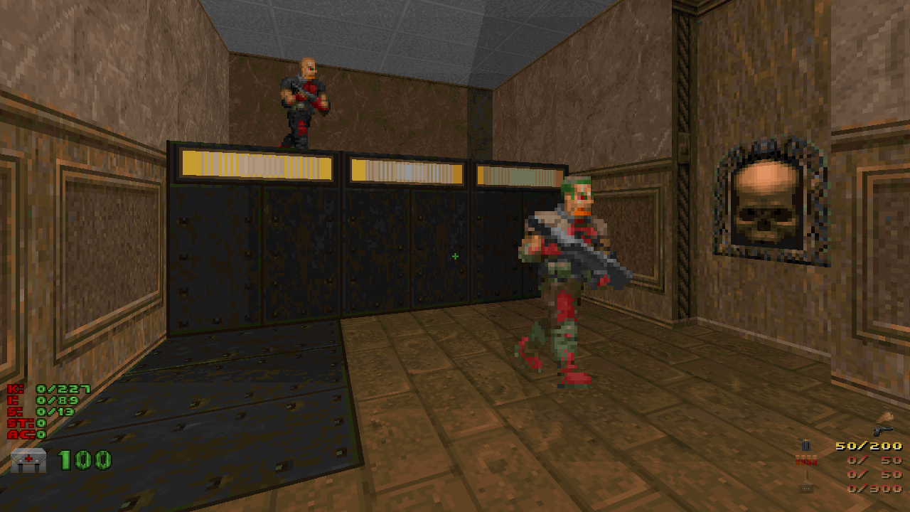
Doom is an interesting contrast to Mario Maker. A great many Doom maps have been produced over the past two decades, but nowhere near as many levels as Mario Maker has produced in a couple years. On the other hand, many people who still play Doom have been playing Doom this entire time, so a greater chunk of the community is really good at the game and enjoys a serious challenge.
I’ve only released a couple Doom maps of my own: Throughfare (the one I contributed to DUMP 2 earlier this year) and a few one-hour speedmaps I made earlier this week. I like building in Doom, with its interesting balance of restrictions — it’s a fairly accessible way to build an interesting 3D world, and nothing else is quite like it.
I’ve had the privilege of watching a few people play through my maps live, and I have learned some things.
The first is that the community’s love of difficulty is comically misleading. It’s not wrong, but, well, that community isn’t actually my target audience. So far I’ve “published” maps on this blog and Twitter, where my audience hasn’t necessarily even played Doom in twenty years. If at all! Some of my followers are younger than Doom.
Most notably, this creates something of a distribution problem: to play my maps, you need to install a thing (ZDoom) and kinda figure out how to use it and also get a copy of Doom 2 which probably involves spending five bucks. Less of a hurdle than getting Mario Maker, yes, but still some upfront effort.
Also, ZDoom’s default settings are… not optimal. Out of the box, it’s similar to classic Doom: no WASD, no mouselook. I don’t know who this is meant to appeal to. If you’ve never played Doom, the controls are goofy. If you’ve played other shooters, the controls are goofy. If you played Doom when it came out but not since, you probably don’t remember the controls, so they’re still goofy. Oof.
Not having mouselook is more of a problem than you’d think. If you as the designer play with mouselook, it’s really easy to put important things off the top or bottom of the screen and never realize it’ll be a problem. I watched someone play through Throughfare a few days ago and get completely stuck at what seemed to be a dead end — because he needed to drop down a hole in a small platform, and the hole was completely hidden by the status bar.
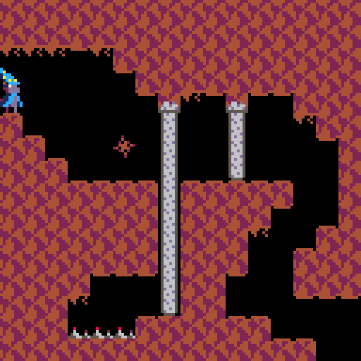
That’s actually an interesting example for another reason. Here’s the room where he got stuck.
When you press the switch, the metal plates on the ground rise up and become stairs, so you can get onto the platform. He did that, saw nowhere obvious to go, and immediately turned around and backtracked quite a ways looking for some other route.
This surprised me! The room makes no sense as a dead end. It’s not an easter egg or interesting feature; it has no obvious reward; it has a button that appears to help you progress. If I were stuck here, I’d investigate the hell out of this room — yet this player gave up almost immediately.
Not to say that the player is wrong and the level is right. This room was supposed to be trivially simple, and I regret that it became a hurdle for someone. It’s just a difference in playstyle I didn’t account for. Besides the mouselook problem, this player tended to move very quickly in general, charging straight ahead in new areas without so much as looking around; I play more slowly, looking around for nooks and crannies. He ended up missing the plasma gun for much the same reason — it was on a ledge slightly below the default view angle, making it hard to see without mouselook.
Speaking of nooks and crannies: watching someone find or miss secrets in a world I built is utterly fascinating. I’ve watched several people play Throughfare now, and the secrets are the part I love watching the most. I’ve seen people charge directly into secrets on accident; I’ve seen people run straight to a very clever secret just because they had the same idea I did; I’ve seen people find a secret switch and then not press it. It’s amazing how different just a handful of players have been.
I think the spread of secrets in Throughfare is pretty good, though I slightly regret using the same trick three times; either you get it right away and try it everywhere, or you don’t get it at all and miss out on a lot of goodies. Of course, the whole point of secrets is that not everyone will find them on the first try (or at all), so it’s probably okay to err on the trickier side.
As for the speedmaps, I’ve only watched one person play them live. The biggest hurdle was a room I made that required jumping.
Jumping wasn’t in the original Doom games. People thus don’t really expect to need to jump in Doom maps. Worse, ZDoom doesn’t even have a key bound to jump out of the box, which I only discovered later.
See, when I made the room (very quickly), I was imagining a ZDoom veteran seeing it and immediately thinking, “oh, this is one of those maps where I need to jump”. I’ve heard people say that about other maps before, so it felt like common knowledge. But it’s only common knowledge if you’re part of the community and have run into a few maps that require jumping.
The situation is made all the more complicated by the way ZDoom handles it. Maps can use a ZDoom-specific settings file to explicitly allow or forbid jumping, but the default is to allow it. The stock maps and most third-party vanilla maps won’t have this ZDoom-specific file, so jumping will be allowed, even though they’re not designed for it. Most mappers only use this file at all if they’re making something specifically for ZDoom, in which case they might as well allow jumping anyway. It’s opt-out, but the maps that don’t want it are the ones least likely to use the opt-out, so in practice everyone has to assume jumping isn’t allowed until they see some strong indication otherwise. It’s a mess. Oh, and ZDoom also supports crouching, which is even more obscure.
I probably should’ve thought of all that at the time. In my defense, you know, speedmap.
One other minor thing was that, of course, ZDoom uses the traditional Doom HUD out of the box, and plenty of people play that way on purpose. I’m used to ZDoom’s “alternative” HUD, which not only expands your field of view slightly, but also shows a permanent count of how many secrets are in the level and how many you’ve found. I love that, because it tells me how much secret-hunting I’ll need to do from the beginning… but if you don’t use that HUD (and don’t look at the count on the automap), you won’t even know whether there are secrets or not.
For a third-party example: a recent (well, late 2014) cool release was Going Down, a set of small and devilish maps presented as the floors of a building you’re traversing from the roof downwards. I don’t actually play a lot of Doom, but I liked this concept enough to actually play it, and I enjoyed the clever traps and interwoven architecture.
Then I reached MAP12, Dead End. An appropriate name, because I got stuck here. Permanently stuck. The climax of the map is too many monsters in not enough space, and it’s cleverly rigged to remove the only remaining cover right when you need it. I couldn’t beat it.
That was a year ago. I haven’t seen any of the other 20 maps beyond this point. I’m sure they’re very cool, but I can’t get to them. This one is too high a hurdle.
Granted, hopping around levels is trivially easy in Doom games, but I don’t want to cheat my way through — and anyway, if I can’t beat MAP12, what hope do I have of beating MAP27?
I feel ambivalent about this. The author describes the gameplay as “chaotic evil”, so it is meant to be very hard, and I appreciate the design of the traps… but I’m unable to appreciate any more of them.
This isn’t the author’s fault, anyway; it’s baked into the design of Doom. If you can’t beat one level, you don’t get to see any future levels. In vanilla Doom it was particularly bad: if you die, you restart the level with no weapons or armor, probably making it even harder than it was before. You can save any time, and some modern source ports like ZDoom will autosave when you start a level, but the original game never saved automatically.
Isaac's Descent
Isaac’s Descent is the little PICO-8 puzzle platformer I made for Ludum Dare 36 a couple months ago. It worked out surprisingly well; pretty much everyone who played it (and commented on it to me) got it, finished it, and enjoyed it. The PICO-8 exports to an HTML player, too, so anyone with a keyboard can play it with no further effort required.
I was really happy with the puzzle design, especially considering I hadn’t really made a puzzle game before and was rushing to make some rooms in a very short span of time. Only two were perhaps unfair. One was the penultimate room, which involved a tricky timing puzzle, so I’m not too bothered about that. The other was this room:
Using the wheel raises all stone doors in the room. Stone doors open at a constant rate, wait for a fixed time, and then close again. The tricky part with this puzzle is that by the time the very tall door has opened, the short door has already closed again. The solution is simply to use the wheel again right after the short door has closed, while the tall door is still opening. The short door will reopen, while the tall door won’t be affected since it’s already busy.
This isn’t particularly difficult to figure out, but it did catch a few people, and overall it doesn’t sit particularly well with me. Using the wheel while a door is opening feels like a weird edge case, not something that a game would usually rely on, yet I based an entire puzzle around it. I don’t know. I might be overthinking this. The problem might be that “ignore the message” is a very computery thing to do and doesn’t match with how such a wheel would work in practice; perhaps I’d like the puzzle more if the wheel always interrupted whatever a door was doing and forced it to raise again.
Overall, though, the puzzles worked well.
The biggest snags I saw were control issues with the PICO-8 itself. The PICO-8 is a “fantasy console” — effectively an emulator for a console that never existed. One of the consequences of this is that the controls aren’t defined in terms of keyboard keys, but in terms of the PICO-8’s own “controller”. Unfortunately, that controller is only defined indirectly, and the web player doesn’t indicate in any way how it works.
The controller’s main inputs — the only ones a game can actually read — are a directional pad and two buttons, ○ and ❌, which map to z and x on a keyboard. The PICO-8 font has glyphs for ○ and ❌, so I used those to indicate which button does what. Unfortunately, if you aren’t familiar with the PICO-8, those won’t make a lot of sense to you. It’s nice that ❌ looks like the keyboard key it’s bound to, but ○ looks like the wrong keyboard key. This caused a little confusion.
“Well,” I hear you say, “why not just refer to the keys directly?” Ah, but there’s a very good reason the PICO-8 is defined in terms of buttons: those aren’t the only keys you can use! n and m also work, as do c and v. The PocketCHIP also allows… 0 and =, I think, which is good because z and x are directly under the arrow keys on the PocketCHIP keyboard. And of course you can play on a USB controller, or rebind the keys.
I could’ve mentioned that z and x are the defaults, but that’s wrong for the PocketCHIP, and now I’m looking at a screenful of text explaining buttons that most people won’t read anyway.
A similar problem is the pause menu, accessible with p or enter. I’d put an option on the pause menu for resetting the room you’re in, just in case, but didn’t bother to explain how to get to the pause menu.Or that a pause menu exists. Also, the ability to put custom things on the pause menu is new, so a lot of people might not even know about it. I’m sure you can see this coming: a few rooms (including the two-door one) had places you could get stuck, and without any obvious way to restart the room, a few people thought they had to start the whole game over. Whoops.
In my defense, the web player is actively working against me here: it has a “pause” link below the console, but all the link does is freeze the player, not bring up the pause menu.
This is a recurring problem, and perhaps a fundamental question of making games accessible: how much do you need to explain to people who aren’t familiar with the platform or paradigm? Should every single game explain itself? Players who don’t need the explanation can easily get irritated by it, and that’s a bad way to start a game. The PICO-8 in particular has the extra wrinkle that its cartridge space is very limited, and any kind of explanation/tutorial costs space you could be using for gameplay. On the other hand, I’ve played more than one popular PICO-8 game that was completely opaque to me because it didn’t explain its controls at all.
I’m reminded of Counterfeit Monkey, a very good interactive fiction game that goes out of its way to implement a hint system and a gentle tutorial. The tutorial knits perfectly with the story, and the hints are trivially turned off, so neither is a bother. The game also has a hard mode, which eliminates some of the more obvious solutions and gives a nod to seasoned IF players as well. The author is very interested in making interactive fiction more accessible in general, and it definitely shows. I think this game alone convinced me it’s worth the effort — I’m putting many of the same touches in my own IF foray.
Under Construction
Under Construction is the PICO-8 game that Mel and I made early this year. It’s a simple, slightly surreal, slightly obtuse platformer.
Traditional wisdom has it that you don’t want games to be obtuse. That acts as a hurdle, and loses you players. Here, though, it’s part of the experience, so the question becomes how to strike a good balance without losing the impact.
A valid complaint we heard was that the use of color is slightly inconsistent in places. For the most part, foreground objects (those you can stand on) are light and background decorations are gray, but a couple tiles break that pattern. A related problem that came up almost immediately in beta testing was that spikes were difficult to pick out. I addressed that — fairly effectively, I think — by adding a single dark red pixel to the tip of the spikes.
But the most common hurdle by far was act 3, which caught us completely by surprise. Spoilers!
From the very beginning, the world contains a lot of pillars containing eyeballs that look at you. They don’t otherwise do anything, beyond act as platforms you can stand on.
In act 2, a number of little radios appear throughout the world. Mr. 5 complains that it’s very noisy, so you need to break all the radios by jumping on them.
In act 3, the world seems largely the same… but the eyes in the pillars now turn to ❌’s when you touch them. If this happens before you make it to the end, Mr. 5 complains that he’s in pain, and the act restarts.
The correct solution is to avoid touching any of the eye pillars. But because this comes immediately after act 2, where we taught the player to jump on things to defeat them — reinforcing a very common platforming mechanic — some players thought you were supposed to jump on all of them.
I don’t know how we could’ve seen that coming. The acts were implemented one at a time and not in the order they appear in the game, so we were both pretty used to every individual mechanic before we started playing through the entire game at once. I suppose when a game is developed and tested in pieces (as most games are), the order and connection between those pieces is a weak point and needs some extra consideration.
We didn’t change the game to address this, but the manual contains a strong hint.
Under Construction also contains a couple of easter eggs and different endings. All are fairly minor changes, but they added a lot of character to the game and gave its fans something else to delve into once they’d beaten it.
Crucially, these things worked as well as they did because they weren’t accessible. Easily-accessed easter eggs aren’t really easter eggs any more, after all. I don’t think the game has any explicit indication that the ending can vary, which meant that players would only find out about it from us or other fans.
I don’t yet know the right answer for balancing these kinds of extras, and perhaps there isn’t one. If you spend a lot of time on easter eggs, multiple endings, or even just multiple paths through the game, you’re putting a lot of effort into stuff that many players will never see. On the other hand, they add an incredible amount of depth and charm to a game and reward those players who do stick around to explore.
This is a lot like the balancing act with software interfaces. You want your thing to be accessible in the sense that a newcomer can sit down and get useful work done, but you also want to reward long-time users with shortcuts and more advanced features. You don’t want to hide advanced features too much, but you also don’t want to have an interface with a thousand buttons.
How larger and better-known games deal with this
I don’t have the patience for Zelda I. I never even tried it until I got it for free on my 3DS, as part of a pack of Virtual Console games given to everyone who bought a 3DS early. I gave it a shot, but I got bored really quickly. The overworld was probably the most frustrating part: the connections between places are weird, everything looks pretty much the same, the map is not very helpful, and very little acts as a landmark. I could’ve drawn my own map, but, well, I usually can’t be bothered to do that for games.
I contrast this with Skyward Sword, which I mostly enjoyed. Ironically, one of my complaints is that it doesn’t quite have an overworld. It almost does, but they stopped most of the way, leaving us with three large chunks of world and a completely-open sky area reminiscent of Wind Waker’s ocean.
Clearly, something about huge open spaces with no barriers whatsoever appeals to the Zelda team. I have to wonder if they’re trying to avoid situations like my experience with Zelda I. If a player gets lost in an expansive overworld, either they’ll figure out where to go eventually, or they’ll give up and never see the rest of the game. Losing players that way, especially in a story-driven game, is a huge shame.
And this is kind of a problem with the medium in general. For all the lip service paid to nonlinearity and sandboxes, the vast majority of games require some core progression that’s purely linear. You may be able to wander around a huge overworld, but you still must complete these dungeons and quests in this specific order. If something prevents you from doing one of them, you won’t be able to experience the others. You have to do all of the first x parts of the game before you can see part x + 1.
This is really weird! No other media is like this. If you watch a movie or read a book or listen to a song and some part of it is inaccessible for whatever reason — the plot is poorly explained, a joke goes over your head, the lyrics are mumbled — you can still keep going and experience the rest. The stuff that comes later might even help you make sense of the part you didn’t get.
In games, these little bumps in the road can become walls.
It’s not even necessarily difficulty, or getting lost, or whatever. A lot of mobile puzzle games use the same kind of artificial progression where you can only do puzzles in sequential batches; solving enough of the available puzzles will unlock the next batch. But in the interest of padding out the length, many of these games will have dozens of trivially easy and nearly identical puzzles in the beginning, which you have to solve to get to the later interesting ones. Sometimes I’ve gotten so bored by this that I’ve given up on a game before reaching the interesting puzzles.
In a way, that’s the same problem as getting lost in an overworld. Getting lost isn’t a hard wall, after all — you can always do an exhaustive search and talk to every NPC twice. But that takes time, and it’s not fun, much like the batches of required baby puzzles. People generally don’t like playing games that waste their time.
I love the Picross “e” series on the 3DS, because over time they’ve largely figured out that this is pointless: in the latest game in the series, everything is available from the beginning. Want to do easy puzzles? Do easy puzzles. Want to skip right to the hard stuff? Sure, do that. Don’t like being told when you made a wrong move? Turn it off.
(It’s kinda funny that the same people then made Pokémon Picross, which has some of the most absurd progression I’ve ever seen. Progressing beyond the first half-dozen puzzles requires spending weeks doing a boring minigame every day to grind enough pseudocurrency to unlock more puzzles. Or you can just pay for pseudocurrency, and you’ll have unlocked pretty much the whole game instantly. It might as well just be a demo; the non-paid progression is useless.)
Chip’s Challenge also handled this pretty well. You couldn’t skip around between levels arbitrarily, which was somewhat justified by the (very light) plot. Instead, if you died or restarted enough times, the game would offer to skip you to the next level, and that would be that. You weren’t denied the rest of the game just because you couldn’t figure out an ice maze or complete some horrible nightmare like Blobnet.
I wish this sort of mechanic were more common. Not so games could be more difficult, but so games wouldn’t have to worry as much about erring on the side of ease. I don’t know how it could work for a story-driven game where much of the story is told via experiencing the game itself, though — skipping parts of Portal would work poorly. On the other hand, Portal took the very clever step of offering “advanced” versions of several levels, which were altered very slightly to break all the obvious easy solutions.
Slapping on difficulty settings is nice for non-puzzle games (and even some puzzle games), but unless your game lets you change the difficulty partway through, someone who hits a wall still has to replay the entire game to change the difficulty. (Props to Doom 4, which looks to have taken difficulty levels very seriously — some have entirely different rules, and you can change whenever you want.)
I have a few wisps of ideas for how to deal with this in Isaac HD, but I can’t really talk about them before the design of the game has solidified a little more. Ultimately, my goal is the same as with everything else I do: to make something that people have a chance to enjoy, even if they don’t otherwise like the genre.