🔗 Play it on itch.io
🔗 Play it on the PICO-8 BBS (where you can also download the cart and view the source code)
(I originally drafted this just after publishing the game, but then decided to start a whole series about its development and wasn’t sure what to do with this! But it’s solid and serves a different purpose, so here it is.)
It’s been a while, but I made another PICO-8 game! It’s a little platformer with light puzzling, where you help Star Anise find his best friend Branch Commander Twig. It’s only half an hour long at worst, and it’s even playable on a phone!
This is the one-and-a-halfth entry in the Star Anise Chronicles series, which after several false starts, finally kicked off over Christmas with a… uh… interactive fiction game. Expect the series to continue with even more whiplash-inducing theme shifts.
More technical considerations will go in the “gamedev from scratch” series, but read on for some overall thoughts on the design. Both contain spoilers, of course, so I do urge you to play the game first.
The first attempt at a Star Anise game was two years ago, in early 2018. The idea was to make a Metroidvania where Star Anise had a bunch of guns that shot cat-themed projectiles, obtained a couple other cat-themed powers, and made a total mess of a serious plot happening in the background while he ran around collecting garbage.
After finishing up the Steam release of Cherry Kisses last month, we decided that our next game should be that one, which would now be Star Anise 2 (since i’d already released a Star Anise 1 some months ago). We have, uh, already altered these plans, but that’s the background.
I don’t really know why I started on this game. I guess there’s some element of stress to working on a project with someone, even if that someone is Ash (my spouse), and especially if I’m supposed to be driving it forward. I have to tell someone what to do, and then if I don’t like the result I have to ask them to fix it, and a lot of tiny design questions are out of my control anyway, and all of this is happening on someone else’s schedule, and I have to convey all the project state that’s in my head in a complicated non-verbal form, and… all of those things are a constant low-level source of stress.
So I guess we’d just finished a game that I’d designed, and it was looking like we were about to start a sizable project where I was the design lead again, and I wanted to make something I could finish by myself as an interlude.
And so I sat down with a teeny tiny tool to make a teeny tiny version of what I expected would be our next game.
Design
The basics were obvious: run, jump, land. I gave Star Anise little landing particles early on — they’re in the bigger prototype, I love landing puffs in general, and having them be stars adds so much silly personality.
I knew I wanted to have multiple abilities you collect, since that’s the heart of Metroidventures. I briefly considered giving Star Anise a gun, as in the prototype, but gave up on that pretty early. I would’ve had to sprite a gun, a projectile, a projectile explosion, enemies, enemy attacks, enemy death frames…
Don’t get me wrong; I have no problem with drawing all of that. The concern was that PICO-8 has a very limited amount of space for sprites — in the configuration I was using, 128 sprites of 8×8 pixels each. Star Anise himself takes up 9, even with some clever reuse for his walking animation. The star puff takes 4. The common world tile, plus versions for edges and corners, takes up 9. That’s 22 sprites already, more than 17% of the space I have, for absolutely nothing besides jumping around on solid ground. I would have to keep it simple.
That led me to the first two powers, both borrowed from the prototype:
-
AOWR starts conversation with NPCs and opens doors. I can’t really take any creative credit here, since these are both things Anise attempts to do with aowrs in real life.
-
Papping activates levers and knocks over glasses of liquid. Anise only does one of those in real life. (In the prototype, this is a gun — which shoots pawprint-shaped projectiles — but I’d already been thinking about making it a “melee” ability first.)
I adore both of these abilities. I think they both turn some common UI tropes on their heads. NPCs, doors, and levers are all things you usually interact with by pressing some generic “interact” button, but hitting a lever (and meowing at a door) adds some physicality to the action — you’re actually doing something, not just making it go.
And pressing A to talk to an NPC doesn’t really make any sense at all! Consider: almost universally, even in games where the player character speaks, pressing A to start a conversation leads off with the NPC talking. So what the hell did you actually do? What does pressing A represent actually doing that results in someone else casually starting a conversation with you, seemingly unprompted? I have no idea! It’s nonsense! But Anise meows at me all the time and I always respond to him, which is perfectly sensible.
The third power, telepawt, is a little newer. We’d conceived a cat teleporting power pretty recently, but it was more involved and required some big environmental props. I realized pretty quickly that I couldn’t possibly do much of interest on the tiny PICO-8 screen (16 × 16 tiles), but I do like teleporting abilities! I briefly considered ripping off Axiom Verge, but I’ve already done that in fox flux, and the physics are a little involved… and then, lo, inspiration! Combine the two ideas: teleport great distances, but in a controlled and predictable way, by teleporting to the point on the opposite side of the screen. It felt like a very 8-bit kind of power, and I could already imagine a few ways to hide stuff with it, so off I went.
And that seemed like a reasonable progression. A way to talk (and progress through doors), a way to interact with objects, and a way to move around. I decided about halfway through development to make jumping a faux powerup as well; it stretches out the progression a bit more by making you walk past potential jumps and then come back to them later, which is important when I don’t have much map space to work with.
I’d originally planned for items to be separate from abilities, but ran into a couple problems, the worst of which was that I really didn’t have much screen space for sprinkling more items around. I ended up turning items into abilities in their own right, which I think was an improvement overall; now you can crinkle the plastic bag wherever you want, for example.
The game deliberately doesn’t try to explain itself; PICO-8 only has six buttons, and four of them are a d-pad, so I figured button-mashing (as in ye olde NES days) would get everyone through. Still, several players were confused about how to jump (and possibly gave up before even acquiring jump?), and one didn’t realize you could switch abilities, despite the up/down arrowheads on the ability box. Not sure what to learn from this.
The map
I struggled a bit with the map. PICO-8 has a built-in map editor with enough space for 32 screen-sized rooms (arranged in an 8 × 4 grid), which it turns out is not very many. I also very much did not want the game space to be confined to exactly that size of rectangle, so I knew I’d have to do some funky stuff with room connections. (Armed with that power, I ended up making loops and other kinds of non-Euclidean geometry, but hey that’s plenty appropriate for an imaginary moon.)
The bigger problem was designing the rooms outside of the PICO-8 map editor. I tried sketching in Krita, and then on paper, but kept running into the same two problems: it was tedious to rearrange rooms, and I didn’t have a good sense of how much space was available per room.
I found a novel solution: I wrote a Python script to export the map to a PNG, opened it in Aseprite, and edited it there — with each pixel representing a tile and the grid size set to 16. Now I knew exactly how much space I had, and rearranging rooms was easy: double-clicking a cell selects it, and holding Alt while dragging a selection snaps it to the grid. Here’s the beginning part of the game, screenshotted directly from Aseprite at 400% zoom:
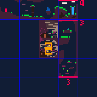
When it came time to pack it all back into a rectangle, I copied the whole map, rearranged the rooms, and numbered them all so I could keep track of connections. Surprisingly, it wasn’t that bad a workflow.
The non-Euclidean map connections came in handy for packing secrets in more efficiently; most of the secret stars are off-screen, making them harder to find, but I couldn’t really afford to have a dedicated treasure room for every single one. So I crammed two treasures into the same room a few times, even though the two routes you’d take to get there are generally nowhere near each other.
Doors helped stretch the map out, too. It’s probably obvious if you think about it in the slightest, but doors don’t lead to different rooms; they reuse the same room. But some tiles only appear in the overworld, some tiles only appear in cave world, and actors (besides doors) don’t spawn in caves. That seemingly small difference was enough to make rooms vastly different in the two worlds; the most extreme case is a “crossroads” room, which you traverse vertically in the overworld but horizontally in cave world. (Honestly, I wish I’d done a bit more of this, but it works best in rooms that only have two overworld exits, and there ended up not being too many of those. Also, caves are restricted to basically just platforming, so there’s only so much variety I can squeeze out of them.)
Designing caves was a little trickier than you might think, since the PICO-8 map has no layers! If something needed to occupy a tile in the overworld, then I could not put something in the same place in cave world. Along with the design nightmare that is telepawt, this gave me a couple headaches.
I do like the cave concept a lot, though. I love parallel versions of places in games, and I have an unfinished PICO-8 game that’s centered around that idea taken to extremes. It’s also kind of a nod to my LÖVE games, all the way back to Neon Phase, where going indoors didn’t load another map — rooms were just another layer.
Aesthetics
Originally, PICO-8 had a fixed palette of 16 colors. You could do palette swaps of various sorts, but you can’t actually change any of the colors.
But since I last used it, PICO-8 gained a “secret palette” — an extra 16 colors that you can request. You can’t have more than 16 colors on the screen at a time, but you can replace one of the existing colors with a “secret” color. There’s also an obscure way to tell PICO-8 to preserve the screen palette when the game finishes, which means I could effectively change the palette in the sprite editor. Hooray!
I didn’t want to completely change the palette, so I tried to keep the alterations minor. For the most part, I gave up reds and pinks for a better spread of greens, purples, and yellows. Here’s the core PICO-8 palette, the secret PICO-8 palette, and the game’s palette, respectively:
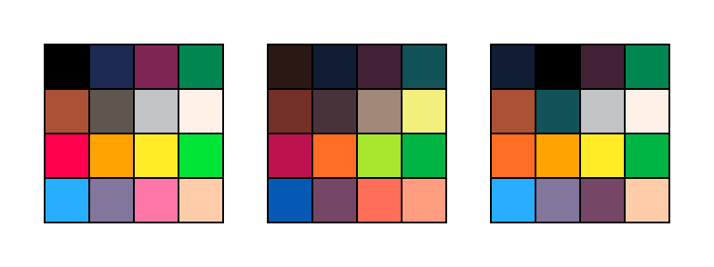
I think I did a decent job of preserving the overall color aesthetic while softening the harsh contrasts of the original palette, and the cool colors really helped the mood.
Note that I changed the background color (color 0 isn’t drawn when it appears in a sprite) to navy and promoted black to a foreground color, which helped black stand out more when used as an outline or whatever. Probably the best example of this is in the logo, traced from the vector logo I made for the first Star Anise game.
Hmm, what else. The tiles themselves felt almost forced, if that makes sense? Like I could only draw them one way. PICO-8 tiles are a rinky-dink 8 pixels, and boy that is not much to work with. If I had a lot of sprite space, I could make bigger metatiles, but… I don’t, so I couldn’t. I tried a lot of variations of tiles, and what I ended up with were pretty much the only things that worked.
I love how the emoting came out. I knew I didn’t have nearly enough room for facial expressions for everyone, but I wanted to give them some kind of visual way to express mood, and the tiny overlays kinda fell naturally out of that. I think they add a ton of personality, especially in how everyone uses them differently.
I’m pretty happy with the sound design, as well. I’m an extremely amateur composer, and I wrote 90% of the music in a few hours on the start of the last day, but I actually like how it came out and I like going back to listen to it. The sound effects are, with some mild exceptions, pretty much excellent — the aowr is incredible, it has fooled other folks in the house more than once, and I knew I had it right when I had a blast just running around mashing the meow button.
I’m also happy with the dialogue, and hope it conveys the lunekos’ personalities in just these few interactions.
While writing the ending, I had to stop in mid-draft to go cry. Then I cried again when I finished it a few days later. I’ll miss you forever, Branch Commander Twig.
If you did, thanks for playing.
![[updates]](https://eev.ee/theme/images/category-updates.png)
