
 notepad
![[articles]](https://eev.ee/theme/images/category-articles.png)
I used Perlin noise for the fog effect and title screen in Under Construction. I tweeted about my efforts to speed it up, and several people replied either confused about how Perlin noise works or not clear on what it actually is.
I admit I only (somewhat) understand Perlin noise in the first place because I’ve implemented it before, for flax, and that took several days of poring over half a dozen clumsy explanations that were more interested in showing off tech demos than actually explaining what was going on. The few helpful resources I found were often wrong, and left me with no real intuitive grasp of how and why it works.
Here’s the post I wish I could’ve read in the first place.
What Perlin noise is
In a casual sense, “noise” is random garbage. Here’s some visual noise.

This is white noise, which roughly means that all the pixels are random and unrelated to each other. The average of all these pixels should be #808080, a medium gray — it turns out to be #848484, which is pretty close.
Noise is useful for generating random patterns, especially for unpredictable natural phenomena. That image above might be a good starting point for creating, say, a gravel texture.
However, most things aren’t purely random. Smoke and clouds and terrain may look like they have elements of randomness, but they were created by a set of very complex interactions between lots of tiny particles. White noise is defined by having all the particles (or pixels) not depend on each other. To generate something more interesting than gravel, we need a different kind of noise.
That noise is often Perlin noise, which looks like this.

That hopefully looks familiar, even if only as a Photoshop filter you tried out once. (I created it with GIMP’s Filters → Render → Clouds → Solid Noise.)
The most obvious difference is that it looks cloudy. More technically, it’s continuous — if you zoom in far enough, you’ll always see a smooth gradient. There are no jarring transitions from black to white. That makes it work surprisingly well when you want something “random”, but not, you know… too random. Here’s a quick sky, made from the exact same image.
All I did was add a layer of solid blue underneath; use Levels to chop off the darkest parts of the noise; and use what was left as a transparent white on top. It could be better, but it’s not bad for about ten seconds of work. It even tiles seamlessly!
Perlin noise from scratch
You can make Perlin noise in any number of dimensions. The above image is of course 2-D, but it’s much easier to explain in 1-D, where there’s only a single input and a single output. That makes it easy to illustrate with a regular old graph.
First, at every integer x = 0, 1, 2, 3, …, choose a random number between -1 and 1. This will be the slope of a line at that point, which I’ve drawn in light blue.

It doesn’t really matter how many points you choose. Each segment — the space between two tick marks — works pretty much the same way. As long as you can remember all the slopes you picked, you can extend this line as far as you want in either direction. These sloped lines are all you need to make Perlin noise.
Any given x lies between two tick marks, and thus between two sloped lines. Call the slopes of those lines a and b. The function for a straight line can be written as m(x - x₀), where m is the slope and x₀ is the x-value where the line crosses the x-axis.
Armed with this knowledge, it’s easy to find out where those two sloped lines cross a given x. For simplicitly, I’ll assume the tick mark on the left is at x = 0; that produces values of ax and b(x - 1) (because the rightmost line crosses the axis at 1, not 0).
I’ve drawn a bunch of example points in orange. You can see how they follow the two sloped lines on either side.

The question now becomes: how can these pairs of points combine into a smooth curve? The most obvious thing is to average them, but a quick look at the graph shows that that won’t work. The “average” of two lines is just a line drawn halfway between them, and the average line for each segment wouldn’t even touch its neighbor.
We need something that treats the left end as more important when we’re closer to the left end, and the right end as more important when we’re closer to the right end. The simplest way to do this is linear interpolation (sometimes abbreviated as “lerp”).
Linear interpolation is pretty simple: if you’re t of the way between two extremes A and B, then the linear interpolation is A + t(B - A) or, equivalently, A(1 - t) + Bt. For t = 0, you get A; for t = 1, you get B; for t = ½, you get ½(A + B), the average.
Let’s give that a try. I’ve marked the interpolated points in red.

Not a bad start. It’s not quite Perlin noise yet; there’s one little problem, though it may not be immediately obvious from just these points. I can make it more visible, if you’ll forgive a brief tangent.
Each of these curves is a parabola, given by (a - b)(x - x²). I wanted to be able to draw this exactly, rather than approximate it with some points, which meant figuring out how to convert it to a Bézier curve.
Bézier curves are the same curves you see used for path drawing in vector graphics editors like Inkscape, Illustrator, or Flash. (Or in the SVG vector format, which I used to make all these illustrations.) You choose a start and end points, and the program provides an extra handle attached to each point. Dragging the handles around changes the shape of the curve. Those are cubic Bézier curves, so called because the actual function contains a t³, but you can have a Bézier curve of any order.
As I looked into the actual math behind Bézier curves, I learned a few interesting things:
-
SVG supports quadratic Bézier curves! That’s convenient, since I have a quadratic function.
-
Bézier curves are defined by repeated linear interpolation! In fact, there’s such a thing as a linear Bézier “curve”, which is linear interpolation — a straight line between two chosen points. A quadratic curve has three points; you interpolate between the first/second and second/third, then interpolate the results together. Cubic has four points and goes one step further, and so on. Fascinating.
-
The parabolas formed by the red dots are very easy to draw with Bézier curves — in fact, Perlin noise bears a striking similarity to Bézier curves! It makes sense, in a way. The first step produced values of ax and b(x - 1), which can be written -b(1 - x), and that’s reminiscent of linear interpolation. The second step was a straightforward round of linear interpolation. Two rounds of linear interpolation is how you make a quadratic Bézier curve.
I think I have a geometric interpretation of what happened here.
Pick a segment. It has a “half”-line jutting into it from each end. Mirror them both, creating two half-lines on each end. Add their slopes together to make two new lines, which are each other’s mirror images, because they were both formed from one line plus a reflection of the other. Draw a curve between those two lines.
I’ve illustrated this below. The dotted lines are the mirrored images; the darker blue lines are the summed new lines; the darker blue points are their intersections (and the third handle for a quadratic Bézier curve); and the red arc is the exact curve following the red points. If you know a little calculus, you can confirm that the slope on the left side is a - b and the slope on the right side is b - a, which indeed makes them mirror images.

Hopefully the problem is now more obvious: these curves don’t transition smoothly into each other. There’s a distinct corner at each tick mark. The one at the end, where both curves are pointing downwards, is particularly bad.
Linear interpolation, as it turns out, is not quite enough. Even as we get pretty close to one endpoint, the other endpoint still has a fairly significant influence, which pulls the slope of the curve away from the slope of the original random line. That influence needs to drop away more sharply towards the ends.
Thankfully, someone has already figured this out for us. Before we do the linear interpolation, we can bias t with the smoothstep function. It’s an S-shaped curve that’s similar to the straight diagonal line y = x, but at 0 and 1 it flattens out. Towards the middle, it doesn’t change a lot — ½ just becomes ½ — but it adds a strong bias near the endpoints. Put in 0.9, and you’ll get 0.972.
The result is quartic — t⁴, which SVG’s cubic Béziers can’t exactly trace — so the gray line is a rough approximation. I’ve compensated by adding many more points, which are in black. Those points came out of Ken Perlin’s original noise1 function, by the way; this is true Perlin noise.

The new dots are close to the red quadratic curves, but near the tick marks, they shift to follow the original light blue slopes. The midpoints have exactly the same values, because smoothstep doesn’t change ½.
(The function for each segment is now 2(a - b)x⁴ - (3a - 5b)x³ - 3bx² + ax, rather more of a mouthful. Feel free to differentiate and convince yourself that the slopes at the endpoints are, in fact, exactly a and b.)
If you want to get a better handle on how this feels, here’s that same graph, but live! Click and drag to mess with the slopes.
Octaves
You may have noticed that these valleys and hills, while smooth, don’t look much like the cloudy noise I advertised in the beginning.
In a shocking twist, the cloudiness isn’t actually part of Perlin noise. It’s a clever thing you can do on top of Perlin noise.
Create another Perlin curve (or reuse the same one), but double the resolution — so there’s a randomly-chosen line at x = 0, ½, 1, …. Then halve the output value, and add it on top of the first curve. You get something like this.

The entire graph has been scaled down to half size, but extended to the full range of the first graph.
You can repeat this however many times you want, making each graph half the size of the previous one. Each separate graph is called an octave (from music, where one octave has twice the frequency of the previous), and the results look nice and jittery after four or five octaves.

Extending to 2-D
The idea is the same, but instead of a line with some slopes on it, the input is a grid. Also, to extend the idea of “slope” into two dimensions, each grid point has a vector.

I shortened the arrows so they’d actually fit in the image and not overlap each other, but these are intended to be unit vectors — that is, every arrow actually has a length of 1, which means it only carries information about direction and not distance. I’ll get into actually generating these later.
It looks similar, but there’s a crucial difference. Before, the input was horizontal — the position on the x-axis — and the output was vertical. Here, the input is both directions — where are we?
A rough algorithm for what we did before might look like this:
- Find the distance to the nearest point to the left, and multiply by that point’s slope.
- Do the same for the point to the right.
- Interpolate those two values together.
This needs a couple major changes to work in two dimensions. Each point now has four neighboring grid points, and there still needs to be some kind of distance multiplication.

The solution is to use dot products. If you have two vectors (a, b) and (c, d), their dot product is the sum of the pairwise products: ac + bd. In the above diagram, each surrounding grid point now has two vectors attached to it: the random one, and one pointing at the chosen point. The distance multiplication can just be the dot product of those two vectors.
But, ah, why? Good question.
The geometric explanation of the dot product is that it’s the product of the lengths of the two vectors, times the cosine of the angle between them. That has never in my life clarified anything, and it’s impossible to make a diagram out of, but let’s think about this for a moment.
All of the random vectors are unit vectors, so their lengths are 1. That contributes nothing to the product. So what’s left is the (scalar) distance from a chosen point to the grid point, times the cosine of the angle between these two vectors.
Cosine tells you how small an angle is — or in this case, how close together two vectors are. If they’re pointing the same direction, then the cosine is 1. As they move farther apart, the cosine gets smaller: at right angles it becomes zero (and the dot product is always zero), and if they’re pointing in opposite directions then the cosine falls to -1.
To visualize what this means, I plotted only the dot product between a point and its nearest grid point. This is the equivalent of the orange dots from the 1-D graph.

That’s pretty interesting. Remember, this is a kind of top-down view of a 3-D graph. The x- and y-coordinates are the input, the point of our choosing, and the z-coordinate is the output. It’s usually drawn with a shade of gray, as I’ve done here, but you can also picture it as a depth. White points are coming out of the screen towards you, and black points are deeper into the screen.
In that sense, each grid point has a sloped plane stuck to it, versus the sloped lines we had with 1-D noise. The vector points towards the white end, the end that sticks out of the screen towards you. For points closer to the grid point, the dot product is close to zero, just like the 1-D graph; for points further away, the result is usually more extreme.
You may not be surprised to learn at this point that the random vectors are usually referred to as gradients.
Now, each point has four dot products, which need to be combined together somehow. Linear interpolation only works for exactly two values, so instead, we have to interpolate them in pairs. One round of interpolation will get us down to two values, then another round will produce a single value, which is the output.
I tried to make a diagram showing an intermediate state, to help demonstrate how the multiple gradients combine, but I couldn’t quite figure out how to make it work sensibly.
Instead, please accept this interactive Perlin noise grid, where you can once again drag the arrows around to see how it affects the resulting pattern.
3-D and beyond
From here, it’s not too hard to extend the idea to any number of dimensions. Pick more unit vectors in the right number of dimensions, calculate more dot products, and interpolate them all together.
One point to keep in mind: each round of interpolation should “collapse” an axis.
Consider 2-D, which requires dot products for each of the four neighboring points: top-left, top-right, bottom-left, bottom-right. There are two dimensions, so two rounds of interpolation are needed.
You might interpolate top-left with top-right and bottom-left with bottom-right; that would “collapse” the horizontal axis and leave only two values, top and bottom. Or you might do it the other way, top-left with bottom-left and top-right with bottom-right, collapsing the vertical axis and leaving left and right. Either is fine.
What you definitely can’t do is interpolate top-right with bottom-left and top-left with bottom-right. You need to know how much to interpolate by, which means knowing how far between points you are. Interpolating horizontally is fine, because we know our horizontal distance from that grid point. Interpolating vertically is fine, because we know our vertical distance from that grid point. Interpolating… diagonally? What does that mean? What’s our value of t? And how on Earth do we interpolate the two resulting values?
This is a little tricky to keep track of in three or more dimensions, so keep an eye out.
Variations
The idea behind Perlin noise is pretty simple, and you can modify almost any of it for various effects.
Picking the gradients
I know of three different ways to choose the gradients.
The most obvious way is to pick n random numbers from -1 to 1 (for n dimensions), use the Pythagorean theorem to get the length of that vector, then divide all the numbers by the length. Voilà, you have a unit vector. This is what Ken Perlin’s original code did.
That’ll work, but it’ll produce more vectors pointing diagonally than vectors pointing along an axis, for the same reason that rolling two dice produces 7 more than anything else. You really want a random angle, not a random coordinate.
For two dimensions, that’s easy: pick a random angle! Roll a single number between 0 and 2π. Call it θ. Your vector is (cos θ, sin θ). Done.
For three dimensions… uh.
Well, I looked this up on MathWorld and found a solution that I believe works in any dimension. It works exactly the same as before: pick n random numbers and scale down to length 1. The difference is that the numbers have to be normally distributed — that is, picked from a bell curve. In Python, there’s random.gauss() for this; in C, well, I think you can fake it by picking a lot of plain random numbers and adding them together. Again, same idea as rolling multiple dice.
This doesn’t work so well for one dimension, where dividing by the length will always give you 1 or -1, and your noise will look terrible. In that case, always just pick a single random number from -1 to 1.
The third method, as proposed in Ken Perlin’s paper “Improving Noise“, is to not choose random gradients at all! Instead, use a fixed set of vectors, and pick from among them randomly.
Why would you do this? Part of the reason was to address clumping, which I suspect was partly caused by that diagonal bias. But another reason was…
Optimization
I’ve neglected to mention a key point of Ken Perlin’s original implementation. It didn’t quite create a set of random gradients for every grid point; it created a set of random gradients of a fixed size, then used a scheme to pick one of those gradients given any possible grid point. It kept memory use low and was designed to be fast, but still allowed points to be arbitrarily high or low.
The “improved” proposal does away with the random gradients entirely, substituting (for the 3-D case) a set of 16 gradients where one coordinate is 0 and the other two are either -1 or 1. These aren’t unit vectors any more, but the dot products are much easier to compute. The randomness is provided by the scheme for picking a gradient given a grid point. For large swaths of noise, it turns out that this works just as well.
Neither optimization is necessary to have Perlin noise, but you might want to look into them if you’re generating a lot of noise in realtime.
Smootherstep
The choice of smoothstep is somewhat arbitrary; you could use any function that flattens out towards 0 and 1.
“Improving Noise” proposes an alternative in smootherstep, which is 6x⁵ - 15x⁴ + 10x³. It’s possible to make higher-order polynomials the same way, though of course they get increasingly time-consuming to evaluate.
There’s no reason you couldn’t also adapt, say a sine curve: ½sin(π(x - ½)) + ½. Not necessarily practical, and almost certainly much slower than a few multiplications, but it’s perfectly valid.
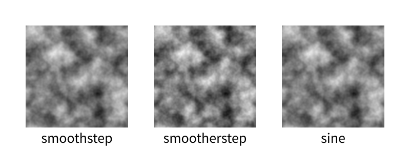
Looks pretty similar to me. smootherstep has some harsher extremes, which is interesting.
Octaves
There’s nothing special about the way I did octaves above; it’s just a simple kind of fractal. As long as you keep adding more detailed noise with a smaller range, you’ll probably get something interesting.
This talk by Ken Perlin has some examples, such as taking the absolute value of each octave before adding them together to make a turbulent effect, or taking the sine to create a swirling marbled effect.
Throw math at it and see what happens. That’s what math is for!
Tiling
Make the grid of gradients tile, and the resulting noise will tile. Super easy.
Simplex noise
In higher dimensions, even finding the noise for a single point requires a lot of math. Even in 3-D, there are eight surrounding points: eight dot products, seven linear interpolations, three rounds of smoothstep.
Simplex noise is a variation that uses triangles rather than squares. In 3-D, that’s a tetrahedron, which is only four points rather than eight. In 4-D it’s five points rather than sixteen.
I’ve never needed so much noise so fast that I’ve had reason to implement this, but if you’re generating noise in 4-D or 5-D (!), it might be helpful.
Some properties
The value of Perlin noise at every grid point, in any number of dimensions, is zero.
Perlin noise is continuous — there are no abrupt changes. Even if you use lots and lots of octaves, no matter how jittery it may look, if you zoom in enough, you’ll still have a smooth curve.
Contrary to popular belief — one espoused even by Ken Perlin! — the output range of Perlin noise is not -1 to 1. It’s ±½√n, where n is the number of dimensions. So a 1-D plane can never extend beyond -½ or ½ (which I bet you could prove if you thought about it), and the familiar 2-D noise is trapped within ±½√2 ≈ ±0.707 (which is also provable by extending the same thought a little further). If you’re using Perlin noise and expecting to span a specific range, make sure to take this into account.
Octaves will change the output range, of course. One octave will increase the range by 50%; two will increase it by 75%; three, by 87.5%; and so on.
The output of Perlin noise is not evenly distributed, not by a long shot. Here’s a histogram of some single-octave 2-D Perlin noise generated by GIMP:

I have no idea what this distribution is; it’s sure not a bell curve. Notice in particular that the top and bottom ⅛ of values are virtually nonexistent. If you play with the live 2-D demo, you can probably figure out why that happens: you only get a bright white if all four neighboring arrows are pointing towards the center of the square, and only get black if all four arrows are pointing away. Both of those cases are relatively unlikely.
If you want a little more weighting on the edges, you could try feeding the noise through a function that biases towards its endpoints… like, say, smoothstep. Just be sure you normalize to [0, 1] first.
Surprisingly, adding octaves doesn’t change the distribution all that much, assuming you scale back down to the same range.
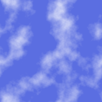
There are quite a lot of applications for Perlin noise. I’ve seen wood grain faked by throwing in some modulus. I’ve used it to make a path through a roguelike forest. You can get easy clouds just by cutting it off at some arbitrary value. Under Construction‘s smoke is Perlin noise, where positive values are smoke and negative values are clear.
Because it’s continuous, you can use one axis as time, and get noise that also changes smoothly over time. Here’s a loop of some noise, where each frame is a 2-D slice of a (tiling) 3-D block of noise:

Give me some code already
Right, right, yes, of course. Here’s a Python implementation in a gist. I don’t know if I can justify turning it into a module and also I’m lazy.
Some cool features up in here:
- Unlimited range
- Unlimited dimensions
- Built-in octave support
- Built-in support for tiling
- Lots of comments, some of which might even be correct
- Probably pretty slow
Here’s the code that created the above animation:
 1from perlin import PerlinNoiseFactory
 2import PIL.Image
 3
 4size = 200
 5res = 40
 6frames = 20
 7frameres = 5
 8space_range = size//res
 9frame_range = frames//frameres
10
11pnf = PerlinNoiseFactory(3, octaves=4, tile=(space_range, space_range, frame_range))
12
13for t in range(frames):
14    img = PIL.Image.new('L', (size, size))
15    for x in range(size):
16        for y in range(size):
17            n = pnf(x/res, y/res, t/frameres)
18            img.putpixel((x, y), int((n + 1) / 2 * 255 + 0.5))
19
20    img.save("noiseframe{:03d}.png".format(t))
21    print(t)
Ran in 1m40s with PyPy 3.